Projects
One of the most successful launches in 2015
We‘re getting nostalgic and it‘s time for a little throwback.
Maybe you haven‘t heard of Keratin Color, but since its launch in the USA exclusively in Walmart in 2015 it has become one of the leading brands in the retail sector. The products with the holistic packaging design by baries design have been rolled out nationwide in all retail channels in the USA and Canada since January 2016.
Schwarzkopf has received nine of the leading beauty awards in the US, including the prestigious „Allure Best of Beauty Award“, the „US Product of the Year Award“ and the „Product of the Year USA“ in 2017.
The creation of new brands is one of the core competencies of baries desgin. So, the successful design of Keratin Color began with a pitch to which Schwarzkopf invited us. Therefore, it is not surprising that we won this competition.
The challenge
At the time of publication, the new formulation with pre-color serum and K-Bond PlexTM for younger, fuller looking hair should be obvious at first glance. It should be clear, that this new coloration treats the hair while coloring through new technological properties.
The briefing
There were a few, but significant, ideas from the client that we were to serve in the creation:
- Color code: dark purple, black and Silver
- Communicate: 1st permanent pro-age coloration
- Model approach: optimistic, experienced, active & vital (age: end 30 – middle 40)
One harmonic and expressive packaging design
Our work
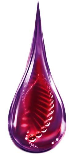
Keratin is a water-soluble fiber protein and consists of amino acid chains that are arranged in a helical pattern. The more of these structures are present, the more they can strengthen the hair. Keratin is the main component of the novel formula. Therefore, the purple drop with the red molecular helix inside immediately catches the eye. It visualizes the technology of coloration, which both nourishes and strengthens. Deep colors and strong contrasts underline the power and performance of this formula. The particulate background directs the eye to the information, which in turn is linked to the model‘s hair by a silver line. This results in a harmonic and expressive overall picture, in which the logo Keratin Color is the center of attention.
Logo development
Since the holistic packaging design was created from one source, the logo was naturally also developed by us to match the overall appearance. The extended line from the „K“ symbolizes a keratin fiber and at the same time combines the two words „keratin“ and „color“ into one unit. Additional, the softness of the font reflects the caring properties. Finally, a contrast of white and dark red allows for a very good recognition value.
Model approach
The model approach originates from baries design as well. Only the age group (30 – 40 years) and an optimistic basic attitude with modern femininity was specified. We choose to cut the faces to offer a lot of space to stage the beautiful dyeing result and to link it with the informative texts. This way of showing a model on a coloration package was revolutionary at that time and has opened up many design possibilities ever since.
Schwarzkopf Keratin Color on the web


