Author: saskia
Pushing the boundaries for Fa by creating disruptive packaging design for their Feel Good Vibes product line. For the good emotional packaging concept we were encouraged to think outside the box. So, we were able to create a design beyond the FA design limits.
Our work
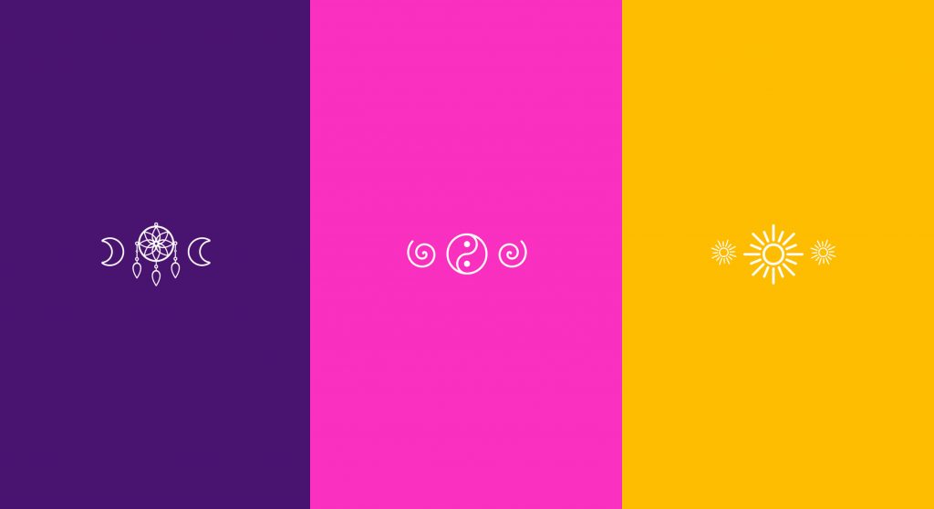
Three products should evoke different feelings for the consumer: Catch Dreams, GET Spiritual and GO Happy. The designs should create a wow-effect for millennials for whom self-awareness plays a key role in their lives. Improving their mental well-being to escape from daily stress is an ever increasing desire of that generation. Therefore, emotions are an important aspect when it comes to beauty purchases:
The ultimate key for the packaging design of the young and trendy project by Fa is to evoke a positive emotion for millennials. Those are evolving around happiness, mindfulness, positivity and spirituality. Our aim was to invite the consumer into a world full of empathy where they can forget everyday life for a few moments.

Creating a good emotional packaging design by using colour, wording, typo and symbols as key design elements
In order to create the positive feelings matching each product line, we started by defining a complementary colour code and visual world:
The dream catcher lifts you into a “feel good mood” with a calming visual of the milky way and colours reflecting soothing nights. To get spiritual on the other hand, a light magenta was chosen which stands for spirituality and female positive energy.
Furthermore, the appearance of the product line Go Happy gives rise to an uplifting mood. This is achieved through positive colours alluding to summer, beach and the ocean – positive vibes and happiness guaranteed.
A highlight for the product lines GET Spiritual and GO Happy, which come in transparent bottles, is an extra feature on the back-label. There, the statements “find your inner peace” and “happy mind happy life” are prominent text blocks stretching over the entire back-label that are visible through the bottles. This allows strengthening the emotional story-telling, while creating a positive feeling.
Maybe you are interested in more packaging designs made by baries design:
The brand IGORA Vital has been in Latin American countries for more than 50 years and is well-established. It provides a unique treatment coloration combined of Keratin & Serin including 7 Oils. But these caring properties weren’t prominent enough on the brands packaging design. Therefore, it had to be emphasized as part of a brand relaunch.
The new packaging design of IGORA Vital brand relaunch
The aim was to make the brand the first option for women over 35 who are experiencing greys for the first time. To position the brand under the care concept, a packaging design with more advanced caring properties was required. For this reason, the following objectives should be taken into account:
- Create an appealing look & feel leading to a superior market position.
- Clear visualization of the benefit: perfect care while coloring.
- Adapt the design structure to the Gliss Color architecture created by baries design.
- Keep IGORA’s main elements to not lose current users of the well-known brand.


Our work
Together with the team from IGORA vital, we strengthened the brand position in the Latin American market. So, we were able to reinforce the brand’s unique selling proposition with a new packaging design.
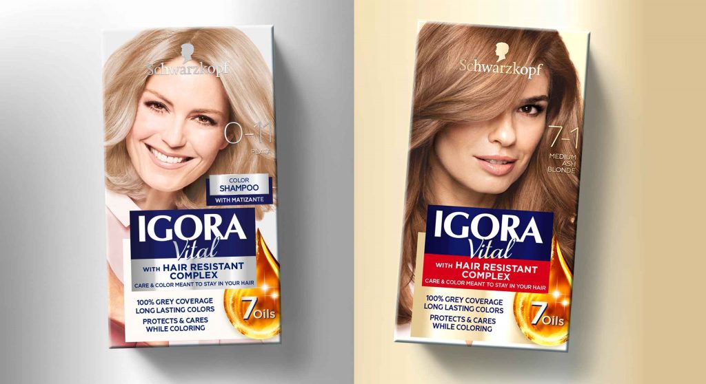
We started to move the packaging design forward by adapting a more modern and structured design architecture as well as the colors of the packaging. To evoke a premium brand image and to not lose existing users at the same time, the elegant blue, red and gold have been kept. But now the colors are balanced in a new way such that a premium appearance is ensured. As an example, the background color red has been moved to the bottom part of the focal text box.
In order to appeal to a target group of 35+, who experience greys for the first time, a new model approach was required. In order to that, the new packaging design shows women in the age of the target consumer with a natural and approachable presence. Additionally, more modern fonts have been applied. Especially on the shade number – an important aspect influencing purchase decision – this transformation leads to a more elegant brand image.
prominent oil visualization on the packaging design to underline the intense care
Absolutely crucial was to communicate IGORA’S caring properties and to reinforce the caring concept: permanent coloration that does not only protect the hair from damage but treats the hair during the coloring process with an anti-breakage action. The new built-in ‘Color Care System’ uses the most advanced anti-hair-damage technology and 7 Oils complex for outstanding caring properties. Hence, our main focus was to include a very prominent oil visualization on the packaging design to underline the intense care. The oil visualization is a drop in a soft and smooth shape with inner texture and light reflections to make it stand out and give it a premium and caring character. To make it easier for consumers to understand the complex caring formula, we have decided to put focus on the 7 Oils complex and included this benefit on the drop in text form.
Through the elegant color tones and the new design architecture, the brand stays recognizable for existing users. At the same time, it transfers a more premium look & feel. With natural and approachable women, the right target group is addressed. Overall, the packaging design creates a more caring, modern and sophisticated brand image. An additional line extension for more mature women has been created by highlighting silver color tones. Thereby, the key target user can be addressed directly and a broader market may be explored.
See more relaunch designs made by baries design
Merry Christmas and a Happy New Year!
Regardless of the challenges, 2020 was the year of our Heart’s Desires. Matching special needs arising from the pandemic, the project Heart’s Desires allowed us to spread some positivity and we are looking forward to a new year!

give instead of take: a better way to celebrate!
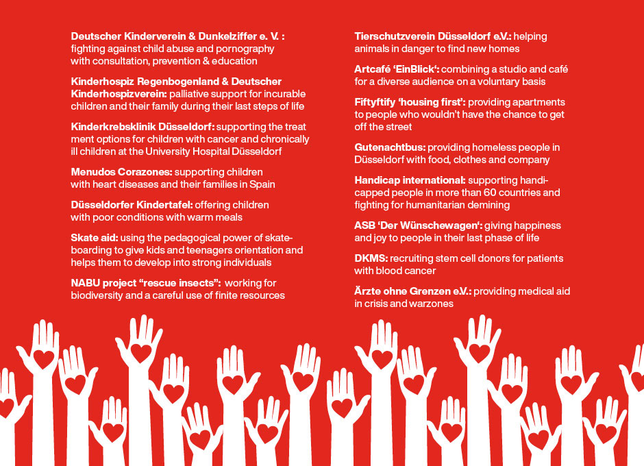
This is the motto of our Heart’s Desires. Our heart does not only beat for design. In 2020, it was our heart’s desire to have a special focus on the social and environmental impact we have as an agency. Until this year, every baries team member received a personal birthday gift. This year, we decided to donate that money instead to a good purpose. Therefore, everyone could individually select a charity of their choice. Less consumption – more happiness!
These are the organizations our team members selected:
Check our Instagram highlights to see the variety of organizations that have been chosen so far by our team members for their birthday donations!
creative carnival – style meets sustainability!
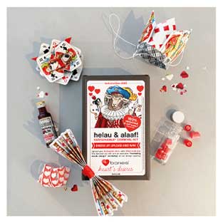
Helau & Alaaf! Celebrating carnival in the Rhineland is a great tradition and provides the opportunity to dress up in funky costumes. Being located in Düsseldorf it is imperative that we dress up and we very much enjoy visiting our customers in a casual way. Of course, as a creative team we love to come up with a new costume every year and to surprise our clients and friends with a new, creative & trendy carnival-kit every year. However, carnival can bring about a lot of waste and is rather environmental-unfriendly. The costumes mostly consist of disposable items and the sweets and treats are wrapped in plastic. How did we solve this conflict?
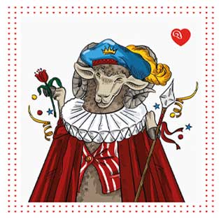
This year, we have finally created our first sustainable carnival-kit! All treats we have given our customers have been locally manufactured in Düsseldorf and wrapped in paper to avoid plastics. The motto for our self-made costumes out of upcycled materials: Be Kings and Queens of hearts!
locally sourced gifts
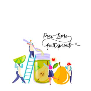
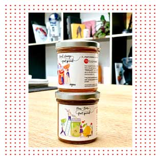
In the course of the year, we are giving a few seasonal gifts to our customers and employees, which were under our motto Heart’s desires as well. As part of the mission, the gifts are regionally sourced and intended for a good cause. As an example: the summer gifts were fruity jams handmade by „Paul kocht“ – an initiative that offers work and acceptance to people with special needs. With natural ingredients and exclusive flavors such as ‚Aperol-Orange‘ or ‚Pear and Lime‘, the spreads didn’t only take care of our client’s summer vibes, but also meaningful work. All this of course packed with a self-illustrated baries design.
christmas love with small and social businesses
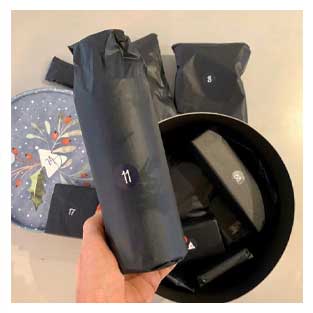
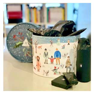
Now, going towards the end of the year, it is even more important to share some love with people who are important to you during the Advent time. The countdown towards Christmas has officially started and we are so excited to unpack the wonderful presents from our Adventsome calendar together with every team member day by day. Matching our Heart’s Desires motto, the Advent calendar contains
Real sustainability on the next level: Henkel Laundry and Home Care is launching its new brand Love Nature, that is committed to sustainable cleanliness and refillable bottles – and baries design builds the holistic brand design.
Brand building for Henkel‘s new sustainable vegan & eco-friendly cleaning brand
Briefing
For us as designers, it is a matter of course to strive for sustainable packaging – being as environmentally friendly as possible. Therefore, we were beyond excited to take part in the strategic brand building of Love Nature. We were asked to create a holistic concept for the new brand absolutely from scratch. The products should be green by heart, but still target the mass market. Research revealed that performance and fragrance are crucial product properties for consumers, which should not be compromised by sustainability. Accordingly, it was important to come up with a design strategy that combines eco-friendliness with top performance and great fragrances.
Cleanness with love for nature
Challenge
- Communicate, that the product performance is not compromised by the natural formulation.
- Promote the eco-friendly properties by a natural look and feel.
- Educate consumers on how powerful a sustainable product can be and how to use it.
Our work
How do you turn ecological cleaners and detergents into an easy choice for everyone? Our holistic design approach started from creating bottle shapes, logo, product labels, icons to pack shots and mood boards.
Firstly, we had to conceptualize how to balance the communication of sustainability and product performance. Consumers still perceive these properties as contradiction and put more emphasis on strong performance as well as fragrance when it comes to laundry and home care. Hence, it has been a crucial design task to convince users: the product can do both!
It has been recommended to use a bright-colored formula in order to transport the products’ high performance and amazing scent. In addition to that, we perfectly chose a label giving the product the needed natural look and feel. The color relates to natural craft paper. Moreover, we decided to give the label a more organic touch by including imperfect fonts and subtle colors.
Logo & icon development
Of course, the logo clearly reveals the brand identity involving sustainability. The natural green in a light an artistic watercolor style symbolizes the earth and provides a rich contrast to the natural label colors. Additionally, this image is made even more clear in the letter ‘o’ of the word ‘Love’. On top, a butterfly is lifting its wings flying into nature. The emotional element makes you feel good to live consciously and creates a movement. As Henkel’s product manager states:
“They say a butterfly flapping its wings in one part of the world may cause a huge effect somewhere else.”
Moreover, the strong color in contrast to the natural paper highlights the sense of importance, that is put towards our planet.
Another very important aspect whilst considering sustainable packaging design is consumer education. Many people still lack knowledge on the specific eco-friendly properties and seek easy-to-understand information on products. Hence, why we have created a range of icons, which highlight the most important benefits playfully. Next to the standardized CFI cruelty-free and EU Ecolabel, we designed icons to show: The bottles are made of 100% recycled plastic and are again recyclable. Additionally, the ingredients are up to 98,5% from a natural origin. Moreover, the fragrance such as cactus leaves is depicted similarly promoting the important product benefit in an eco-friendly way.


To round things off, there will be refill stations for laundry detergent as well as dishwasher in selected retail stores all over Germany. Thus, Love Natue is the first brand to offer such a sustainable service driving a change in shopping experiences.
We at baries design strive for more ecological & sustainable behavior ourselves. We are especially proud to increase consumer awareness for the topic and to make it easier to literally Love Nature.
See more holistic packaging designs made by baries design
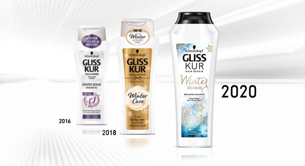
Seasonal limited editions by Schwarzkopf Gliss Kur allow us creative freedom. Therefore, we had a lot of fun creating the limited edition design for Gliss Kur Winter Repair 2020.
Elegant and modern design for winter-stressed hair
The challenge
Contrary to the baseline range, the design should be more disruptive while reflecting the products winterly benefits. Furthermore, we should consider a few other aspects:
- Keep the logo as it is
- Use the new relaunch bottle design
- Create an emotional story around the winter theme
Our work
Like in the years before, we were so excited to create the design for this seasonal range. By breaking up the usual brand structure, the Winter Repair edition differentiates more and more from the baseline. Luckily, this development gives us a lot of leeway to build the design.
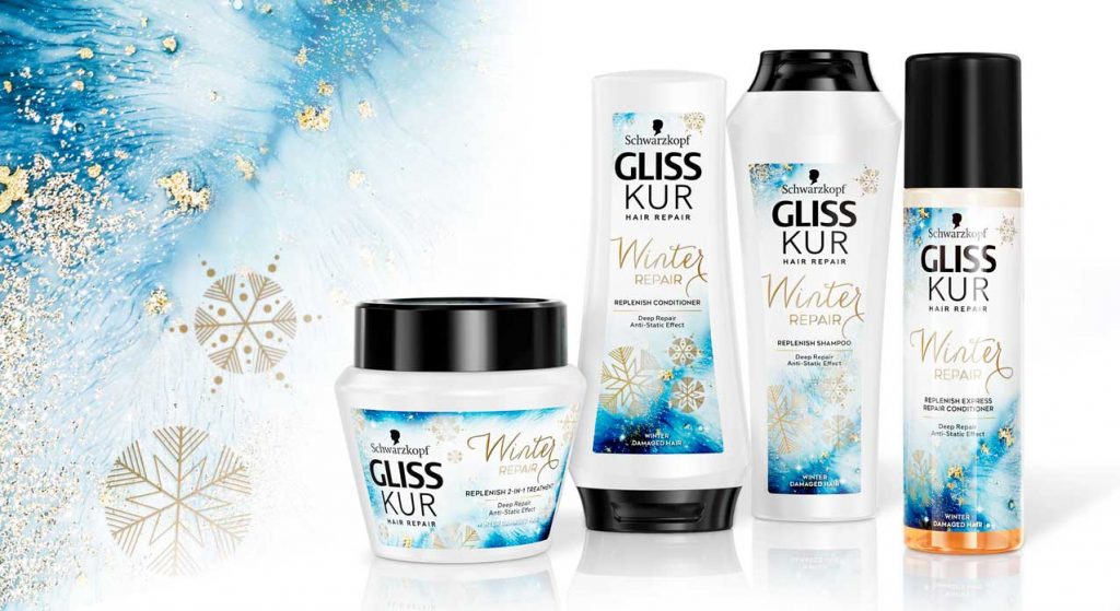
We used the new Gliss Kur bottle designed by baries design as the basis for the design. Thanks to the flowing shape, there is a bigger label and therefore more space for layout. Furthermore, to create a winterly atmosphere, we chose white as basic color. This clean basis also stands for the caring character. The abstract blue watercolor visual suggests an icy surface and transports the winterly coldness. In addition, golden lettering and snowflakes complete the design and create a luxurious look.
Moreover, the strong caring formula is explained by the powerful dark blue tones as well as through the product name lettering. While the word “Repair” states the technological part through a sans serif font, the handwritten word “Winter” communicates the caring aspect.
All these style elements create a look & feel that brings the emotional winterly atmosphere to the bathroom and still conveys the years of expertise that Gliss Kur stands for.
Schwarzkopf Gliss Kur Winter Repairon the web


