Author: saskia

In 2020 the new clean beauty brand was launched: one.two.free! packaging design and brand developement by baries!
“Clean beauty is a global movement and a new transparent approach to the beauty industry, defined by clean brand products that contain no controversial and harmful ingredients for skin, body or environment.”
one.two.free! packaging design and brand building
The challenge
Create a visual identity and a packaging design for a new clean beauty brand.
The design should be young, appealing, cheeky and fresh and address the main target group of “millennial” women, who are seeking for natural & clean products.
The new cosmetic line should be easy to use and contain highly effective fermented ingredients, free of controversially health perceived ingredients. All of this should be reflected in the graphical approach and the packaging design.
Packaging design
Following the brands name, we developed a packaging series that represents a 3-step beauty routine. Consequently, the modern horizontal division of rose and white is broken up by the large numbers. As aresult, we created a striking and clear brand, which makes a big impression on shelf.
Finally, the large numbering, a playful typography and light pastel shades in combination with pink accents, create a strong contrast and an exceptional design.
Above all, the clear & playful design will strengthen the appearance in social media, to address especially the millennial women.
Logo development

It was most challenging to create a logo for the one.two.free! packaging design. Furthermore, it should reflect the purity of the product, its clear and simple application, as well as to capture the zeitgeist. Therefore, the new brand logo got a modern and playful font with a fresh look & feel.
one.two.free! slogan
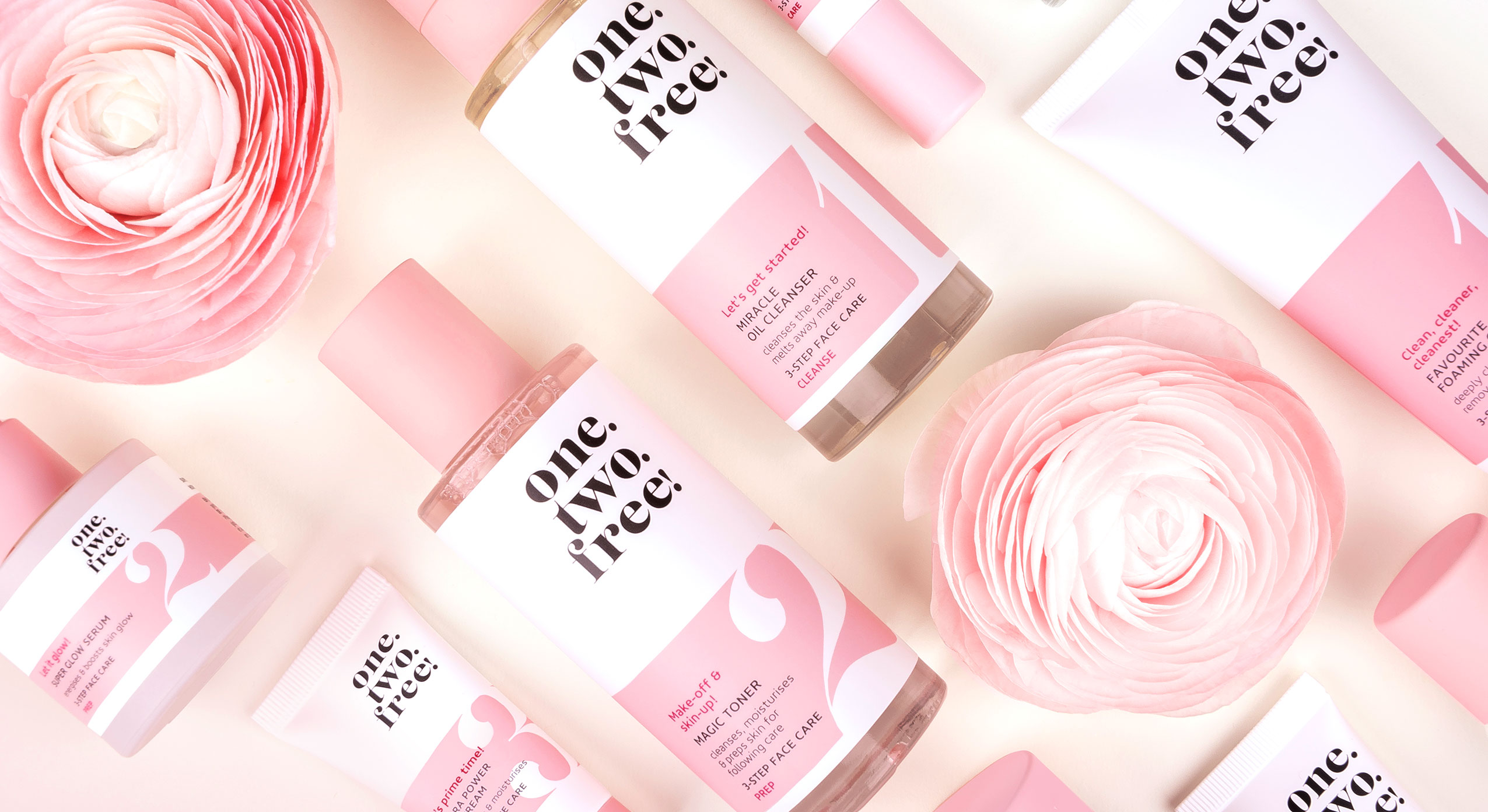
one.two.free! top view product arrangement
One.Two.Free! on the web: click here

Churchkhela food packaging design: A new snack conquers the market
The challenge
The design for Taube Nüsse should represent the handmade production method and the long history. Further, it should communicate the healthy and vegan recipe. Moreover, it should be created as an ecological and recyclable packing.
The background
Taube Nüsse is a small owner-managed company thats aim it is to establish a traditional Georgian snack called Chuchkhela. This natural energy bar is made from walnuts and grape-couverture, free from any preservatives and 100% vegan. Hundreds of years before warriors and shepherds appreciated the Churchkhelas. It is still traditionally made in Tiflis and imported to Germany.
Our work
The sustainable Churchkhela food packaging design idea was given by the client. Consequently, a natural cardboard box is used. Only a small window reveals the delicious contents. Today, the product is still produced according to traditional methods from hand-picked ingredients.
We want to connect this new brand with the long history of the product. Therefore, we designed special illustrations for this food packaging. Small, playful details fit perfectly into coarser elements. A seal creates trust in the authenticity of the manufaction. Above all, we reduced the colors to basic colors. So, the packaging design manifests the centuries-old origin of the Churchkhelas. More variants with various nuts are in planning and will be distinguishable by different colors.
So, stay tuned and check out these delicious snacks.
Taube Nüsse on the web click here
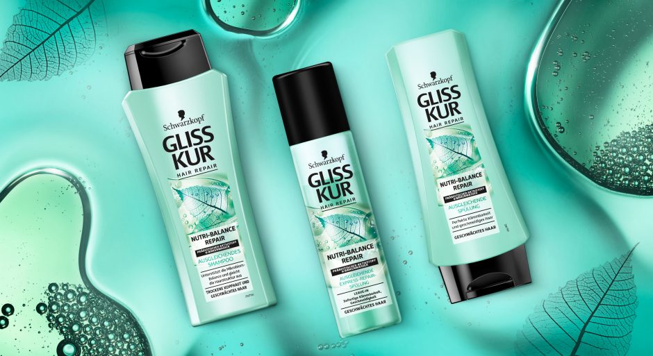
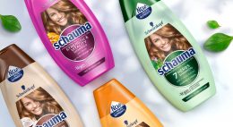
Schwarzkopf Gliss Kur team asked us to develop a label design for their new Gliss Kur subline Nutri-Balance Repair.
New technologies require new designs
The challenge
The task was to develop a label design for the new Gliss Kur sub line Nutri-Balance Repair, which supports the healthy balance of scalp microbiome and laying the foundation for silken smooth hair. These benefits should be transported to the user through the design. Color code and label design need to have a balance of natural appeal and technological performance.
Our work
The current Gliss Kur baseline range shows the performance of the product closed in a box. But new technologies require a new appearance.
The difference started already with Bio-Tech Restore. Product name and main formula components are communicated above the box.
On the other hand, performance and hair type recommendation are located in the lower part. As a result, this clear straightforward structure ensures that the consumer is informed about the differences at first glance. But it leaves little room for emotionality and naturalness. Most importantly, the visual now shows not only the performance, but also the effective ingredients.
Back to Nutri-Balance Repair:
The amorphous, authentic form of the liquid correlates with the representation of the birch leaf. Therefore, it appears as if it had been photographed with an X-ray machine. Most importantly, we were able to combine the natural ingredients and the technology contained in the formula in one image. As a result, we could explain them to the consumer at a glance. The apparent translucency of the visual and the white box make the text stand out. So, it provides clear explanatory information. The soft turquoise shade with a hint of blue generates a pleasantly caring feeling. Consequently, it highlights the silicone- and colorant-free composition.
This label design of Gliss Kur Nutri-Balance Repair follows on seamlessly from that of Gliss Kur Bio-Tech Restore. It is the first new product of the range that combines science with naturalness and whose design also originates from baries design.

New Schwarzkopf Nutri-Balance Repair made by baries
Schwarzkopf Gliss Kur Nurti-Balace Repair on the web: click here
Have a look on our other hair care packaging designs

Packaging design for a revolutionary new brand
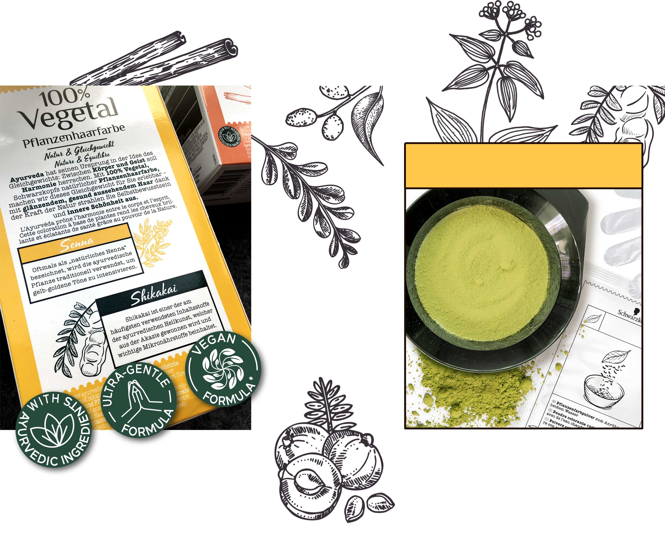
In 2018, Schwarzkopf started to work on a revolutionary new hair color, that won’t damage the hair due to natural ingredients. We were very glad to develop the packaging design for 100% Vegetal and join the exciting process from the very first idea to the final product.
The Challenge
2018 Schwarzkopf briefed us firstly for their first all-natural hair color, crafted in India using the ancient tradition of Ayurveda. Launching a design which reflects the caring power of Ayurvedic plants and herbs and its natural caring benefits, addressing women who want to color their hair, but are afraid to damage it with chemical hair dye. The packaging design from 100% Vegetal should connect the user with the positivity of nature, which implies health and a natural color result.
Besides the natural and vegan ingredients, which should be considered in the packaging design, no models should be shown. The focus should be on the plants and herbs shown in stylized illustrations.
Due to the new method of application as powder and not – as is usually the case with commercially available hair coloration – as cream, new inner elements also emerged. Instead of a bottle developer and a tube of color cream, the packaging now contains just a sachet of powder. This not only saves costs, but above all protects the environment by reducing packaging waste.
Logo Development
The logo should give a clear massage from the first sight: 100% Natural, 100% Vegan and inspired by traditional ayurvedic methods.
We have based the logo design on the symbols known from Sanskrit in order to establish the connection between the Ayurvedic concept and the modern age.
The slightly irregular sans serif typeface, in which individual letters are connected with each other, is inspired by traditional Sanskrit, which has been used in India and South Asia for over 3000 years. It reflects the expertise of traditional Ayurvedic applications and the power of naturalness and stands out of the packaging design.
Our Work
According to the briefing, we created a design for the outer packaging that completely dispenses with a model approach. Instead, the focus is on natural hair and the main ingredients used in each color shade – arranged on a label reminiscent of a pharmacy label. The color of the hair in the background and the main color assigned to the shade in the label ensure that each shade has its own character. At the same time, the white tear-off label on each shade forms a uniform line in harmonious contrast.
The icons on the front were designed with great attention to detail and visualized in an unmistakable way. We also created all illustrations of the inner elements as well as those for instructions for use in the same sketchy style like the coloring ingredient shown on the front.
We have based the logo on the symbols known from Sanskrit in order to establish the connection between the Ayurvedic concept of the product and the modern age. The serif font transports the expertise and the centuries-old traditional method of hair coloring into the present, while the script in the headlines creates a stronger emotional bond with the consumer.
Schwarzkopf 100% Vegetal Natural Hair Color back and inner elements made by baries
Schwarzkopf 100% Vegetal on the web: click here

Technology evolves with the Power of Nature
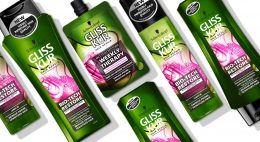
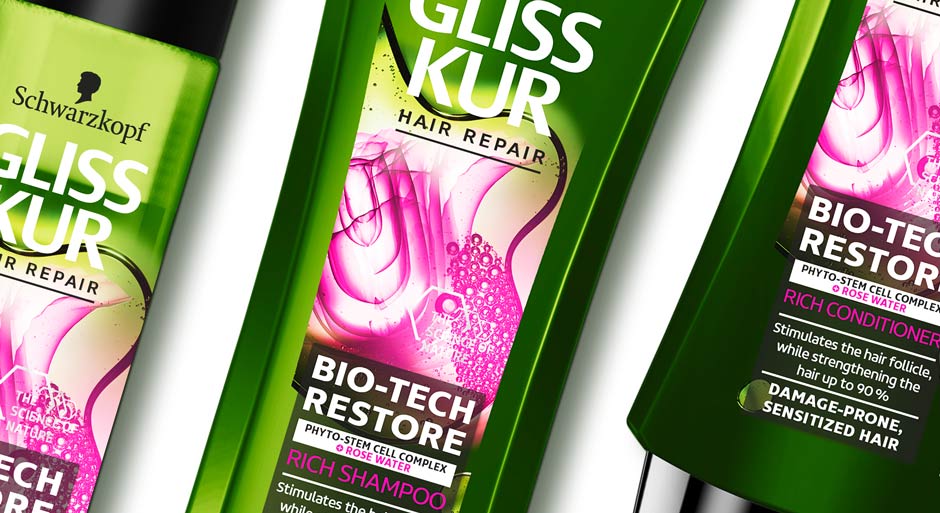
Gliss Kur by Schwarzkopf is well-known for longstanding expertise in hair technology. Nevertheless, natural ingredients play a big role in performing formulas. With the new Gliss Kur Bio-Tech Restore Schwarzkopf didn‘t only offer a new formula that combines both. Instead, together we also set a new focus on design. A visual breakthrough of the power of nature in technology!
Challenge
- Visualize the biological Phyto-Stem Cell Complex and Rose Water
- Set a new focus on the power of nature in technology
- Keep the brand identity recognizable

Gliss Kur Bio-Tech Restore shampoo, conditioner and hair mask with competence and strength
Our work
We have worked with Gliss Kur for over a decade. Following, we were excited about this new natural-technological approach and an innovative design for the new sub line Bio-Tech Restore!
„The Power of Nature“ – Visual
Our focus during the project was the visualization of the natural ingredients.
Starting with the rose water, we developed a new way of showing the traditional flower in a technological context. We visually used the X-Ray machine technology to show the rose blossom in a very detailed and enlightened cross-section. With this ambivalence between represented element and presentation style we mastered the challenge to unite natural ingredient with Gliss Kur’s technology approach. To stress the biological appearance, the flower is embedded in a liquid, which shape is amorphous and organic. Inside, Phyto-Stem Cells are showed with additional small pink liquid bubbles.
Besides, the communication is empowered with a new on top icon, that is claiming “The Power of Nature“. We designed a decent, graphic frame with a chemical form language that leaves open space for the visual.
The Power of Color
The color contrast between pink and green catches attention and enhances the natural impact. The specific green color tone distinguishes from classic organic products on the market and refers to the technological aspect. It also gives a more premium appeal.
The Power of innovative Design
All in all, the visual is the new main actor on the pack. Unlike previous Gliss Kur packaging designs, which show the technological visuals enclosed in a box. Now, a square is used for the text, whereas the visual is unboxed. The new text background ensures easy and structured readability. However, the light transparency leaves still room for the visual. The ingredients get particularly more space to catch attention with the innovative composition and colorful implementation of naturalness in technology.
Gliss Kur Bio-Tech Restore range close up
Gliss Kur Bio-Tech Restore on the web