Category: concepts
SISU – Non-alcoholic Spirit
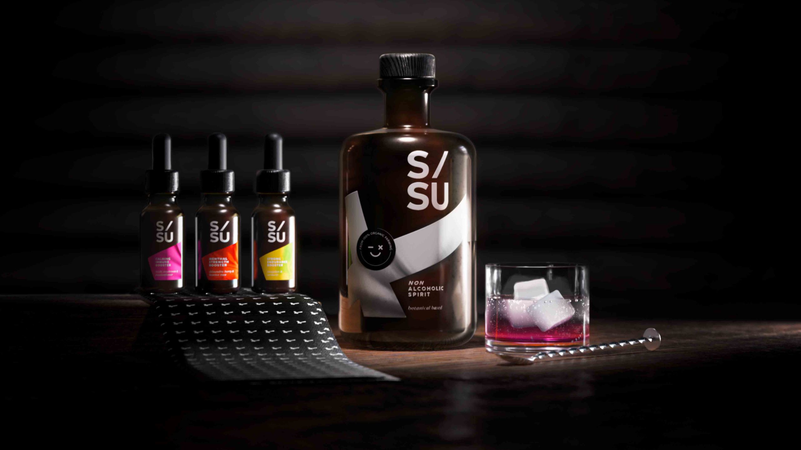
SISU is a non-alcoholic spirit whose name stands for „mental quality“ in the Finnish language and embodies strength, endurance, courage, relentlessness and fighting spirit.
Non-alcoholic spirits are an alternative to conventional spirits. These spirits are sometimes produced in the same way as alcoholic spirits but involve special processes to remove the alcohol as a last step. SISU works with adaptogens which are herbal remedies that can help you combat mental or physical discomfort. They provide a biological boost that manages stress, strengthens your immunity and improves your overall well-being.
For centuries botanicals have been associated with traditional medicine, aromatherapy and herbal teas. Today consumers still perceive herbal substances as a „healthy halo“. Given the circumstances surrounding COVID-19 and to protect their own health, consumers see a positive link between these botanical extracts and emotional well-being.
Design
When designing the label, it was of utmost importance to integrate the Finnish influence. Therefore we decided to incorporate the style of the Finnish flag into the label design.
The flag shown is tilted to the left and forms a diagonal from the bottom left to the top right. This inclination symbolises a positive spiritual development. The logo also contains a diagonal and aspirational element that underlines the concept of the brand.
Dosage & varieties
The 3 different varieties can be purchased in small pipette vials that can also serve as an additional flavour enhancer depending on your needs and taste.
The flavours are:
reishi mushroom / passion flower
shisandra berry / liquorice root
jiaogulan / Turmeric
Discover more siids projects!
On the constant look-out for new challenges we have the demand to push ourselves and to be creative. With our innovation hub siids we now bring our brave ideas to life and invite you to be part of it.
Contemporary design meets Punk
As we are always looking for the latest trends in design and lifestyle, it is our goal to offer perfect products to consumers. With our creative hub SIIDS we constantly develop and promote our creative potential and invite you to be part of it.
Nowadays sustainability is a must and should be considered in every product development. Therefore we looked at the market of decorative cosmetics, which is flooded with plastic packaging. While there is a massive usage of foils and plastics, the filling quantity is not consumer-friendly. Therefore we felt the need to develop a packaging that is both sustainable and consumer-friendly without sacrificing any stylish elements.
The idea was to develop a sustainable and refillable mascara kit, equipped with different brushes, for an exciting shopping experience. The kit includes a refillable Mascara tube, bioplastic refill containers and a selection of brushes for different looks and occasions. The design should be purist, contemporary and expressive.
Brand & Logo development
When designing the product, we took into account that the brand should have a niche character but still appeal to a wide audience. It was also of great importance to position the brand in such a way that it can be extended to a broad product portfolio. In future more mascara colors will be included in the range as well as liquid eyeliner in refillable containers.
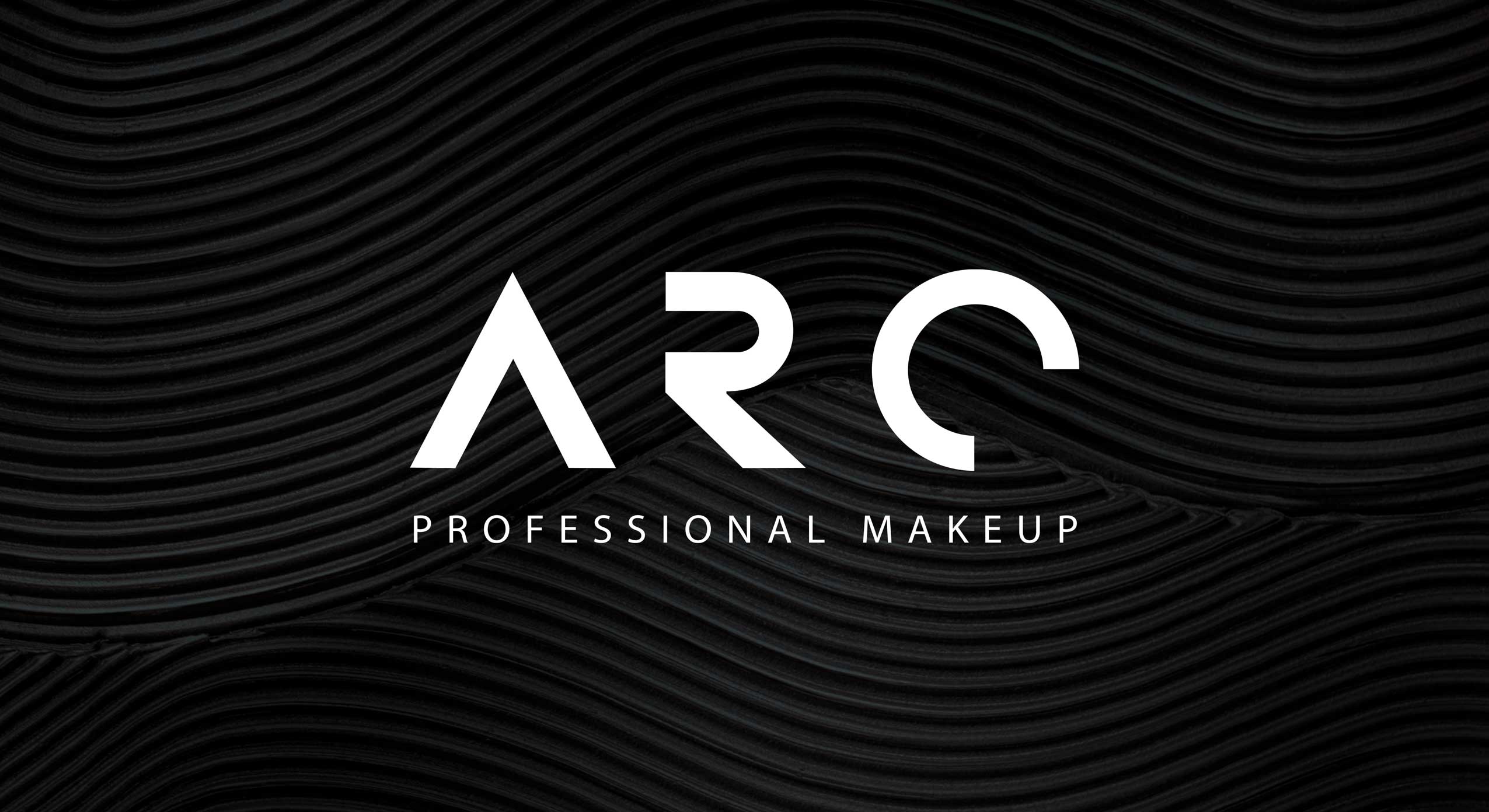
The logo ARC has a simple but graphic approach. The C also serves as the signet of the brand. The arc symbolizes the curved eyelashes and thus embodies the hero product. The look & feel of the brand should express calligraphy, punk, contrast and a contemporary style.
Discover more siids projects!
On the constant look-out for new challenges we have the demand to push ourselves and to be creative. With our innovation hub siids we now bring our brave ideas to life and invite you to be part of it.
The monotony of the last stretch and the anticipation of the coming year
As every year, we are sending our Christmas and New Year’s greetings in a creative format: a conceptual champagne packaging design that symbolically reflects the past year 2021 as well as the expectations for the coming year 2022. In this second pandemic year, our baries champagne packaging design combines the monotony of the last stretch and the anticipation of the coming year.
Our work
We are rounding off the year with a combination of shape, color and material to create a unique composition.
This year our packaging is set in a scene of different objects that we paradoxically have become both fond and tired of in the home office setting and is monochromatically immersed in the Pantone Color of the year 2022 ‚Very Peri‘ which fittingly underlines the zeitgeist.
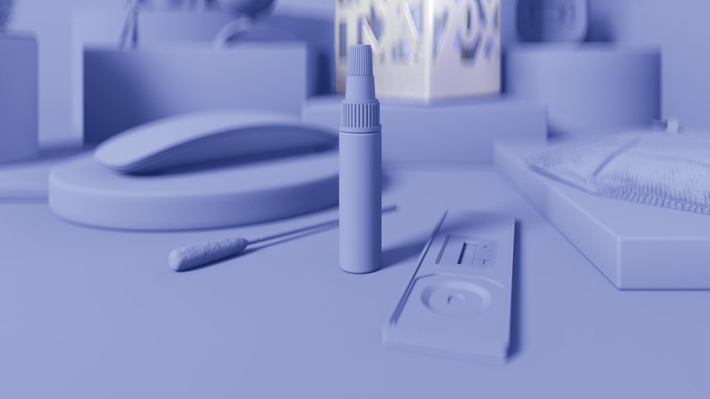
Monotony & Futurism – baries Champagne Packaging Design of the Year 2021, home office items in the Pantone Color of the year 2022 “Very Peri”
Cheers to Transformation and Futurism
Just as the colour reflects times of change, the premium silver packaging contrasts the monochrome everyday objects in above packaging scene. The cut-outs in the packaging provide a hopeful perspective after a period of monotony.
Although we will carry on with the home office in 2022, we hope for a future full of contrasts, transformation as well as digital and aesthetic futurism.
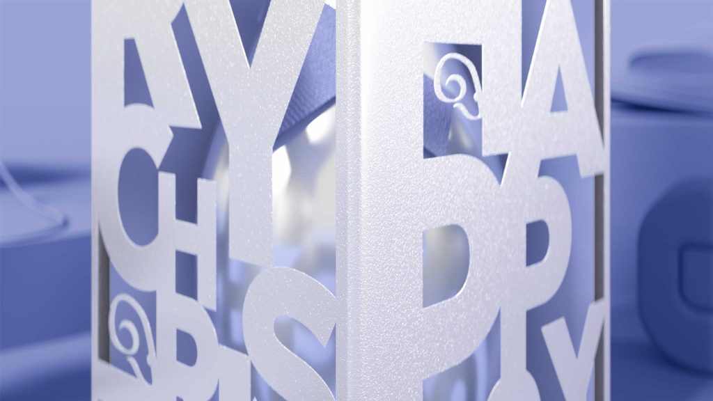
Monotony & Futurism – baries Champagne Packaging Design of the Year 2021, futuristic packaging in metallic silver with revealing cut outs
Discover our projects from 2021:
Always on the lookout for the latest trends in design and lifestyle, it is our goal to offer the customer the perfect product. Our internal baries projects bring our own ideas to life to constantly develop and promote our creative potential.
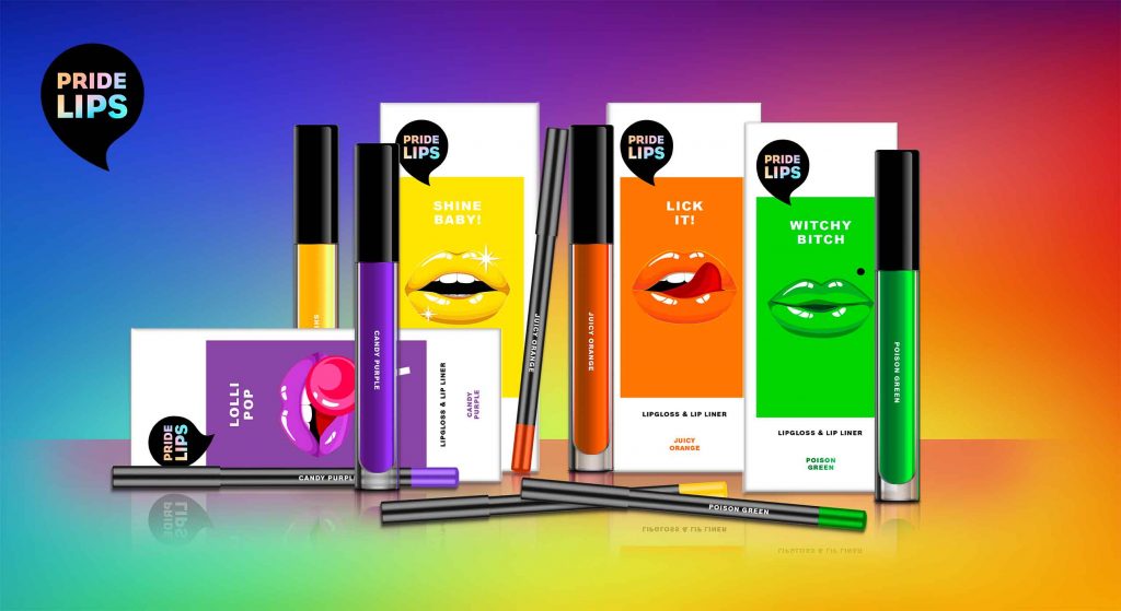
PRIDE LIPS for pride month and beyond
At baries, we have observed in recent years that diversity is becoming more and more relevant. The movement moved out of the niche and gained the awareness of the masses. That’s why we started conceptual brainstorming already last year and developed our own diverse product concept. Today, diversity is extremely important. We take pride month 2021 as an occasion to share our PRIDE LIPS for celebrating tolerance and diversity in society.
Kissing and hugging are important and of special significance to all of us, especially in times of social distancing. That’s why we wanted to celebrate „kissing“ with special KISS KITS that encourage people to interact, have fun and connect with each other.
Our work
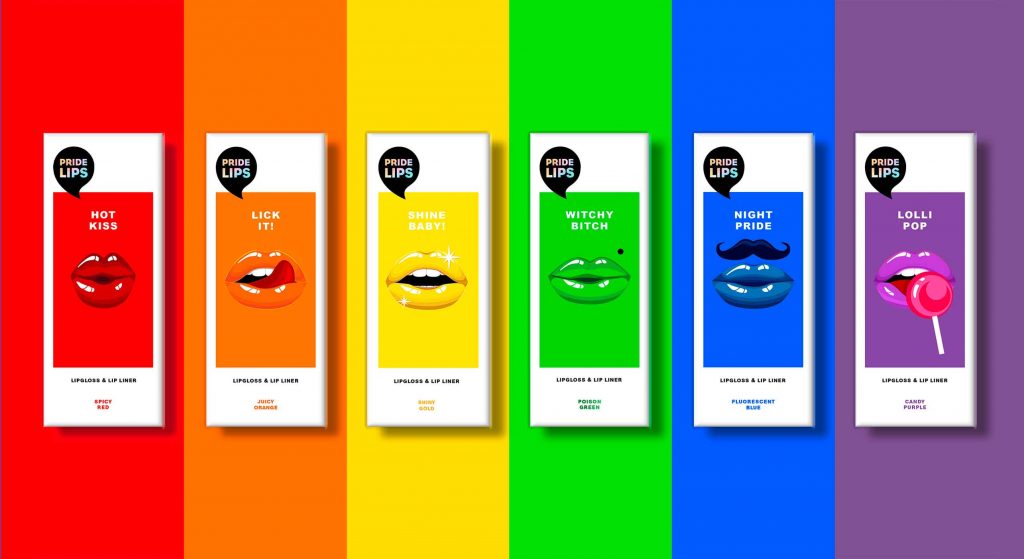
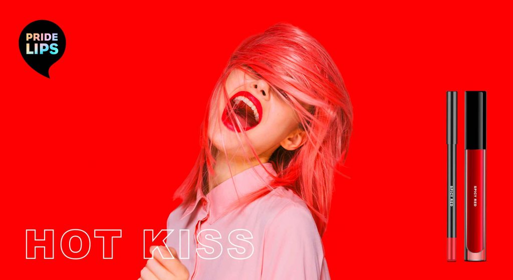
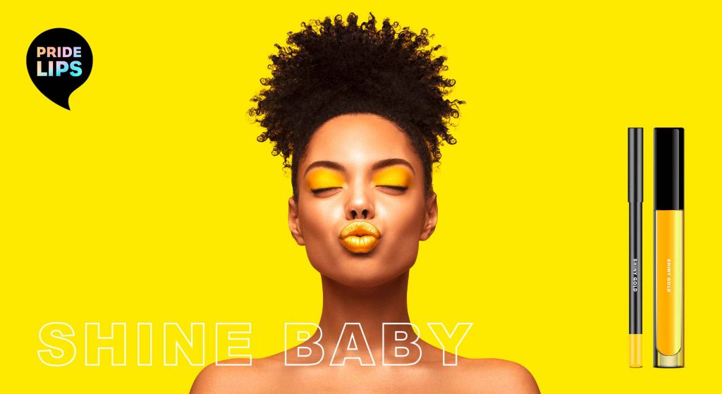
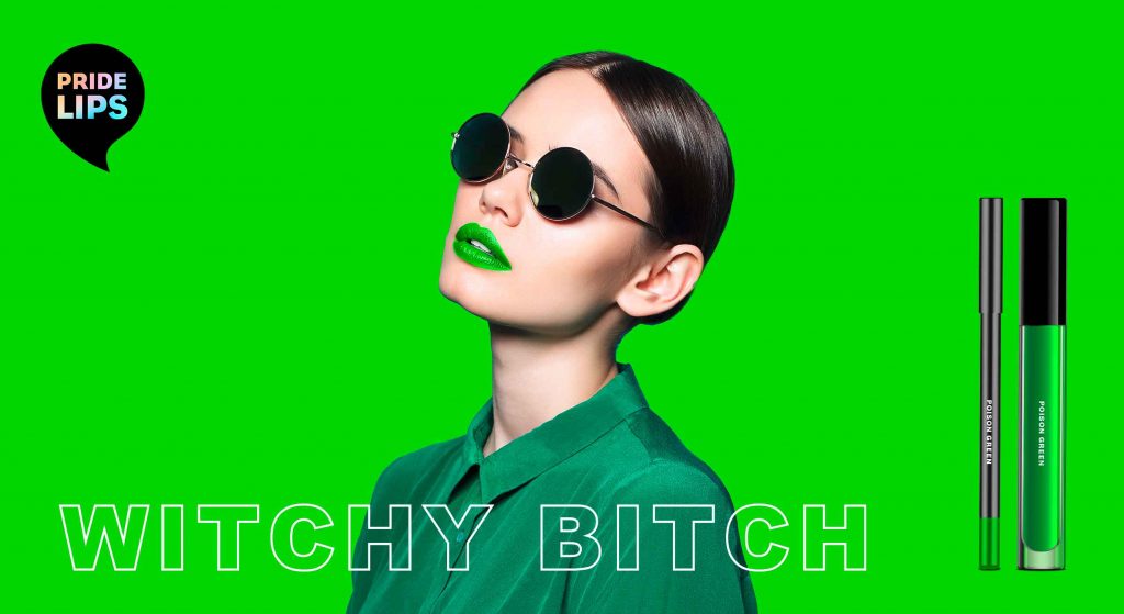
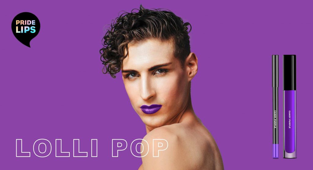
When designing the PRIDE LIPS kiss kits, the idea was to express diversity and joy through the packaging design. For each colour of the iconic PRIDE FLAG we created its own lip gloss and lip liner.
The packaging design features different lip expressions that convey a special, exaggerated expression and provoke in a humorous way. The witty and provocative names of each packaging invite the user to have fun and embrace unexpected happenings.
To make the colours stand out, we decided to use a white packaging box. This way, the depicted colours resemble a colour chart. For the lips illustrations, we chose a poppy style that reminds of comic art. In combination with the logo – a speech bubble that playfully links to the illustration – this creates a harmonious packaging design.
Trendwatch – bold & colorful beauty
Obviously, the colours of our kiss kits are based on the rainbow of the iconic LGBTQ+ flag. However, they are no stranger to the beauty & make up world.
Thanks to the open and tolerant web culture, all colours and looks are accepted and celebrated. It is IN to express one’s individuality and mood. For this reason, each PRIDE LIPS variety has its own character expressed through its unique colour, illustration & playful title. Therefore the brand encourages the consumer to try out and embrace various looks.
be brave, be bold, be free, be pride!
Brand & Logo Design
Our PRIDE LIPS brand is loud and proud. In fact, our kiss kits are designed for those who are not afraid to attract attention but are proud of their individual beauty. Not just for the LGBTQ+ community, but for everyone who makes their own beauty statement.
To highlight the brands‘ extroverted character, the logo is designed as a speech bubble. The individual product names that are positioned below the speech bubble thus become ambassadors for the brand name.
As the black logo stands in striking contrast to the packaging design and monochrome approach, the design gets an avant-garde and arty feel.
In addition, the logo immediately catches the eye and strengthens the brand. It also offers a great canvas for the typology. In order to integrate the rainbow effect of the LGBTQ+ flags in every single product, the typo in the logo is coloured with a gentle rainbow gradient. In contrast, the font is straightforward reinforcing the brand’s strong character.

Maybe you are interested in more packaging designs made by baries design:
Merry Christmas and a Happy New Year!
Regardless of the challenges, 2020 was the year of our Heart’s Desires. Matching special needs arising from the pandemic, the project Heart’s Desires allowed us to spread some positivity and we are looking forward to a new year!

give instead of take: a better way to celebrate!
This is the motto of our Heart’s Desires. Our heart does not only beat for design. In 2020, it was our heart’s desire to have a special focus on the social and environmental impact we have as an agency. Until this year, every baries team member received a personal birthday gift. This year, we decided to donate that money instead to a good purpose. Therefore, everyone could individually select a charity of their choice. Less consumption – more happiness!
These are the organizations our team members selected:
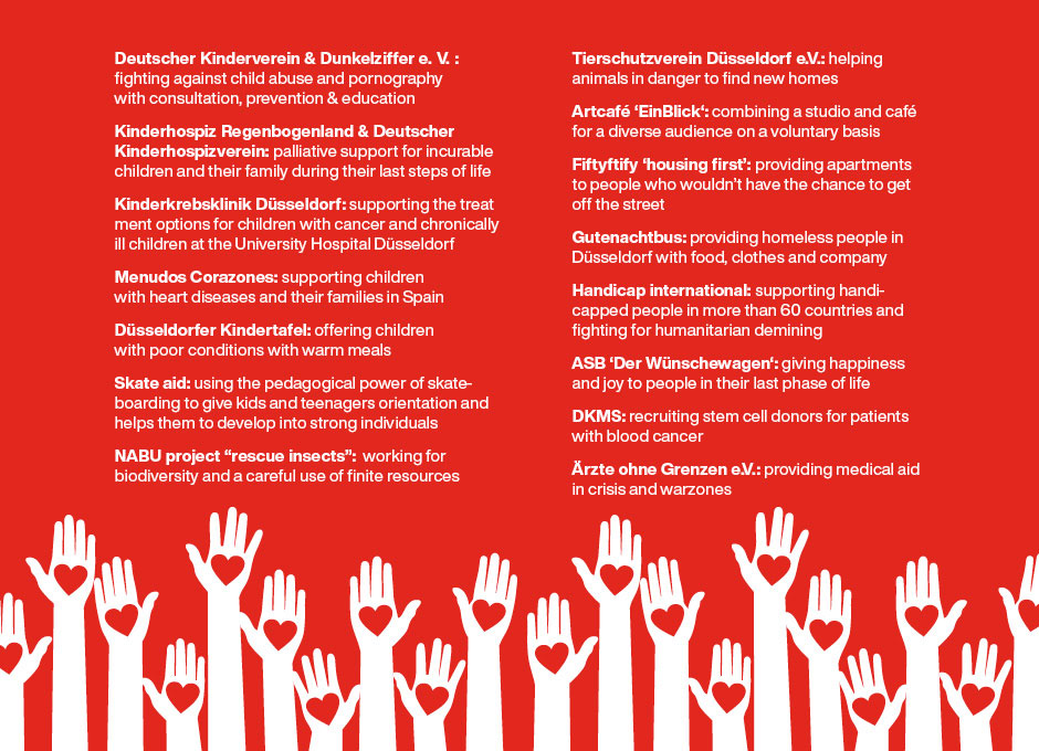
Check our Instagram highlights to see the variety of organizations that have been chosen so far by our team members for their birthday donations!
creative carnival – style meets sustainability!
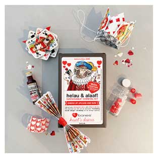
Helau & Alaaf! Celebrating carnival in the Rhineland is a great tradition and provides the opportunity to dress up in funky costumes. Being located in Düsseldorf it is imperative that we dress up and we very much enjoy visiting our customers in a casual way. Of course, as a creative team we love to come up with a new costume every year and to surprise our clients and friends with a new, creative & trendy carnival-kit every year. However, carnival can bring about a lot of waste and is rather environmental-unfriendly. The costumes mostly consist of disposable items and the sweets and treats are wrapped in plastic. How did we solve this conflict?
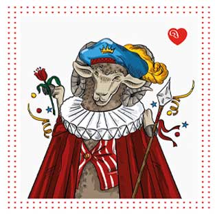
This year, we have finally created our first sustainable carnival-kit! All treats we have given our customers have been locally manufactured in Düsseldorf and wrapped in paper to avoid plastics. The motto for our self-made costumes out of upcycled materials: Be Kings and Queens of hearts!
locally sourced gifts
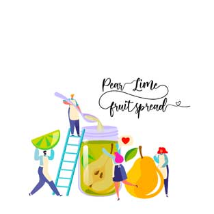
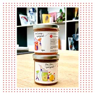
In the course of the year, we are giving a few seasonal gifts to our customers and employees, which were under our motto Heart’s desires as well. As part of the mission, the gifts are regionally sourced and intended for a good cause. As an example: the summer gifts were fruity jams handmade by „Paul kocht“ – an initiative that offers work and acceptance to people with special needs. With natural ingredients and exclusive flavors such as ‚Aperol-Orange‘ or ‚Pear and Lime‘, the spreads didn’t only take care of our client’s summer vibes, but also meaningful work. All this of course packed with a self-illustrated baries design.
christmas love with small and social businesses
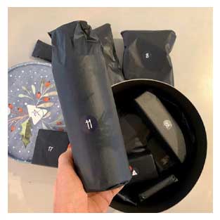
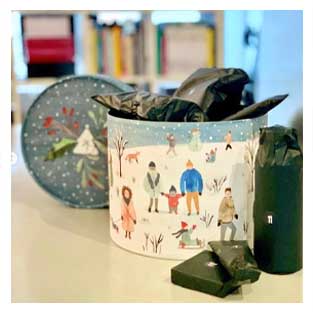
Now, going towards the end of the year, it is even more important to share some love with people who are important to you during the Advent time. The countdown towards Christmas has officially started and we are so excited to unpack the wonderful presents from our Adventsome calendar together with every team member day by day. Matching our Heart’s Desires motto, the Advent calendar contains


