Category: hair care
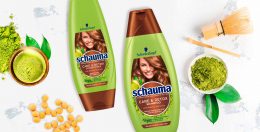
Matcha Tea is already booming as well known detox ingredient from food the food industry. Therefore, Henkel wanted to launch a matcha tea haircare product under the Schauma baseline. It cares for the hair lengths and tips intensely while deeply cleansing the hair roots like a “hair detox”.
Briefing
The main goal was to develop the care & detox segment under Schauma baseline in order to broaden up a bit the target group as it’s a very appealing concept for younger woman.
The challenge here was to use the green color coding but need to differentiate vs. other green variants. We were allowed to be more playful with the ingredient. Last the design should be adapted to the conditioner.


Our work
To make the overall design popping out next to for example 7 herbs we decided to go with a green and brown color code instead of just plain green. The architecture of the label from Schauma Care & Detox with matcha should be the same as in the whole baseline but should still stand out. In order to that, we decided to be more playful with showing the ingredient. The matcha tea powder spreads around the shiny brown circle and connects with a cup of soy matcha tea in the left corner. This tea seems to be freshly brewed, which visually emphasizes the strengthening effect. And like every other visual on the Schauma haircare products, the matcha visual connects with the healthy and shiny hair of the model.
Schwarzkopf Schauma Care & Detox on the web
See more haircare packaging designs
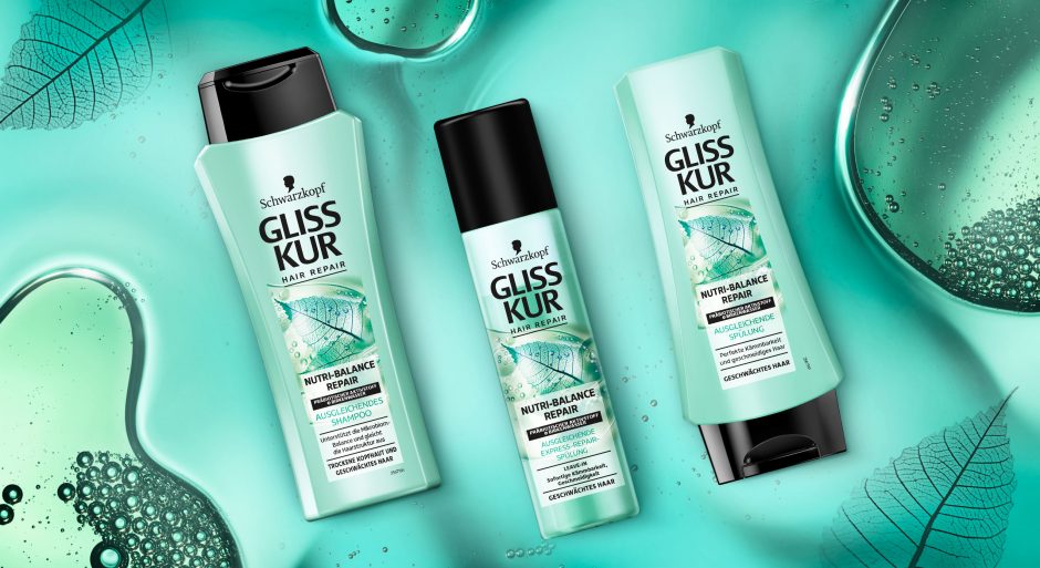
Schwarzkopf Gliss Kur team asked us to develop a label design for their new Gliss Kur subline Nutri-Balance Repair.
New technologies require new designs
The challenge
The task was to develop a label design for the new Gliss Kur sub line Nutri-Balance Repair, which supports the healthy balance of scalp microbiome and laying the foundation for silken smooth hair. These benefits should be transported to the user through the design. Color code and label design need to have a balance of natural appeal and technological performance.
Our work
The current Gliss Kur baseline range shows the performance of the product closed in a box. But new technologies require a new appearance.
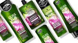
The difference started already with Bio-Tech Restore. Product name and main formula components are communicated above the box.
On the other hand, performance and hair type recommendation are located in the lower part. As a result, this clear straightforward structure ensures that the consumer is informed about the differences at first glance. But it leaves little room for emotionality and naturalness. Most importantly, the visual now shows not only the performance, but also the effective ingredients.
Back to Nutri-Balance Repair:
The amorphous, authentic form of the liquid correlates with the representation of the birch leaf. Therefore, it appears as if it had been photographed with an X-ray machine. Most importantly, we were able to combine the natural ingredients and the technology contained in the formula in one image. As a result, we could explain them to the consumer at a glance. The apparent translucency of the visual and the white box make the text stand out. So, it provides clear explanatory information. The soft turquoise shade with a hint of blue generates a pleasantly caring feeling. Consequently, it highlights the silicone- and colorant-free composition.
This label design of Gliss Kur Nutri-Balance Repair follows on seamlessly from that of Gliss Kur Bio-Tech Restore. It is the first new product of the range that combines science with naturalness and whose design also originates from baries design.
Schwarzkopf Gliss Kur Nurti-Balace Repair on the web: click here
Have a look on our other hair care packaging designs
Technology evolves with the Power of Nature
Gliss Kur by Schwarzkopf is well-known for longstanding expertise in hair technology. Nevertheless, natural ingredients play a big role in performing formulas. With the new Gliss Kur Bio-Tech Restore Schwarzkopf didn‘t only offer a new formula that combines both. Instead, together we also set a new focus on design. A visual breakthrough of the power of nature in technology!
Challenge
- Visualize the biological Phyto-Stem Cell Complex and Rose Water
- Set a new focus on the power of nature in technology
- Keep the brand identity recognizable
Our work
We have worked with Gliss Kur for over a decade. Following, we were excited about this new natural-technological approach and an innovative design for the new sub line Bio-Tech Restore!
„The Power of Nature“ – Visual
Our focus during the project was the visualization of the natural ingredients.
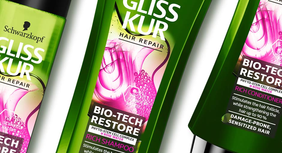
Starting with the rose water, we developed a new way of showing the traditional flower in a technological context. We visually used the X-Ray machine technology to show the rose blossom in a very detailed and enlightened cross-section. With this ambivalence between represented element and presentation style we mastered the challenge to unite natural ingredient with Gliss Kur’s technology approach. To stress the biological appearance, the flower is embedded in a liquid, which shape is amorphous and organic. Inside, Phyto-Stem Cells are showed with additional small pink liquid bubbles.
Besides, the communication is empowered with a new on top icon, that is claiming “The Power of Nature“. We designed a decent, graphic frame with a chemical form language that leaves open space for the visual.

The Power of Color
The color contrast between pink and green catches attention and enhances the natural impact. The specific green color tone distinguishes from classic organic products on the market and refers to the technological aspect. It also gives a more premium appeal.
The Power of innovative Design
All in all, the visual is the new main actor on the pack. Unlike previous Gliss Kur packaging designs, which show the technological visuals enclosed in a box. Now, a square is used for the text, whereas the visual is unboxed. The new text background ensures easy and structured readability. However, the light transparency leaves still room for the visual. The ingredients get particularly more space to catch attention with the innovative composition and colorful implementation of naturalness in technology.
Gliss Kur Bio-Tech Restore on the web
See more hair care packaging designs
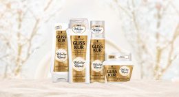
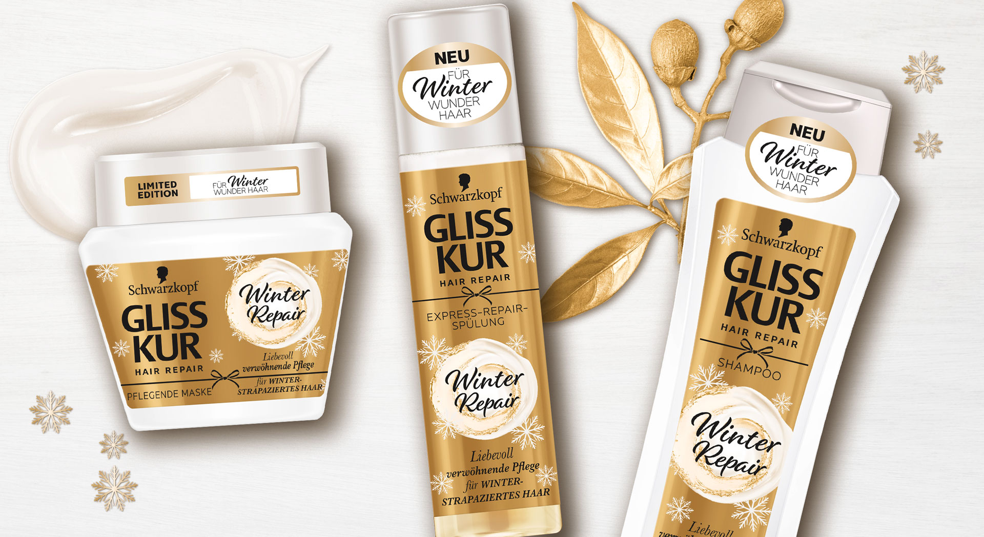
Gliss Kur Winter Repair Packaging Design Relaunch
Briefing
The packaging design relaunch for these wonderful Gliss Kur Winter Repair hair care products from Schwarzkopf should communicate
the caring and repairing properties of the formula inside. It should create a smooth and cozy feeling as well as it should
reflect the high-quality ingredients.
Our Work
We designed labels with golden foil which represents the rich and nourishing ingredients. The light and creamy key visual pops out to be recognized easily as caring element.
The visual shows an oil-enriched creamy swirl so the consumer can see how the hair care will treat their hair. All over the label awake detailed snowflakes this unique heart-warming winterliy feeling, that we all love to have on a sunny day after snowfall.
Schwarzkopf in the web: click here
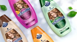
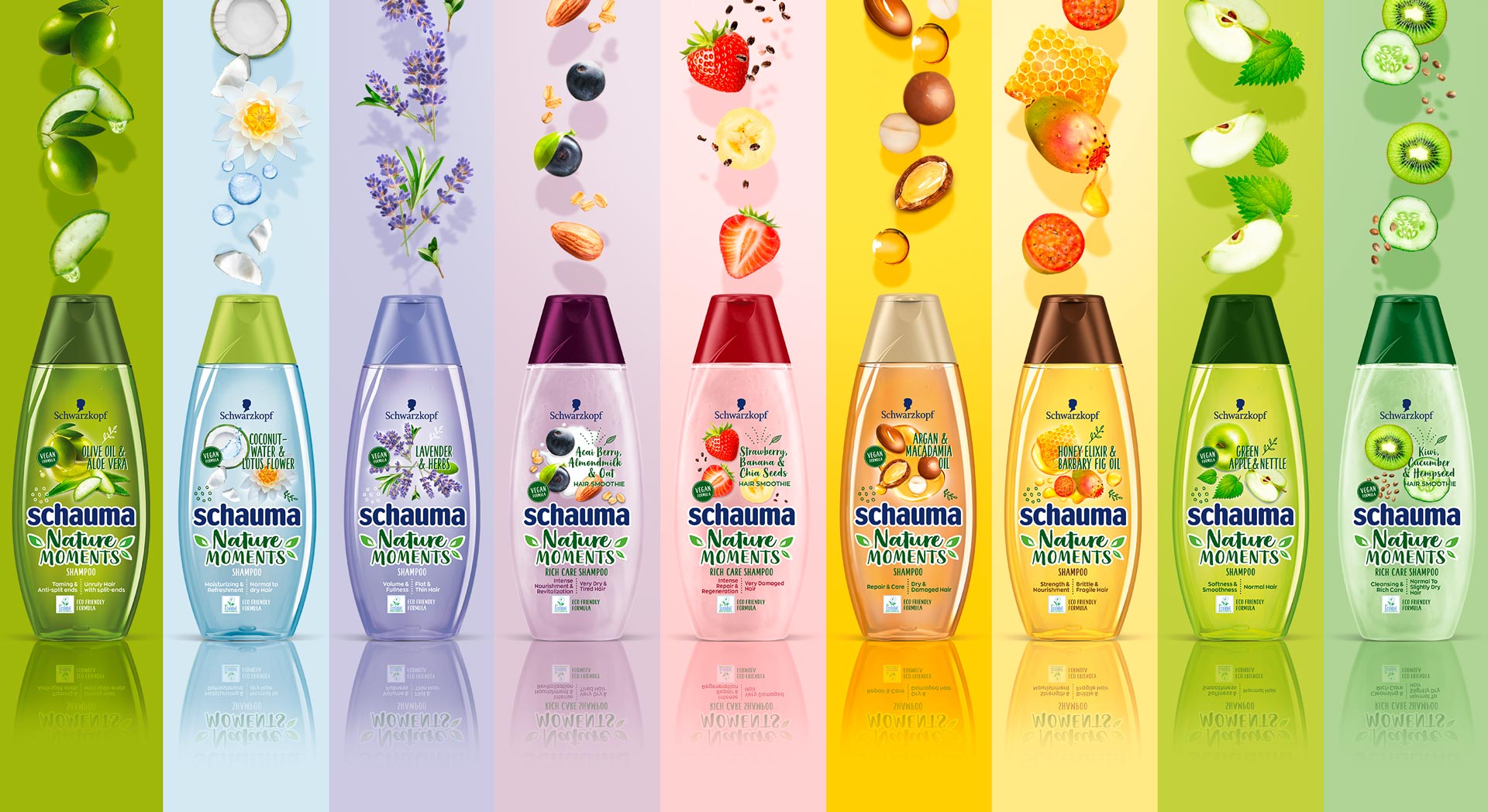
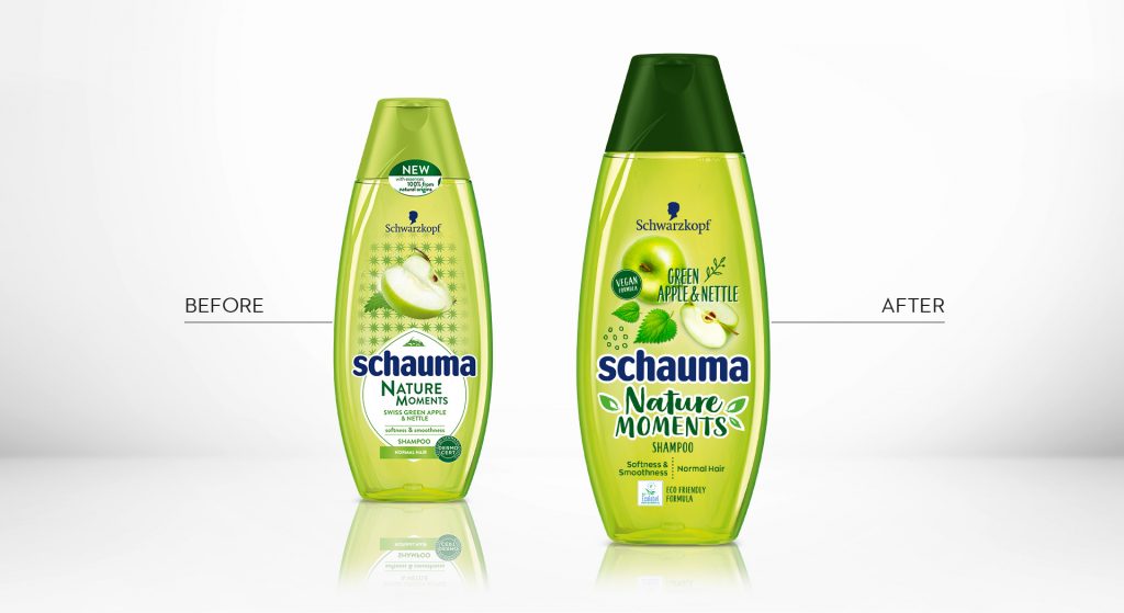
In 2019, Schwarzkopf relaunched the packaging design of it‘s natural shampoo subline „Schauma Nature Moments“. Furthermore, they not only relaunched, but got the eco-label on top! Additionally, they added new ingredient variants and the „Nature Moments Hair Smoothies“ subline was implemented into the portfolio.
Briefing
Because natural ingredients are continously on the run, they stay relevant for the thoughtful consumer. Though, those who care for naturality are now also seeking for more environmental responsibility. Following, the already trusted line „Nature Moments“ needed to be updated to stay relevant and to attract even more responsible consumer to the brand.
– Enhance the natural appeal of Nature Moments
– Modernize visuals to show appealing and gentle natural ingredients
– Communicate environmental responsibility
– Integrate the new eco-label
Our Work
We created an appealing packaging design, that has a strong stopping power and is very playful and designed openly.
The design is focusing on the natural ingredients. Therefore, those are displayed in a modern and dynamic way.
Inspired by food bowls, because they are very appealing to the conciuos consumer, the ingredients are shown in a top view.
So, we catched up with the latest food trend and used the insights in the beauty sector.
Moreover, the open design on the transparent label increases the effect of the transparency of the bottle.
So, this is giving contrast to the Schauma baseline, which is now visually clearly seperated.
Not only by the transparency, rather, because of the emotional focus on the ingredients.
Furthermore, additionally to the new design of the ingredients, we did also add illustrations, so that empower the playfulness.
Finally, we need to find a good way to integrated the eco-label icon.
Even more, the modern typo does help us to enhance the fresh concept.
Especially, the subline „Hair Smoothies“ by Nature Moments is refined by a typo and that gives us a „yummie“ feeling.
Logo Development
The new brand name got a modern and technological font with natural look & feel.


Schauma Nature Moments in the web: click here


