Category: skin care
Truly Care – a zero waste face mask
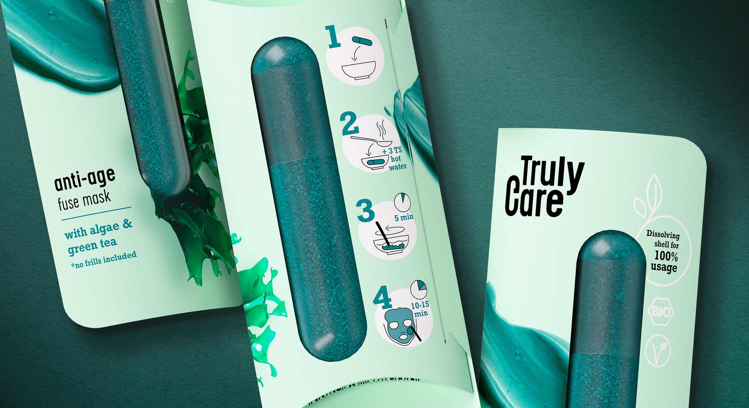
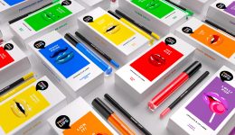
In our day-to-day work as packaging designers we notice that single treatment products, such as face masks, are often also sold in single-use plastic packaging. While single treatments are convenient for many consumers, single-use packaging means a burden on the environment. Therefore we challenged ourselves and designed Truly Care – a sustainable single treatment and zero waste face mask. Truly Care was designed to create as little waste as possible. The packaging consists of a paper wrap and a capsule that contains face mask powder. The paper can be returned to its recycling cycle because we paid attention to not using hot foils or any other finishing that would exclude the paper from its recycling cycle and make the packaging more expensive. The capsule itself is vegan and made of agar-agar – the same material used for nutritional supplement capsules.
Truly Care is developed by siids, the baries innovation hub.
The capsule contains the face mask powder which must be merged with water before application. By pouring hot water over the capsule, the shell dissolves. The powder can then be mixed with the water and the dissolved shell so that the mask can be applied. To support sustainability and to create a healthy product, the amount of ingredients is kept very low. The anti-age fuse mask consists of algae powder (spirulina) and green tea leaves. The calming fuse mask contains concentrated pomegranate powder and clay. The cleansing fuse scrub is made of coffee and charcoal.
No additional microplastics, chemical dyes or any other chemical agents are included. Truly Care is organic and vegan and the face mask can be flushed away without any concern.
The motto of Truly Care, “no frills included”, does not only refer to the ingredients but also to the product itself. The packaging material was kept as minimalistic and pure as possible. Furthermore the visual appearance of Truly Care speaks a clear and straightforward design language. The paper wrap only shows the main ingredient and the texture of the product to give buyers and consumers an idea of the product. On the back easy, minimalistic icons guide consumers through the user instructions. The product’s sustainability and organic ingredients are communicated through the “bio” and “vegan” icons. We refrained from using explicit sustainable features, like brown paper, because we believe that these days it is one’s duty and it goes without saying to design any product as sustainable as possible. This should not only be communicated to a sustainable target group because we want everyone to use and see it.
„Truly Care“ tells what the product does: It’s an honest and genuine caring product for your skin. Hence we chose a minimalistic but sturdy font to represent the products’ features. The omission of serifs underlines the „no frills included“ motto because a striking and detailed font would not represent the raw pureness and strength of this product. The „c“ in the logo was extended by a little line which, combined with the letter C, represents the shape of the Truly Care face mask capsule.
Discover more siids projects!
On the constant look-out for new challenges we have the demand to push ourselves and to be creative. With our innovation hub siids we now bring our brave ideas to life and invite you to be part of it.
The BeautyLove skin care line for e-commerce beauty boxes
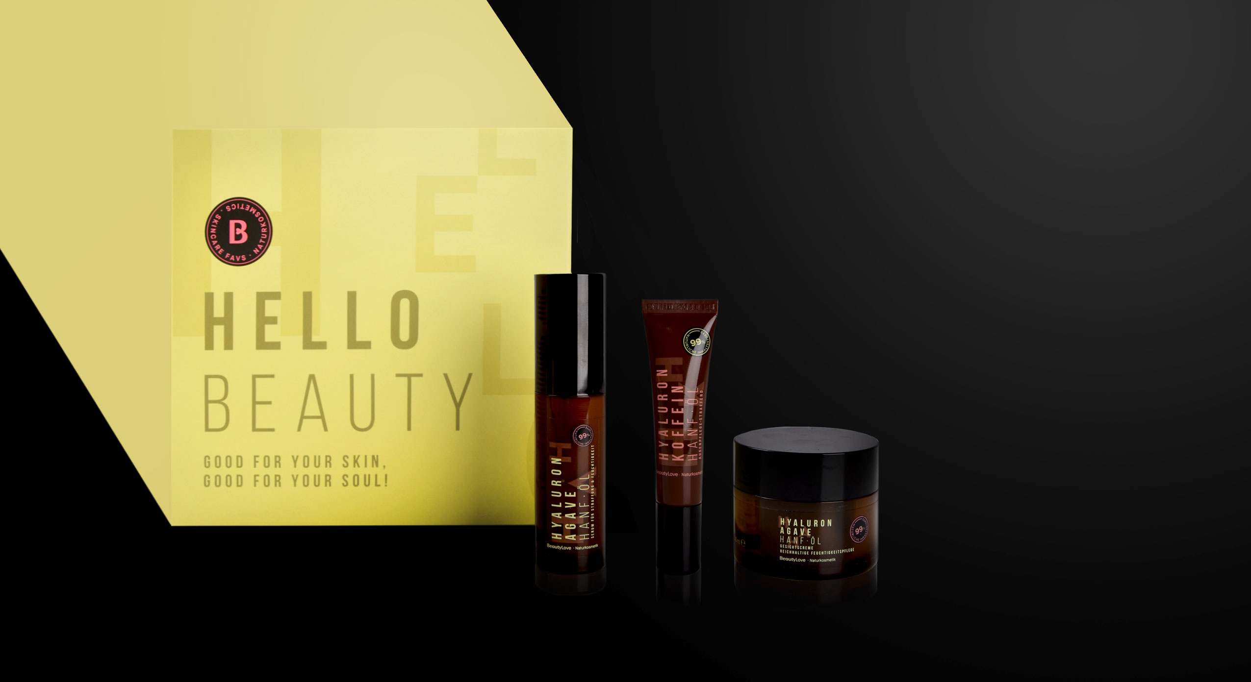
In 2022 BeautyLove, an online shop for beauty lovers and beautybox fans, launched a new natural cosmetics skin care line. BeautyLove stands for eco-friendly cosmetics and packaging. Thus 99% of all ingredients used are natural and all products are NATURE certified.
For the first time, The OrganicLabs of BeautyLove has developed natural cosmetics together with Beauty lovers in the network. Together with the community three natural cosmetic products were developed, featuring power ingredients such as hemp oil, hyaluronic acid, agave & organic caffeine.
The design follows a typographic approach to achieve an expressive avant-garde look that appeals to the younger target group and GenZ. For the design of the product range we used pastel colours and warm colour codes that are usual stylistic elements of natural cosmetics. Nevertheless, we deliberately avoided elaborate visualizations of the ingredients. Instead, it was important to combine the natural colours with a large typography that describes the ingredients in an almost graphic way. To leave more room for these design elements, the BeautyLove logo appears more in the background as an „endorser“ on the black bar of the front. The strong contrast between the black colour and the soft pink and green colour tones emphasizes the young and fresh look as well as the premium character.
All in all, the tonality of the products is natural, organic and of high quality as well as performing. The seal supports the claim of being a sensible brand that highly values sustainability. For us it was very exciting to support the brand’s launch of a natural cosmetic product and we are proud to see the product hitting the e-commerce shelf!
Discover our other skin care projects!
Graphic Interpretation of Hygienic Skin Care
In 2020, we developed a new packaging design in the skin care segment for Kascin. The designs for the Acne patches convince with graphic modernity and discreet playfulness. Here it was important to combine the naturalness with the hygienic aspect of the product to create a coherent design.


Our work
We at baries decided to work with reduced and clinical elements, so the medical effect of the product is highlighted. The graphics adapt the look of the respective patches and are a transparent solution. To focus directly on the essentials, the product name is written vertically, which attracts attention. The XL is highlighted by the typographic reference to the visual elements.
Through the graphic elements and the reduction, the packaging radiates a modern and simple look. The individual products are color-coded, and here we decided on cool tones. Especially the main color white arouses confidence.
In summary, there is a good mix between the clarity in the typography and the playfulness of the graphic elements. We developed a new concept for a packaging design which can be used for other Kascin products in the future.
Maybe you are interested in more great packaging designs made by baries design:
Puristic pharmacy skin care with the power of nature
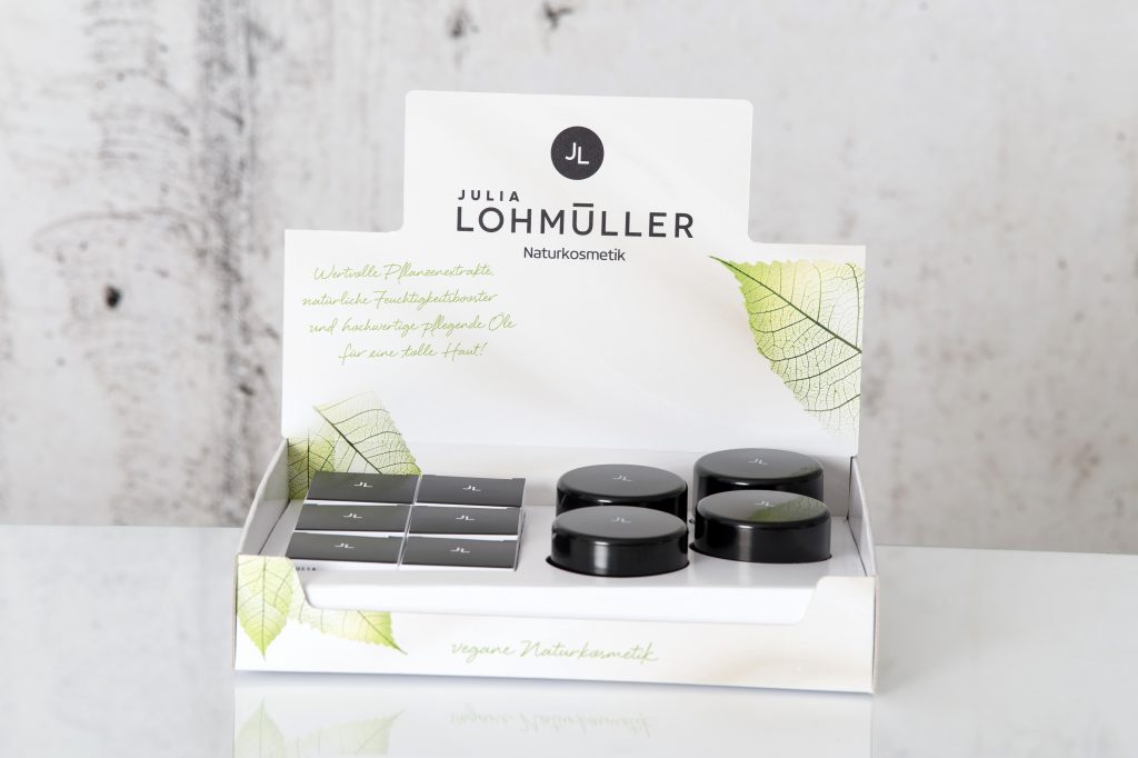
This new natural cosmetics line was strategically developed and created by baries design in 2019 and is aimed at the pharmacy segment. The brand name Julia Lohmüller is the name of the owner of the „Industrial – Pharmacy“. This pharmacy has been in Essen for many years and has existed for over two generations. Since from the consumer point of view natural cosmetics are very popular nowadays, she decides to create under her personal name her own line of cosmetics with the power of nature without any additives. Bearing this in mind, Julia Lohmüller tasked us with the design work for her skin care products, which also forms the basis for further product lines.


Our work
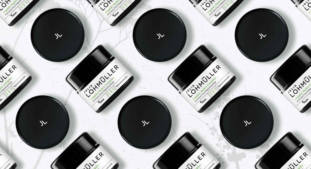
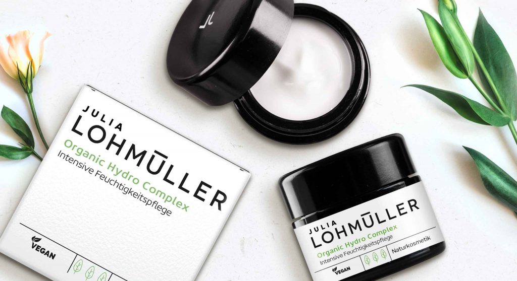
Developing an intense moisturizer for the day. For this, the idea of pharmacy and natural cosmetics should be conceptually integrated into both packaging and logo design. Additionally, the product should appear puristic and authentic and suggest the pure power of nature without any additives.
Logo development
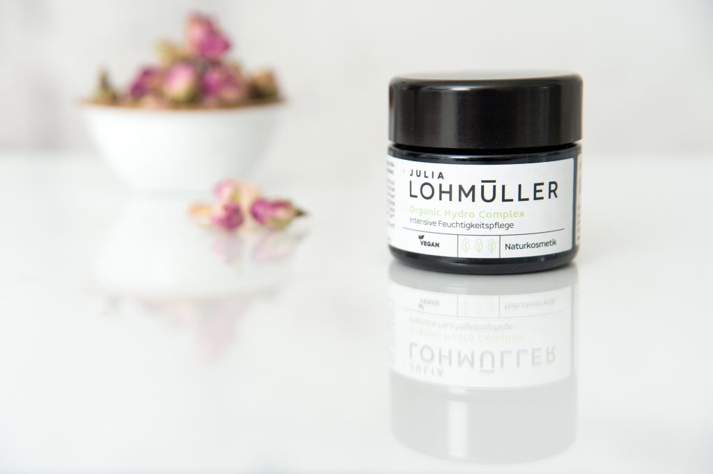
The new brand logo impresses with its modern and uncomplicated typography. It is the focus of the design and covers almost 2/3 of the design space. Through this, effectiveness and authenticity is conveyed by the logo, which also reflects the performance of Julia Lohmüller’s know-how.
Julia Lohmüller natural skin cosmetic on the web
Maybe you are interested in more skin care packaging designs made by baries design:
Always looking for the latest trends in design and lifestyle, it is our goal to offer the customer the perfect product. In internal baries projects we bring our own ideas to life to constantly develop and promote our creative potential.
NOX – cleansing & care mask series for the night
In 2020 baries developed and designed a new cosmetic line, targeting the luxury segment. NOX is a luxurious natural skin care brand, that focuses on clean and natural ingredients.
Our design work
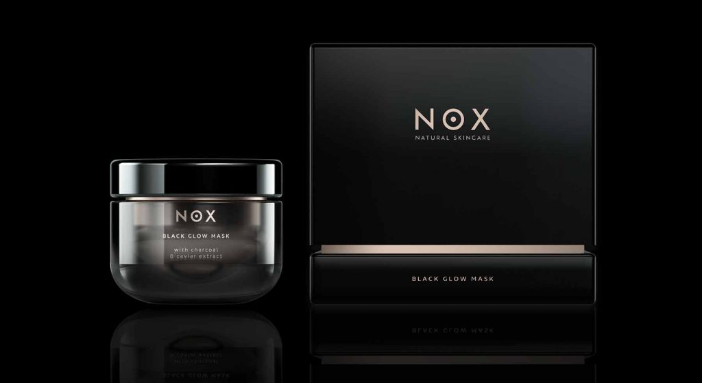
This cosmetic cleansing series is made especially for night care. Therefore, the theme of the night should be taken up conceptually in the packaging design as well as in the logo design. Additionally, the product should radiate a mysterious, luxurious aura and helps the user to achieve a divine like complexion overnight. So, we decided to choose a high-quality glass jar, which is coated with a black lustrous lacquer. On the inside it has a golden finish and on the outside a combination of various transparent varnishes. In other words, the jar design itself serves to visually translate the night theme. Above all, the gold inside stands for the divine beauty — the divine elixir. We want to match valuable natural ingredients with an iconic design. In conclusion, this product line got its own identity to stand out in the selective market.
SKIN OF A GODDESS –
This guiding principle embodies the demand for this luxurious, natural skin care range.
Ingredients and recipe
There are three signature masks with three different ingredient collections:
- raw cacao extract & seaweed oil with charcoal
- caviar extract & charcoal
- truffle oil & charcoal
Logo design
NOX (Latin “night“) is in the Roman mythology the goddess and personification of the night. Therefore, it serves perfectly as name for these high-quality black masks.
Consequently, the new brand name needs to have a modern and technological approach with natural look & feel. So, the logo is characterized by a simple typography, which is clear and sans-serif.
Moreover, the dot in the middle of the O gives the logo a strong recognition value and can also be used as an icon.

©2020 baries design GmbH. All rights reserved.
See more of our innovative skin care packaging designs


