Projects
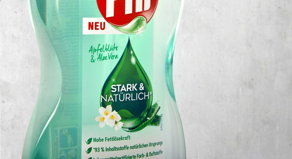
The new design for Pril Strong & Natural convinces with a pure look
Pril is one of the great traditional brands in Germany when it comes to performance and trust. Hence it’s all the more important for the brand to create a product line for its loyal consumers that meets the challenges in terms of sustainability and naturalness without sacrificing any of its renowned reliability. With our new design we have supported Pril on its path to a new naturalness.
The green drop for natural power
To combine naturalness with performance and communicate clearly to consumers, we have kept the drop as an iconic element. It conveys the cleaning power that distinguishes Pril products, while simultaneously communicating purity and naturalness through its green colour and the subtle integration of the fragrance. To emphasise these features, the Pril logo was also adapted by colouring the drop.
The refill pouch saves up to 70% plastic and thus marks a right step towards greater sustainability in the household. The illustration of the pump dispenser design on the pouch offers particularly easy orientation for consumers at the shelf. The shape of the bottles forms a transparent window which, just like the real bottle, conveys the naturalness and purity of the product. Additionally the design features a large disruptive element to show the advantages of the refill pouch at one glance.
It was very exciting to join a big traditional brand like Pril on its way to greater sustainability. The development of its corresponding refill pouch was a matter close to our hearts. It makes saving plastic so easy for consumers!


