Tag: branding
With Hatice Schmidt LaBS we created a whole new Hatice Schmidt cosmetic brand identity including logo development, packaging and website design.
Visionary brand building
Challenge
We were asked to develop a logo and corporate identity for the new cosmetic brand Hatice Schmidt LaBS, which both should transport diversity and expertise of Hatice Schmidt herself. We had also the pleasure to create the packaging design of the first two eyeshadow palettes HOLY and DAY. The appearance of packaging should have a high-class look but at the same time integrate a character of an urban grunge style.
Background
Hatice Schmidt, one of the most famous German Beauty YouTuber, describes herself as rough and edgy. Grown up in Berlin Neukölln – a very hard neighborhood – she learned to assert herself early. Her new brand Hatice Schmidt LaBS should therefore reflect her strength and independence as well as her experiences. The cosmetic product standards are very high, as she has been testing and evaluating them for almost a decade.
Her indie brand in the high-end segment is to establish itself in the cosmetics market and provide competition in the premium segment with high-quality formulations and unusual packaging designs.
Logo development
For the logo of Hatice Schmidt LaBS, we perfectly combine urban grunge with high quality. Therfore, one of the most modern fonts was overlaid in a staggered manner. As a result, the luxurious appearance is disturbed by the distortion in a way that suggests the origin of Hatice Schmidt.
Packaging design
The HOLY eyeshadow palette includes colors that are perfectly suited to special occasions and the DAY palette includes colors for everyday make-up. Based on urban grunge style, we have designed the lettering of the eye shadow packagings Holy and Day in graffiti look. The high quality of the products is reflected in the varnish.
Website design
New cosmetic products need a new website. Therfore, we designed the surface for the web shop for the products of Hatice Schmidt LaBS. In the near future it should be extended by further products and constantly updated with new content. Strategically we designed a concept that allows intuitive operation and clearly highlights the products for the user. Implementation of the visual presentation and managing the communication and coordination with the IT service provider on top. Last butnnot least, we produced animations of the logo and short video clips for social media content.


In december 2018 Douglas launched the Beauty Packaging Design for Amber Valletta Capsule Collection in collaboration with model and actress Amber Valletta. We are very proud of our cool but simultaneously high-quality looking packaging design with the organically flowing all-over-embossings.
The Amber Valletta Capsule Collection was born!
Briefing
We got a very detailed and extensive design briefing. This project was a great chance to show our competence in all-round care service: consultation, conception, logo and packaging design and finally implementation.
Douglas wants to enrich its portfolio with a new premium brand. Therfore, a high quality packaging with comfortable textures and wearable shades were requested.
Moreover, the design should transport confidence, timelessness and sophistication. This Beauty Packaging for Amber Valletta is addressed to women who feel confident and want to look perfect on any occasion
Our Work
We loved this task from the beginning. And, this collaboration between Douglas GmbH in and Amber Valletta was more than inspiring.
Beauty Packaging for Amber Valletta
Skin care is mostly connected with rose, white and nude color shades. To achieve the prmiumness, we decided to design the approach in a rosegold look. So, this color supports the quality of the comfortable formulas and let the wearable shades stand for their own. Moreover, we provided the packaging with an flowing and organic all-over embossing. As a result, the consumer will experience an interesting and luxurious haptic. The design needs to work on for the differnt shapes of all five products.
Logo Development
The new brand name should get a personal style. Therfore, we thought about a handwritten character of the logo. The idea waslikes very much. Finally, inspired by Amber Vallettas original signature, the logo font was choosen closely by the original signature. Additionally, the logo is highlighted by the reduced and puristic setted product descriptions. Both, logo and claims were arranged simply black on a clean white box.


Original signature from Amber Valletta and final logodesign
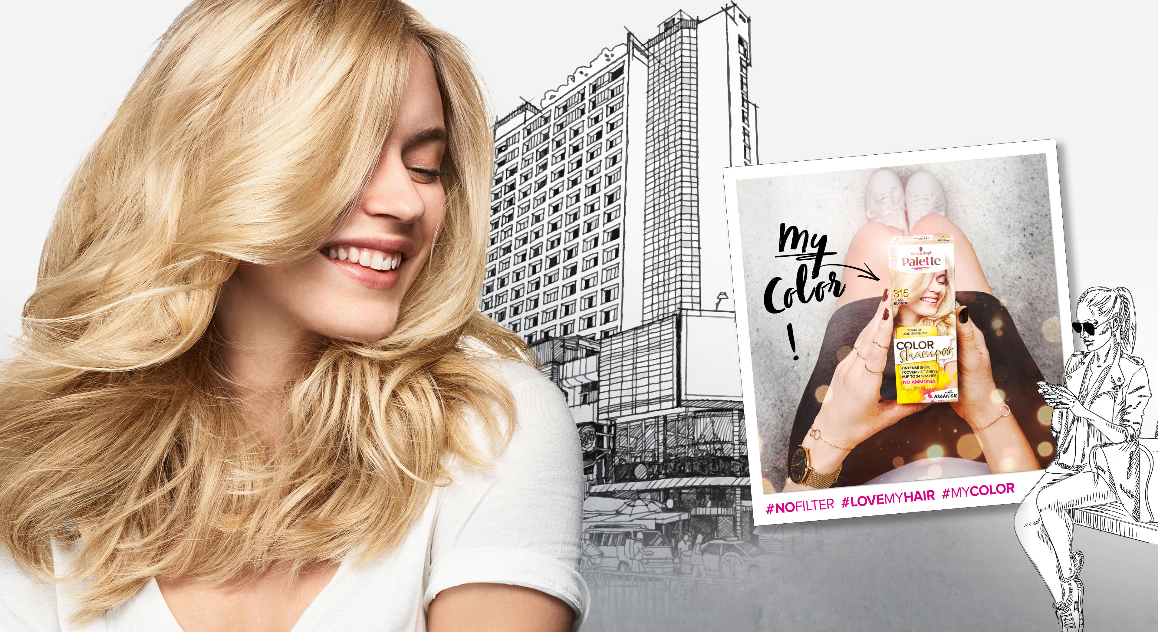
In 2018 Palette relaunched three of it‘s coloration sub brands in one. The new designs create a strong range within the different duration levels with an extra it piece – the metallic spray add-ons.
Briefing
– make the brands younger and more mainstream
– show strong color vibrancy
– increase shelf impact
– transfer easy usage & fun from coloring for especially the low level colors
Our Work
The new overall architecture for the three sub-brands creates an impactful brand block.
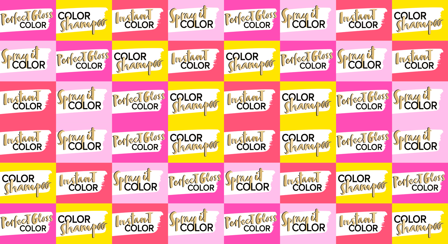
Color brushstroke and color spots playfully stress the vibrant color concept.


Models & Storytelling
Young & playful models are giving the brand a new look. The whole pack surrounding is telling an urban story – supported by in-house taken Insta-Pics at the backsides of each pack.
Logo Development
The newly developed logos unify the brands by the unique look & feel. The brands are united by strong COLOR and differed by the levels of lastingness.
www.schwarzkopf.de/palette-perfect-gloss
www.schwarzkopf.de/palette-color-shampoo


