Tag: design
Urban coolness meets pure design
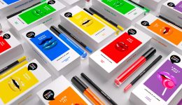
In summer 2021 the indie product brand Hatice Schmidt Labs expands its portfolio with two new products:
a highlighter and a bronzer, available in 4 (highlighter) or 5 (bronzer) different shades.
Just like Hatice Schmidt and her make-up brand, the packaging should represent high quality sophistication and a touch of urban coolness.
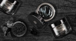
The boxes themselves are pure and simple. They come in white for the highlighter and in black for the bronzer to underline the luxurious character of the products.
To break with the clean simplicity, the embossed black/white logo is used as the only central design element. It represents the modern and edgy twist – the philosophy behind all Hatice Schmidt products.


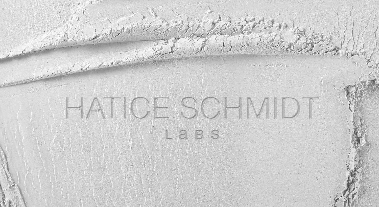
Hatice Schmidt Logo Design, developed by baries design
Discover other projects:
In december 2018 Douglas launched the Beauty Packaging Design for Amber Valletta Capsule Collection in collaboration with model and actress Amber Valletta. We are very proud of our cool but simultaneously high-quality looking packaging design with the organically flowing all-over-embossings.
The Amber Valletta Capsule Collection was born!
Briefing
We got a very detailed and extensive design briefing. This project was a great chance to show our competence in all-round care service: consultation, conception, logo and packaging design and finally implementation.
Douglas wants to enrich its portfolio with a new premium brand. Therfore, a high quality packaging with comfortable textures and wearable shades were requested.
Moreover, the design should transport confidence, timelessness and sophistication. This Beauty Packaging for Amber Valletta is addressed to women who feel confident and want to look perfect on any occasion
Our Work
We loved this task from the beginning. And, this collaboration between Douglas GmbH in and Amber Valletta was more than inspiring.
Beauty Packaging for Amber Valletta
Skin care is mostly connected with rose, white and nude color shades. To achieve the prmiumness, we decided to design the approach in a rosegold look. So, this color supports the quality of the comfortable formulas and let the wearable shades stand for their own. Moreover, we provided the packaging with an flowing and organic all-over embossing. As a result, the consumer will experience an interesting and luxurious haptic. The design needs to work on for the differnt shapes of all five products.
Logo Development
The new brand name should get a personal style. Therfore, we thought about a handwritten character of the logo. The idea waslikes very much. Finally, inspired by Amber Vallettas original signature, the logo font was choosen closely by the original signature. Additionally, the logo is highlighted by the reduced and puristic setted product descriptions. Both, logo and claims were arranged simply black on a clean white box.


Original signature from Amber Valletta and final logodesign
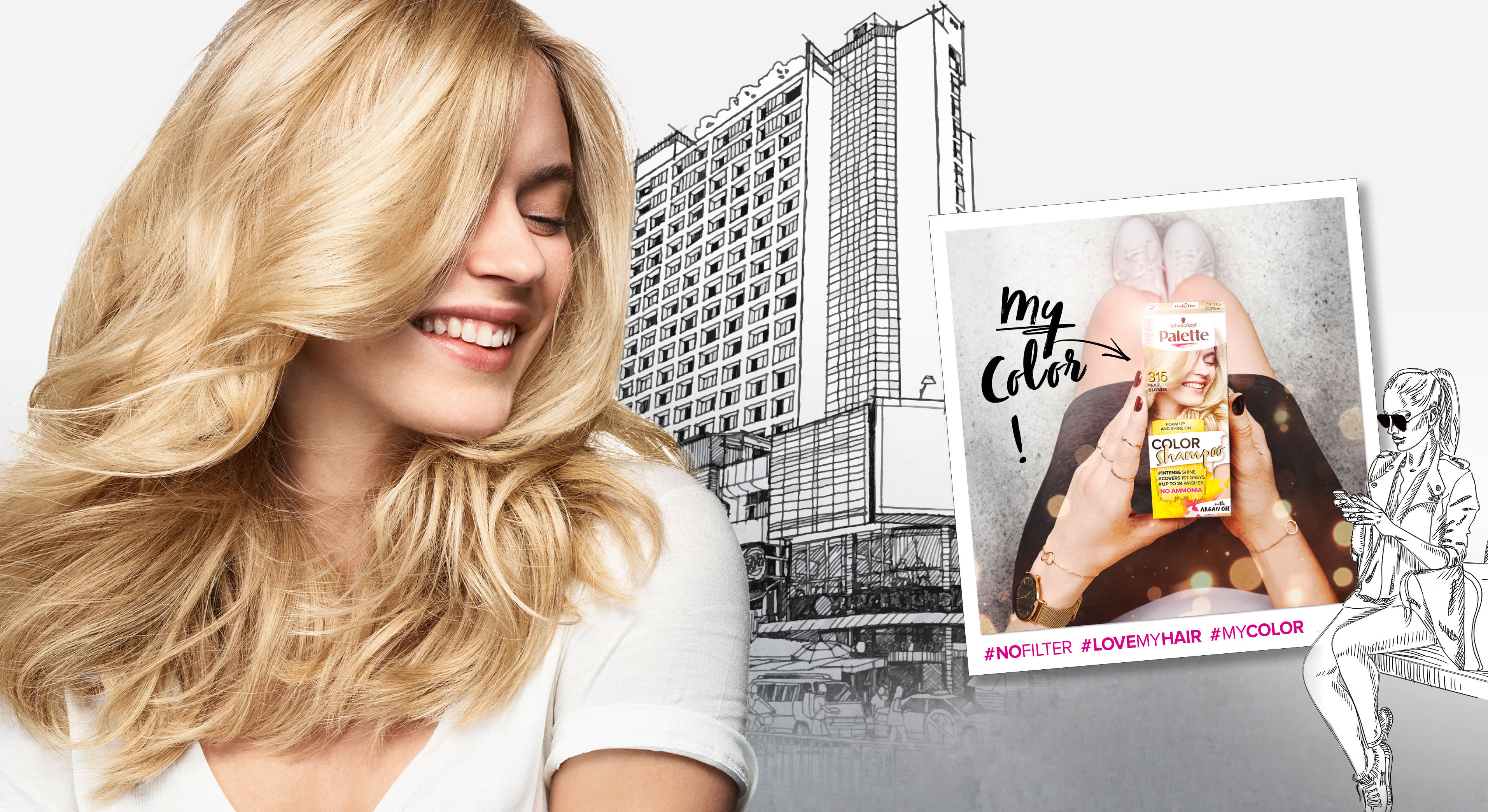
In 2018 Palette relaunched three of it‘s coloration sub brands in one. The new designs create a strong range within the different duration levels with an extra it piece – the metallic spray add-ons.
Briefing
– make the brands younger and more mainstream
– show strong color vibrancy
– increase shelf impact
– transfer easy usage & fun from coloring for especially the low level colors
Our Work
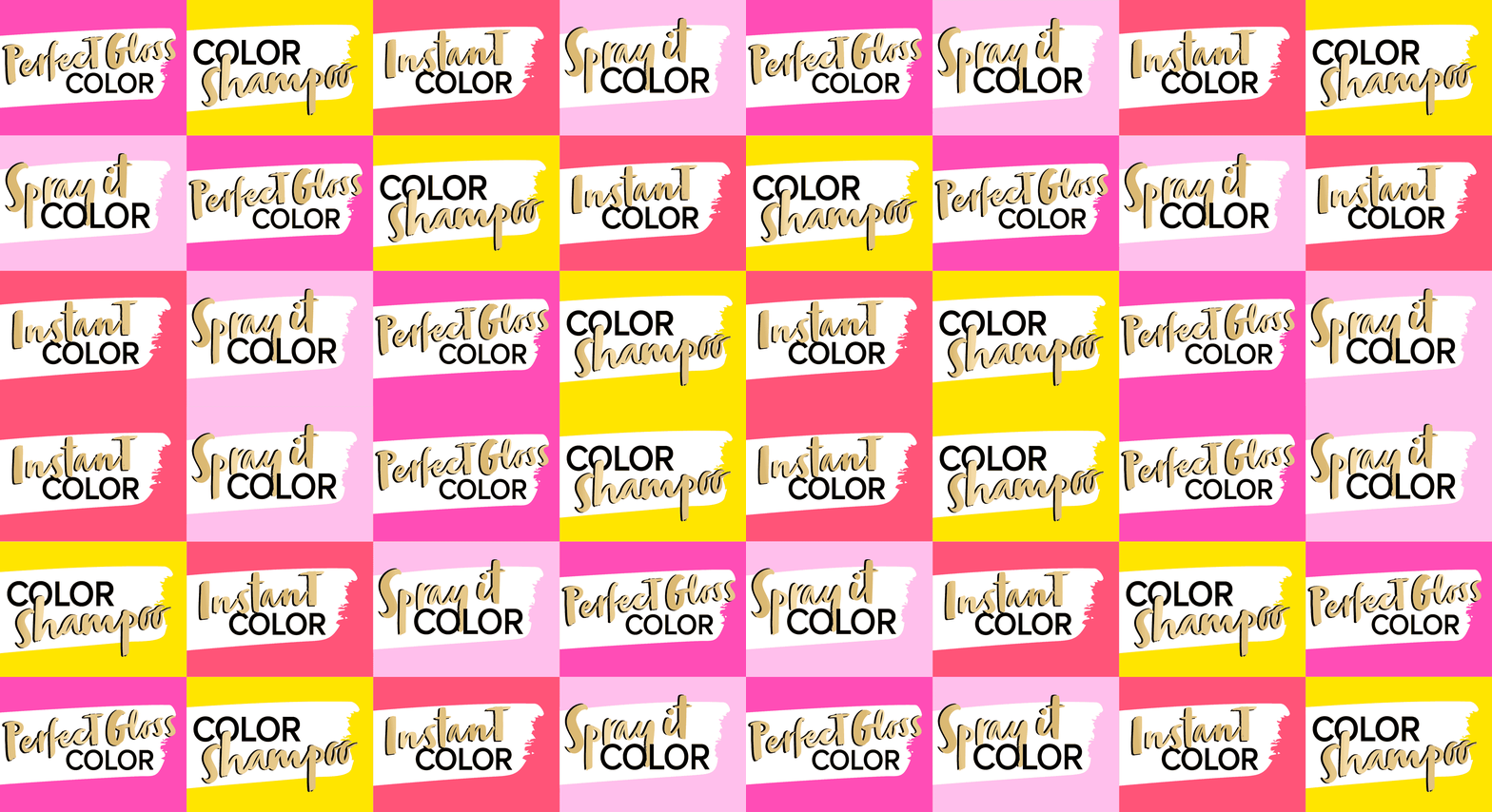
The new overall architecture for the three sub-brands creates an impactful brand block.
Color brushstroke and color spots playfully stress the vibrant color concept.


Models & Storytelling
Young & playful models are giving the brand a new look. The whole pack surrounding is telling an urban story – supported by in-house taken Insta-Pics at the backsides of each pack.
Logo Development
The newly developed logos unify the brands by the unique look & feel. The brands are united by strong COLOR and differed by the levels of lastingness.
www.schwarzkopf.de/palette-perfect-gloss
www.schwarzkopf.de/palette-color-shampoo
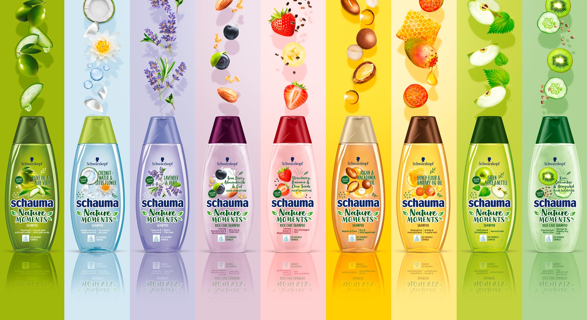
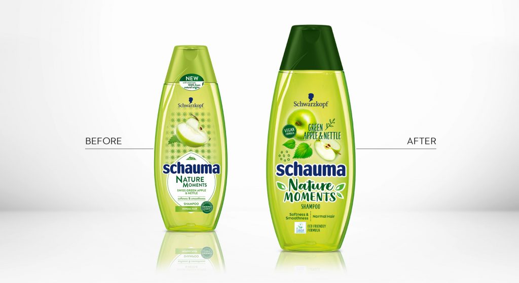
In 2019, Schwarzkopf relaunched the packaging design of it‘s natural shampoo subline „Schauma Nature Moments“. Furthermore, they not only relaunched, but got the eco-label on top! Additionally, they added new ingredient variants and the „Nature Moments Hair Smoothies“ subline was implemented into the portfolio.
Briefing
Because natural ingredients are continously on the run, they stay relevant for the thoughtful consumer. Though, those who care for naturality are now also seeking for more environmental responsibility. Following, the already trusted line „Nature Moments“ needed to be updated to stay relevant and to attract even more responsible consumer to the brand.
– Enhance the natural appeal of Nature Moments
– Modernize visuals to show appealing and gentle natural ingredients
– Communicate environmental responsibility
– Integrate the new eco-label
Our Work
We created an appealing packaging design, that has a strong stopping power and is very playful and designed openly.
The design is focusing on the natural ingredients. Therefore, those are displayed in a modern and dynamic way.
Inspired by food bowls, because they are very appealing to the conciuos consumer, the ingredients are shown in a top view.
So, we catched up with the latest food trend and used the insights in the beauty sector.
Moreover, the open design on the transparent label increases the effect of the transparency of the bottle.
So, this is giving contrast to the Schauma baseline, which is now visually clearly seperated.
Not only by the transparency, rather, because of the emotional focus on the ingredients.
Furthermore, additionally to the new design of the ingredients, we did also add illustrations, so that empower the playfulness.
Finally, we need to find a good way to integrated the eco-label icon.
Even more, the modern typo does help us to enhance the fresh concept.
Especially, the subline „Hair Smoothies“ by Nature Moments is refined by a typo and that gives us a „yummie“ feeling.
Logo Development
The new brand name got a modern and technological font with natural look & feel.


Schauma Nature Moments in the web: click here
After we designed the relaunch for Schauma baseline in 2018 for our long-term client Schwarzkopf, we now developed the packaging design for Schaumas Limited Edition „Scentsational Fragrance“ in 2019.
Briefing
We were asked to develop a diverse and playful design concept to complement the new baseline design.
The new limited edition should create a visually emotional scent experience and follow the market trends with a catchy, bold and colorful packaging design.
Our Work
Focusing on the fragrance notes, we chose an illustration style, that gives consumers the eye-catching scent experience, that Schauma has asked for. Colors and contrasts within the visuals were key to be as eye-catching as the shampoo shelf requires. Surely, the key elements, that we had developed within the Schauma relaunch stayed. Such as the round effect foil and newly centered information. It was very clear from the beginning on, that what we needed to do was exchanging the model as a key visual with the ingredients and make those the main actor. Also, we added the range name and the fragrance name in a playful typo to catch the new consumers‘ attention. On top of the new key visuals, we added some lovable illustrated outlines at the bottom of the label for the extra emotional kick.


Sieh dir diesen Beitrag auf Instagram an
Ein Beitrag geteilt von Schwarzkopf International (@schwarzkopf) am


