Tag: etiketten druck
We are happy to introduce a new packaging design by Baries Design.
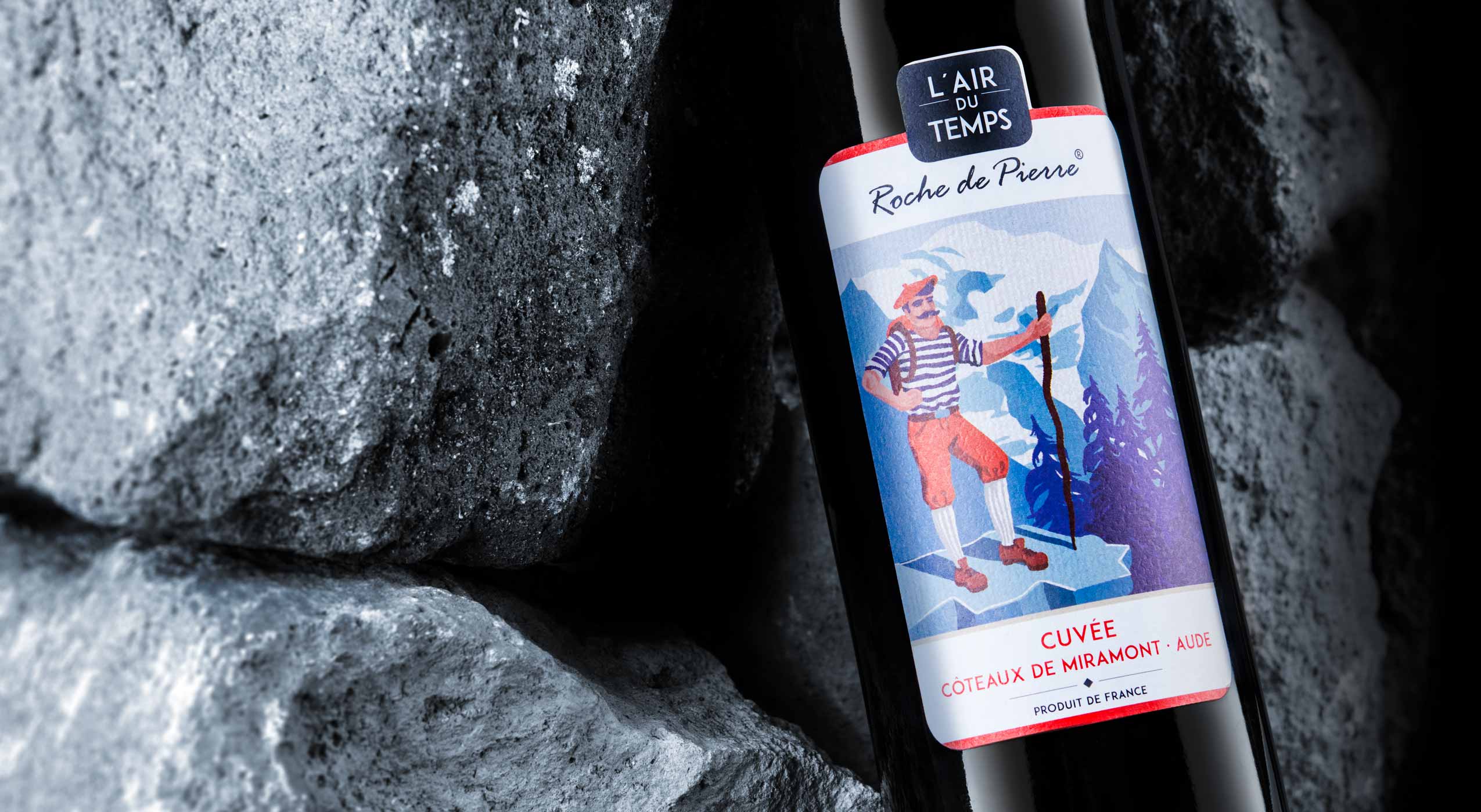
The label design of this french cuveé wine was created in collaboration with Pieroth Wine Company. The range includes 10 wines of different couleurs. An approachable, modern and likeable brand image should be communicated, beyond the conventional rigor of classic „chateau“ wines.
A certain french mediterranean lightness combined with a kind of belle epoque feeling should create an visually inviting and re-experienceable approach.

L´air du temps product range abstract. The whole range consists of ten white, red and rosé wines

A red wine bottle with label design by B.aries Design Agency Duesseldorf is lying on several rocks.
We created situations, characters and moods that communicate the character of the wine itself. Even more they stimulate an aesthetic desire to try. The successful union of lightness and value.
L´air du temps in the web: click here
The label design should consciously break with traditional wine labels.
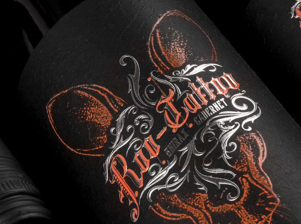
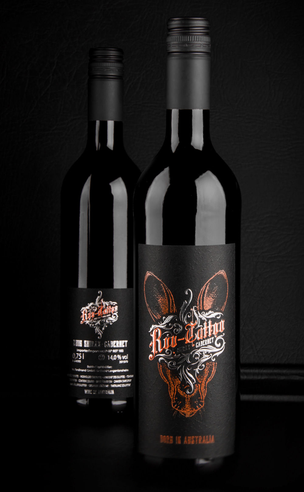
It should show the kangaroo as the national symbol of Australia in an independent way.
Tattoos represent a young and rebellious lifestyle. The new wine name „Roo Tattoo“ is a phonetically memorable use („Roo“ is Australian slang for „Kangaroo“).
It was important to ensure that the kangaroo does not look lovely or even cute, but wild and original. This could be abstracted and any style parallels with known brands or representants of Australia should be avoided.
The design language should be rough and unpolished like the australian outback.
The wine itself: Red wine (Shiraz / Cabernet) with a typical high alcohol content for australian wines. Ideally, the wine is not too finely grained, but retains a touch of something raw originality.

Closeup of the Roo-Tattoo wine label by B.aries Design for Pieroth Wine Company 2018
What’s Unique?
Its a cool australian red wine for young men to explore a new target group for the customer. Its a red wine for tough young men who like tattoos, rock music and an independent lifestyle. In this context the label design and black structured paper generates a new look and feel of a mainly masculine red wine.

New Roo-Tattoo wines by B.aries Design for Pieroth Wine Company 2018
Creative Agency: B.aries Design GmbH
Project Type: Produced, Commercial Work
Client: Pieroth Wine Company
Packaging Contents: Red wine
Packaging Substrate / Materials: Glass bottle
Printing Process: Screen-printing, Foil stamping, Embossed structured black paper
Roo-Tattoo online: click here
Roo-Tattoo press: click here
BenFit Nutrition packaging design. The new revolutionary protein bread from Benfit is in the market! Benfit is a start-up company from Düsseldorf.
Nutritionist and fitness coach Ben produces white bread with a high protein content which is low in fat, without preservatives and without added sugar – and it tastes great too!
For a conscious low carbohydrate nutrition. FIT BY HIGH PROTEIN.


