Tag: Fa
Pushing the boundaries for Fa by creating disruptive packaging design for their Feel Good Vibes product line. For the good emotional packaging concept we were encouraged to think outside the box. So, we were able to create a design beyond the FA design limits.
Our work
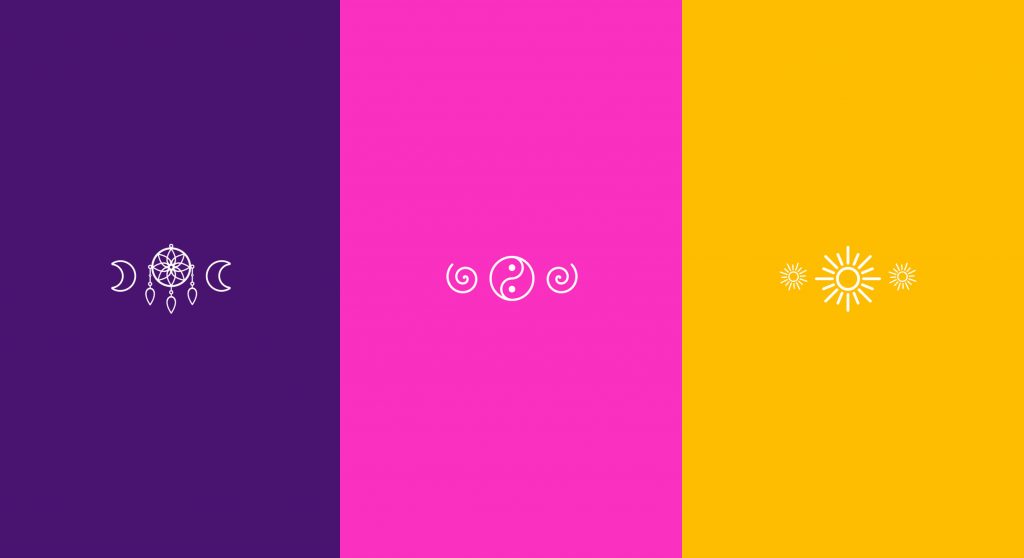
Three products should evoke different feelings for the consumer: Catch Dreams, GET Spiritual and GO Happy. The designs should create a wow-effect for millennials for whom self-awareness plays a key role in their lives. Improving their mental well-being to escape from daily stress is an ever increasing desire of that generation. Therefore, emotions are an important aspect when it comes to beauty purchases:
The ultimate key for the packaging design of the young and trendy project by Fa is to evoke a positive emotion for millennials. Those are evolving around happiness, mindfulness, positivity and spirituality. Our aim was to invite the consumer into a world full of empathy where they can forget everyday life for a few moments.

Creating a good emotional packaging design by using colour, wording, typo and symbols as key design elements
In order to create the positive feelings matching each product line, we started by defining a complementary colour code and visual world:
The dream catcher lifts you into a “feel good mood” with a calming visual of the milky way and colours reflecting soothing nights. To get spiritual on the other hand, a light magenta was chosen which stands for spirituality and female positive energy.
Furthermore, the appearance of the product line Go Happy gives rise to an uplifting mood. This is achieved through positive colours alluding to summer, beach and the ocean – positive vibes and happiness guaranteed.
A highlight for the product lines GET Spiritual and GO Happy, which come in transparent bottles, is an extra feature on the back-label. There, the statements “find your inner peace” and “happy mind happy life” are prominent text blocks stretching over the entire back-label that are visible through the bottles. This allows strengthening the emotional story-telling, while creating a positive feeling.
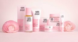
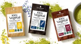
Maybe you are interested in more packaging designs made by baries design:
After we designed the relaunch for Schauma baseline in 2018 for our long-term client Schwarzkopf, we now developed the packaging design for Schaumas Limited Edition „Scentsational Fragrance“ in 2019.
Briefing
We were asked to develop a diverse and playful design concept to complement the new baseline design.
The new limited edition should create a visually emotional scent experience and follow the market trends with a catchy, bold and colorful packaging design.
Our Work
Focusing on the fragrance notes, we chose an illustration style, that gives consumers the eye-catching scent experience, that Schauma has asked for. Colors and contrasts within the visuals were key to be as eye-catching as the shampoo shelf requires. Surely, the key elements, that we had developed within the Schauma relaunch stayed. Such as the round effect foil and newly centered information. It was very clear from the beginning on, that what we needed to do was exchanging the model as a key visual with the ingredients and make those the main actor. Also, we added the range name and the fragrance name in a playful typo to catch the new consumers‘ attention. On top of the new key visuals, we added some lovable illustrated outlines at the bottom of the label for the extra emotional kick.


Sieh dir diesen Beitrag auf Instagram an
Ein Beitrag geteilt von Schwarzkopf International (@schwarzkopf) am
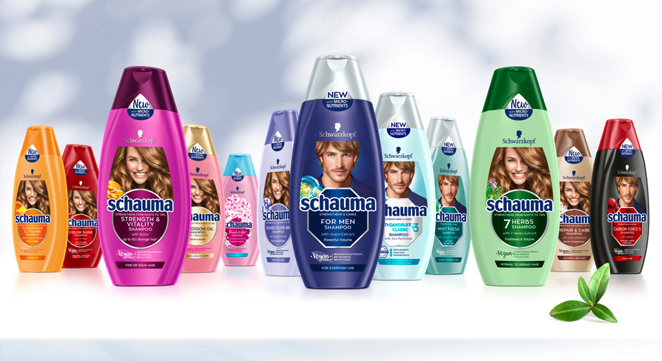
We are proud to show you our work on the Schauma packaging relaunch 2019. The trusted hair care brand has a history of over 80 years and is traditionally providing hair strength and care for the entire family. In 2019 the brand got a new face, developed with baries design.
Briefing
– Rejuvenate to a modern, eye-catching and lovable brand
– Revitalize the traditionally natural concept by stressing natural ingredients, vegan formulas & vitality
– Refine to be more emotional and family-oriented
– Differentiate family member‘s in packaging design (women, men, teens & kids)
– Unify global portfolio of almost 100 SKU‘s but stay colorful
– Strengthen brand impact and enhance flow of information on packaging label
“vegan formulas“ icon – new element in Schauma packaging relaunch 2019
Our Work
Key of Schauma packaging relaunch 2019 is the complete reorganization of the label. Therefore, the innovation of the circle and transformation into the centered design was created. This design step conveys a more emotional appeal and clusters the label information. On top, the circles pop out with colored refinements.
New Model Approach
To keep the brand‘s high recognition value, we kept the traditional model on top. Still, we set a highlight with the new model, that catches attention with her vital, natural smile and hair. Not only is the label reorganized, but we also unified the portfolio by switching individual bottle and cap colors for harmonized look.
Every SKU‘s got it‘s own new, natural ingredient icon to stress the naturalness. In addition, we stressed the natural concept with the „vegan“ icon, that was developed for the Schauma shampoos. Even the sticker on top supports with it‘s unconventional shape, that fits the bottle naturally.


Before and after comparison of the Schauma packaging design
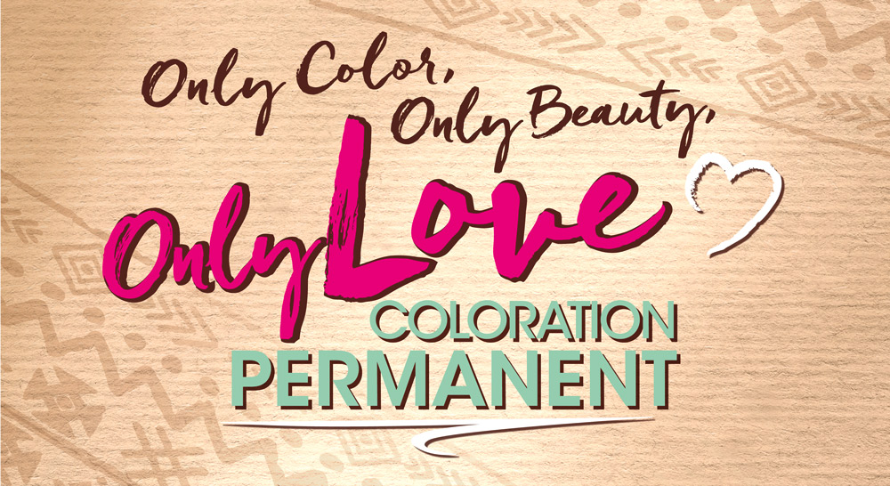
In 2019 Schwarzkopf released the new hair coloration brand „Only Love“.
Briefing
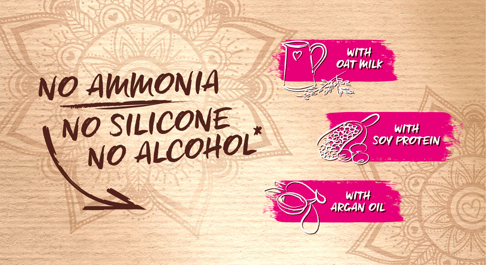
– Create the first Peace & Love Color: Good vibes formula & intense color
– Address the young and diverse target group with expressive, fun & self-confident design – Be bold and revolutionary
Our Work
For Only Love we designed an eye-catching coloration, that is „free – from“ but pops out between the usual ecological packaging. Through the combination of recycling paper carton box with bold, fun colors we created a revolutionary brand for the retail coloration shelf. The journey started with analyzing carton box colors, discussing the „no-model“-approach and working with playful, bold typography. Consumers are seeking for gentleness and trendy intensity. Only Love is both, technologically and design-wise a „hair-volution“.


