

Tag: Henkel

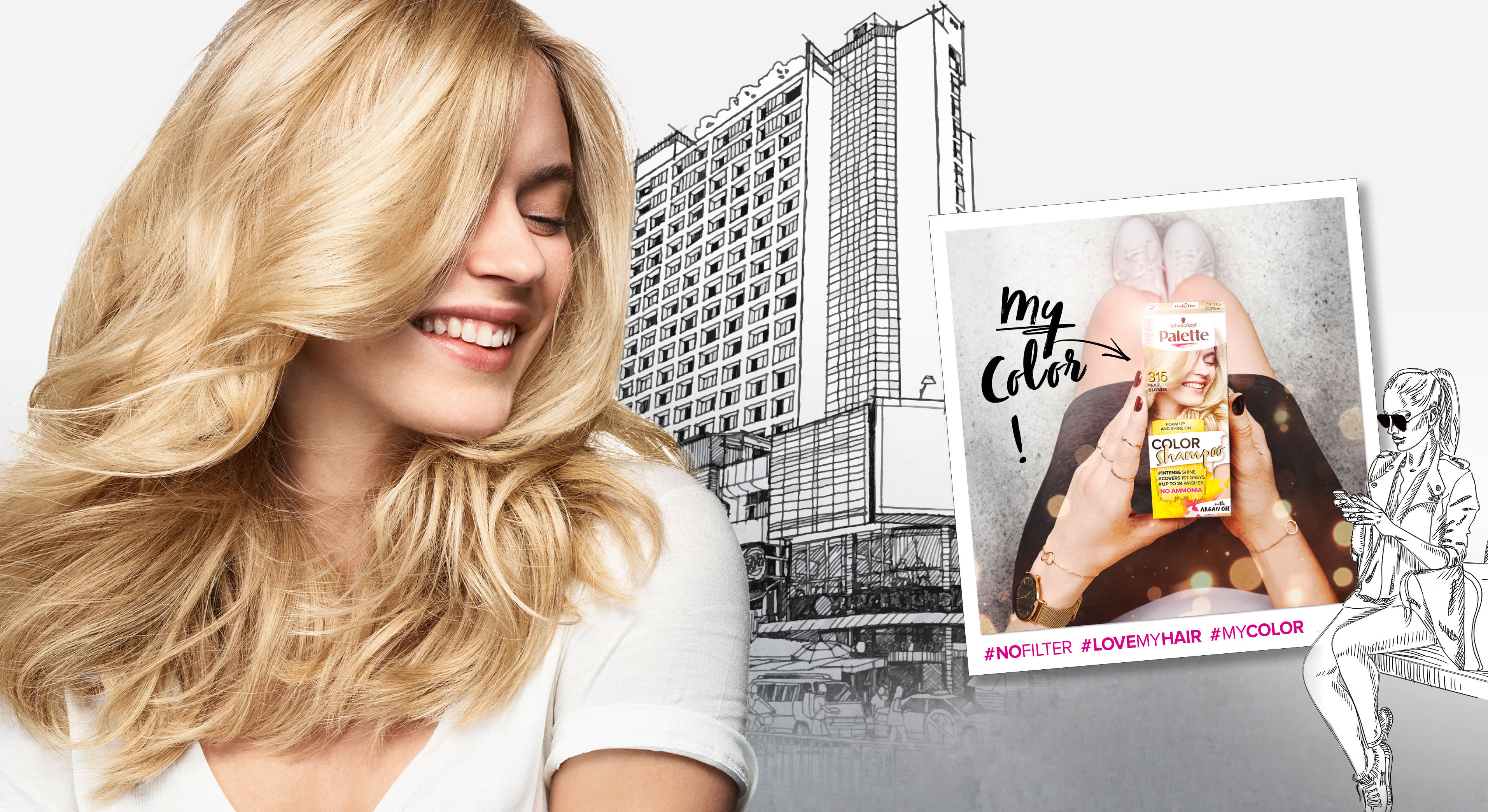
In 2018 Palette relaunched three of it‘s coloration sub brands in one. The new designs create a strong range within the different duration levels with an extra it piece – the metallic spray add-ons.
Briefing
– make the brands younger and more mainstream
– show strong color vibrancy
– increase shelf impact
– transfer easy usage & fun from coloring for especially the low level colors
Our Work
The new overall architecture for the three sub-brands creates an impactful brand block.
Color brushstroke and color spots playfully stress the vibrant color concept.

Models & Storytelling
Young & playful models are giving the brand a new look. The whole pack surrounding is telling an urban story – supported by in-house taken Insta-Pics at the backsides of each pack.
Palette Color Shampoo relaunch 2018 overview
Logo Development
The newly developed logos unify the brands by the unique look & feel. The brands are united by strong COLOR and differed by the levels of lastingness.
Palette Levels logo variations
www.schwarzkopf.de/palette-perfect-gloss
www.schwarzkopf.de/palette-color-shampoo

After we designed the relaunch for Schauma baseline in 2018 for our long-term client Schwarzkopf, we now developed the packaging design for Schaumas Limited Edition „Scentsational Fragrance“ in 2019.
Briefing
We were asked to develop a diverse and playful design concept to complement the new baseline design.
The new limited edition should create a visually emotional scent experience and follow the market trends with a catchy, bold and colorful packaging design.
Our Work
Focusing on the fragrance notes, we chose an illustration style, that gives consumers the eye-catching scent experience, that Schauma has asked for. Colors and contrasts within the visuals were key to be as eye-catching as the shampoo shelf requires. Surely, the key elements, that we had developed within the Schauma relaunch stayed. Such as the round effect foil and newly centered information. It was very clear from the beginning on, that what we needed to do was exchanging the model as a key visual with the ingredients and make those the main actor. Also, we added the range name and the fragrance name in a playful typo to catch the new consumers‘ attention. On top of the new key visuals, we added some lovable illustrated outlines at the bottom of the label for the extra emotional kick.
Sieh dir diesen Beitrag auf Instagram an

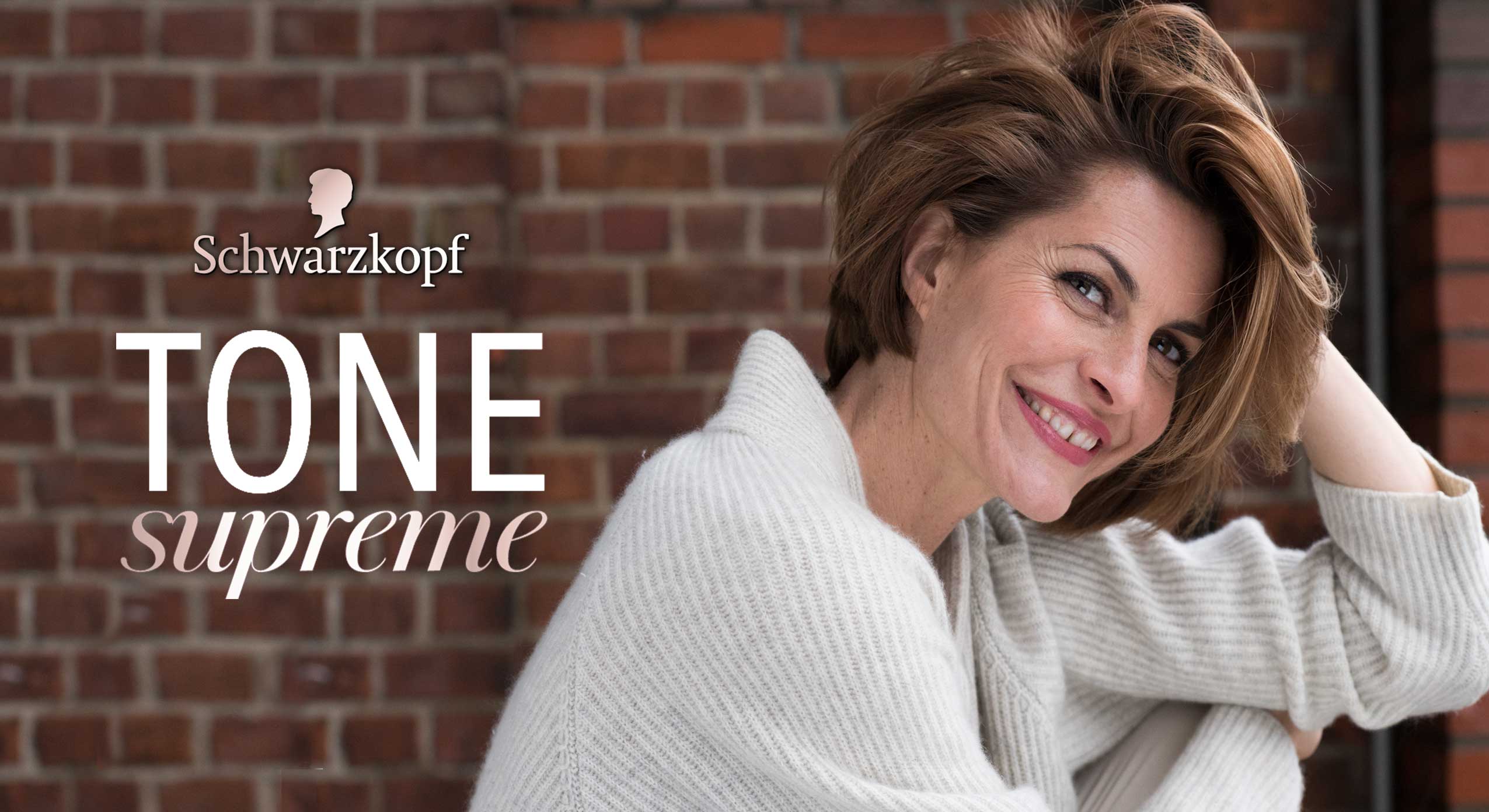
Schwarzkopf Tone Supreme was launched in 2019. It is specialized for mature woman with grey hairs. Especially for those who are afraid that hair coloring looks too artificial with the years.
The Challange
Launching a coloration packaging design which reflects the lifestyle of the modern mature woman, who is interested in a clean appearance. And therfore, she is looking for a truly natural looking color touch.
– Differentiate design from existing coloration standards
– Visualize new gradual toning & gentleness for hair and scalp
– Address mature women with grey or white hair who want a natural color result
Our Work
Certainly, it was most important to catch the attention of the modern consumer 50+ with a modern design approach. So the design should present new vitality and refreshed lifestyle of the elderly.
For Tone Supreme we developed a totally new model approach communicating the enjoyment of life.
In addition, the color code consists of white, light ash tones and rose gold. And in combination with noble marble structures and a color touch of purple, the design creates a premium appearance of lightness and transparency. This captures the main benefits of Tone Supreme and empowers the RTB, which is discreet, light and gentle. Besides, the intense but yet sophisticated purple color creates the strong contrast that is needed within the coloration shelf. So, it offers modernity in a pale shelf section of grey covering products.
In conclusion, the clear design structure offers modern simpleness and clarity for the elderly consumer.
Icon developement for folding box of Tone Supreme
Modelapproach shooted for Schwarzkopf’s new coloration Tone Supreme

We are proud to show you our work on the Schauma packaging relaunch 2019. The trusted hair care brand has a history of over 80 years and is traditionally providing hair strength and care for the entire family. In 2019 the brand got a new face, developed with baries design.
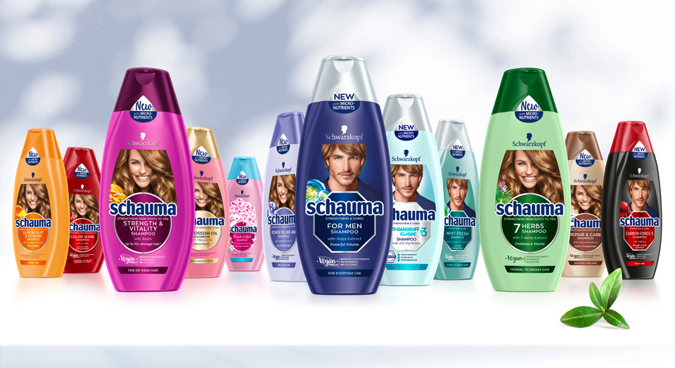
Schwarzkopf Schauma hair care range overview 2019 selection
Briefing
– Rejuvenate to a modern, eye-catching and lovable brand
– Revitalize the traditionally natural concept by stressing natural ingredients, vegan formulas & vitality
– Refine to be more emotional and family-oriented
– Differentiate family member‘s in packaging design (women, men, teens & kids)
– Unify global portfolio of almost 100 SKU‘s but stay colorful
– Strengthen brand impact and enhance flow of information on packaging label
“vegan formulas“ icon – new element in Schauma packaging relaunch 2019
New Vegan sticker layout design for Schauma relaunch 2019
Our Work
Key of Schauma packaging relaunch 2019 is the complete reorganization of the label. Therefore, the innovation of the circle and transformation into the centered design was created. This design step conveys a more emotional appeal and clusters the label information. On top, the circles pop out with colored refinements.
New Model Approach
To keep the brand‘s high recognition value, we kept the traditional model on top. Still, we set a highlight with the new model, that catches attention with her vital, natural smile and hair. Not only is the label reorganized, but we also unified the portfolio by switching individual bottle and cap colors for harmonized look.
Every SKU‘s got it‘s own new, natural ingredient icon to stress the naturalness. In addition, we stressed the natural concept with the „vegan“ icon, that was developed for the Schauma shampoos. Even the sticker on top supports with it‘s unconventional shape, that fits the bottle naturally.
Before and after comparison of the Schauma packaging design

In 2018 Schwarzkopf launched their Gliss Kur influencer packaging. This hair care special editions were designed in collaboration with the influencer Anna-Maria Damm, Valentina Pahde and Yvonne Pferrer.
The packaging designs are based on the Gliss Kur hair care line but stand out with their individual design appearance.
Our Work
Consequently, we created young and trendy hair care packaging designs with the girls individual style, that attract young beauty lovers. Therefore, the designs show each influencers‘ personal passion for beauty:
Big city life, blossom elegance and travel happiness should be key messages to attract the millennium generation.
The Gliss Kur influencer packagings are connected by familiar design elements. The key messages are written in boxes, that are refined with golden highlights.

Influencer credos and matching packaging designs.


