Tag: launch 2020
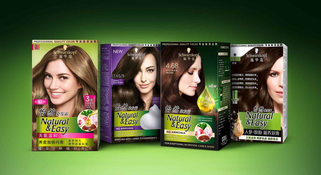
New Botanical Oils infused coloration for exceptional nutrition, care, shine and a divine floral scent.
In 2020, the brand Natural & Easy launched the new Chinese “Botanical Oils“ coloration design, developed by baries.
Natural & Easys leading position in the Chinese market will be used to improve the awareness of the natural product. Therefore, special attention is given to the oil infusion trend and the botanical ingredients. The brand introduces the Botanical Oils line and adds a new oil treatment for post-dye care aimed at women 35+ who want to cover their gray hair.
The overall design follows the Natural & Easy baseline. It keeps the green background color as recognition value. In addition, the design should creatively implement the terms oil, floral and natural to underline the concept of the natural product. Moreover, the design of the coloration should be more premium than the current Natural & Easy base line. Further it should focus on the Botanical Oil concept to exploit the brand’s image of naturalness.
A luminous drop functions as a central element to highlight the care quality and radiance of the colored hair. Besides, a uniform overall impression is created from the degree of shine of the hair and the light reflection of the drop. In order to give a high quality impression, the product is decorated with gold elements.
The new Botanical Oils infused system for exceptional nutrition, care, shine and divine floral scent is enriched with caring traditional Chinese medicine ingredients for intense yet natural looking colour. Besides, the caring traditional Chinese medicine ingredients such as lingzi extract, leaf extract, lotus extract and litchi extract are shown in the circular icon to emphasize the naturalness of the coloration line.

Maybe you are interested in more hair colour packaging designs made by baries design:
With Hatice Schmidt LaBS we created a whole new Hatice Schmidt cosmetic brand identity including logo development, packaging and website design.
Visionary brand building
Challenge
We were asked to develop a logo and corporate identity for the new cosmetic brand Hatice Schmidt LaBS, which both should transport diversity and expertise of Hatice Schmidt herself. We had also the pleasure to create the packaging design of the first two eyeshadow palettes HOLY and DAY. The appearance of packaging should have a high-class look but at the same time integrate a character of an urban grunge style.
Background
Hatice Schmidt, one of the most famous German Beauty YouTuber, describes herself as rough and edgy. Grown up in Berlin Neukölln – a very hard neighborhood – she learned to assert herself early. Her new brand Hatice Schmidt LaBS should therefore reflect her strength and independence as well as her experiences. The cosmetic product standards are very high, as she has been testing and evaluating them for almost a decade.
Her indie brand in the high-end segment is to establish itself in the cosmetics market and provide competition in the premium segment with high-quality formulations and unusual packaging designs.
Logo development
For the logo of Hatice Schmidt LaBS, we perfectly combine urban grunge with high quality. Therfore, one of the most modern fonts was overlaid in a staggered manner. As a result, the luxurious appearance is disturbed by the distortion in a way that suggests the origin of Hatice Schmidt.
Packaging design
The HOLY eyeshadow palette includes colors that are perfectly suited to special occasions and the DAY palette includes colors for everyday make-up. Based on urban grunge style, we have designed the lettering of the eye shadow packagings Holy and Day in graffiti look. The high quality of the products is reflected in the varnish.
Website design
New cosmetic products need a new website. Therfore, we designed the surface for the web shop for the products of Hatice Schmidt LaBS. In the near future it should be extended by further products and constantly updated with new content. Strategically we designed a concept that allows intuitive operation and clearly highlights the products for the user. Implementation of the visual presentation and managing the communication and coordination with the IT service provider on top. Last butnnot least, we produced animations of the logo and short video clips for social media content.


