Tag: limited edition
Another summer brings forth a new design for Gliss Kur’s Summer Limited Edition
Every year, the brand Gliss Kur is challenging baries with a design evolution of its Summer Repair shampoo.
Briefing
We are very happy, that our creativity has been requested again by Gliss Kur for the brand’s yearly Summer Repair Limited Edition. The product aims at targeting millennials – a generation that craves to live the moment and be early adaptors of new products and experiences. Known as the “me generation” they feel more special using a limited edition. Therefore, the design should convey the shampoo’s specific properties such that it protects your hair before and after sun and beach exposure. The only requirement briefed was that the orange bottle remains just like in previous years only with a black instead of a silver cap.
Challenge
- Create a special summer feeling with an outstanding design different to regular baseline products
- Promote the hair expertise and protective benefits of the shampoo with its necessities
- Target millennials by a young, trendy and vibrant look and feel
Sieh dir diesen Beitrag auf Instagram an
Ein Beitrag geteilt von Schwarzkopf International (@schwarzkopf) am
Our Work
Spending a day by the sea, having sandy feet and salty hair. This is exactly the summer mood, which the design has to bring across. Therefore, we just imagined the feeling of a perfect summer moment: watching a beautiful sunset on palm fringed beaches. In order to keep a soft and calm appearance, we kept the orange color code of the bottle and highlighted the modern high palm trees as well as a few birds next to them in a darker orange. Further down, you can see the sandy beach stretching in front of the yellowish sea, which is illuminated by the sunset.
As the name of the limited edition presents such a unique selling proposition, we have highlighted it with a white stroke. In contrast to that white, we used a turquoise font on top of it for the variant’s name. Our aim was to distinguish the words “summer” and “repair” from one another to perfectly combine two benefits of the shampoo. The “summer” in a handwritten font communicates an image different from Gliss Kur baseline shampoos translating into light ocean waves. The word “repair” on the other hand remains in a clear font allowing potential customers to recall Gliss Kur’s identity of strong protection and a technology-based brand. Lastly, additional emotional claims like “Enjoy the summer” and “Limited Edition” have been added in order to provide a personal touch, that is highly valued by the target group.
Overall, the design strongly communicates the benefit of the shampoo of repairing summer stressed hair.
The Evolution of Gliss Kur’s Summer Repair Editions
Here’s an overview of the Gliss Kur Summer Repair designhistory. All of these have been created by baries and we’re looking forward to inspiring summer moments for next year!
Gliss Kur Summer Repair in the web
See more summery packaging designs
After winter comes summer!
The delightful „Sommer“ hand and foot balm packaging designs for Lütticke were launched this summer season. They are in accordance to Lütticke special winter balm edition, that we designed in 2019.


Briefing
- Create a summery Luetticke „Sommer“ design according to the Luetticke winter balm edition
- Transmit the fragrance of the fruity, natural sorts „Granatapfel“ with pomegranate and „Lemon“ with lemongrass
Our Work
For the new Lütticke „Sommer“ edition we used casual watercolor illustrations of the ingredients. This style very well transfers the lightness of the season to the packaging design.
The cheeky illustration style with intense color nuances and freestyle watercolor drops creates a summery, joyful look and feel. Furthermore, Lütticke „Sommer“ packaging design shows leaves all around to give the impression of a garden with intense fruits and fresh fragrances. So, this casual artworks leave the viewer open to imagination for the smell of the ingredients. Color coding squares in the center ensure an easy differentiation between the formulas and the caption of the type.
Whilst winter and summer designs both appeal with illustrations, the watercolor style creates a contrast to the wintery vintage illustration style. However, the caring white base color and the calming centered layout join the summer with the winter edition. Both build upon the long experience of Lütticke skin care and treating formulas.

Learn more about Lütticke on the web
See more beauty packaging designs
Briefing
This design for the Lütticke winter edition briefing was very clear and at the same time very open: „Please create a winterly design for our two winter hand balms. This eligible trust in our skills made us very happy and we just needed one rework step to finish the design for this caring and soothing hand balm.
Our Work
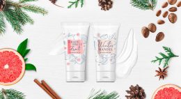
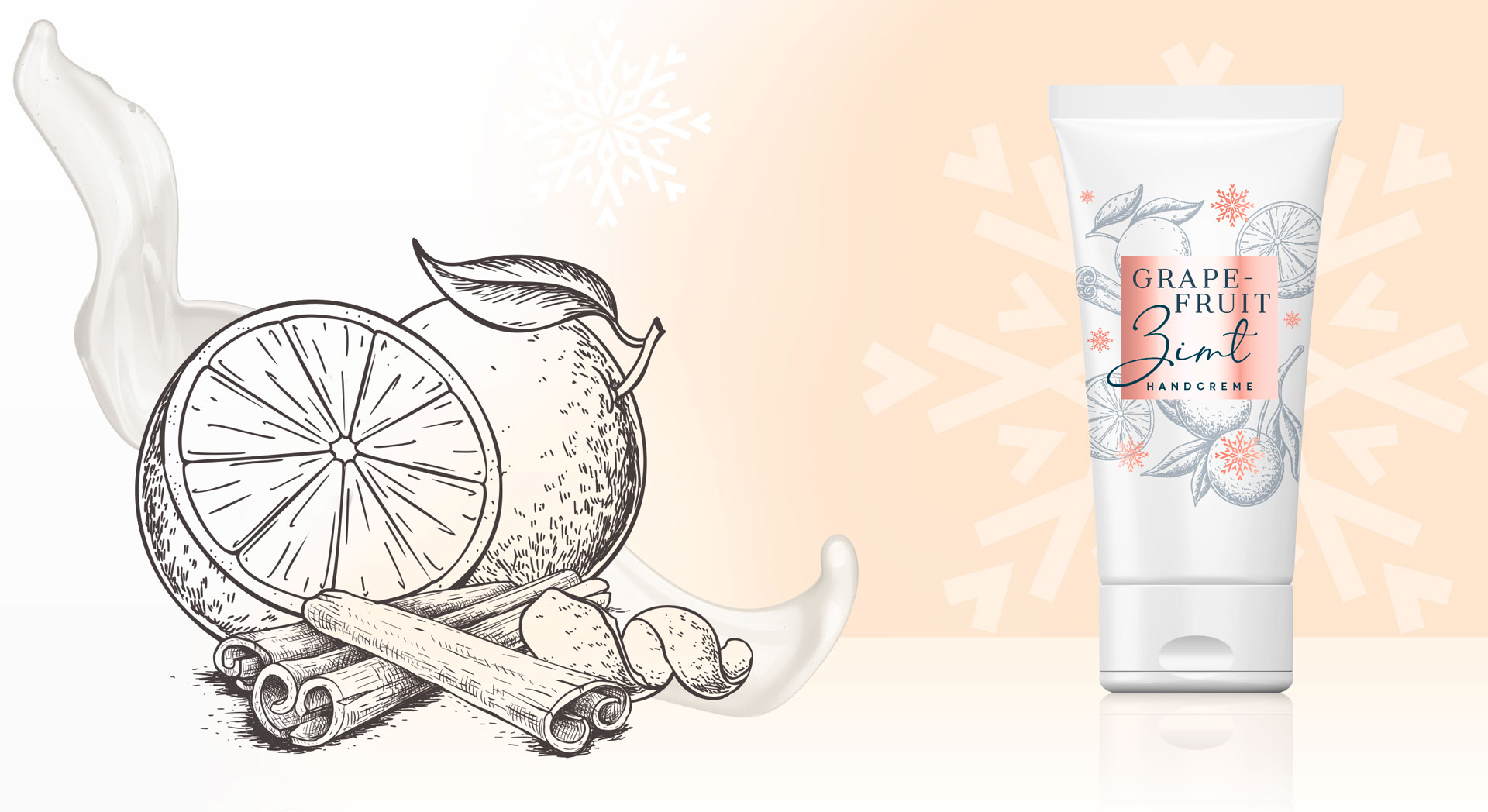
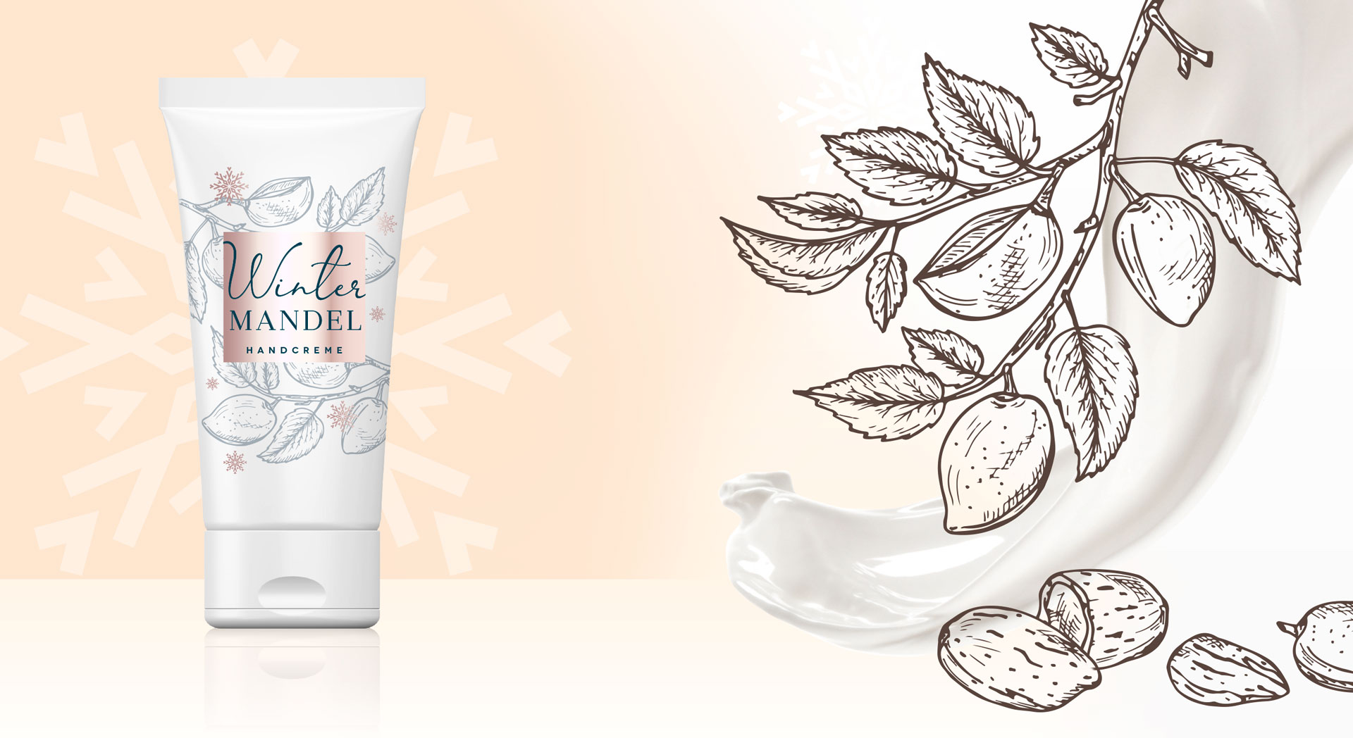
We created the arrangement of the illustrations in a way around the square that you literally can smell the soothing fragrance.
We were inspired by the vintage illustration style. This style represents the long tradition of Lütticke in skin care in particular hand and food skin. The colors of the centered square and the decorative snowflakes brand the sku, so the consumer can easily differentiate between the fragrances. For the comfortable feeling of the pampering Lütticke winter balm we chose warm rose and red colors. This ensures the consumer of the treating formula.
Lütticke in the web: click here


