Tag: packaging design
GLISS label relaunch 2024 – Revolutionizing haircare: Unveiling the new GLISS experience
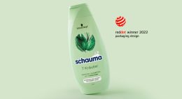
GLISS KUR has always been the expert in hair care. Today, it offers solutions for all hair problems and is more than just a hair care product – it is a lifestyle product. The technological brand perception has accordingly shifted to a lifestyle-orientated, natural look for the GLISS label relaunch 2024.
We are proud to work as the lead agency for GLISS KUR and bring the new products to market. With 15 years of experience in beauty packaging, we are a reliable partner for innovative and contemporary design.
The icon has always been crucial to the visual identity of the GLISS KUR brand. When creating the packaging, our priority was to preserve the brand essence and visual characteristics to ensure its recognition in the market. Therefore, we simplified the icon to strengthen the portfolio.
It’s amazing! I have been designing the brand image of Schwarzkopf Gliss packaging for 25 years, since 2009 with my own agency and the baries design team. Joana-Maria Bauchwitz, owner and creative director of baries design
As part of the redesign of GLISS KUR’s visual identity, the brand logo has been given a contemporary facelift. Further, the name GLISS KUR now stands strongly as GLISS only. It embodies a sophisticated and high-quality image. This strategic reduction on the label not only emphasizes the modern appeal of the brand, but also creates more space for visual representations and enables a focused and refined presentation.
Gliss‘ Aqua Revive collection was launched in 2020 and achieved remarkable success due to its distinctive aesthetic. Its design features a liquid sphere surrounded by caustic reflections and floristic algae-inspired leaves, which conveys a sense of well-being, relaxation, and wellness.
New packaging design elements were carefully selected to enhance the overall visual concept. The success of the collection prompted us to incorporate the icon’s visualization into the brand design. In line with the new brand strategy, we have intentionally positioned the most important visual elements outside the conventional text field.
Schwarzkopf GLISS maintains its position as a hair technology expert, emphasizing its unique advantages. To reinforce this message, we have included the square element from the previous design as a background for the text. This strategic decision not only enhances brand recognition among our current customers, but also ensures optimal readability and a well-defined textual structure. Thanks to the design structure, GLISS has achieved a cleaner and more minimalist appearance.
Haptiq Icon
Moreover, we also created the Haptiq System icon. This transformative and distinctive symbol with a competent touch was designed to transcend categories from coloration to care and styling. The black and white color code effortlessly blends into communication. Consumers will experience the tactile touch, accompanied by the integration of IQ, reaffirming the brand’s dedication to intelligent hair solutions.
Discover more projects!
SISU – Non-alcoholic Spirit
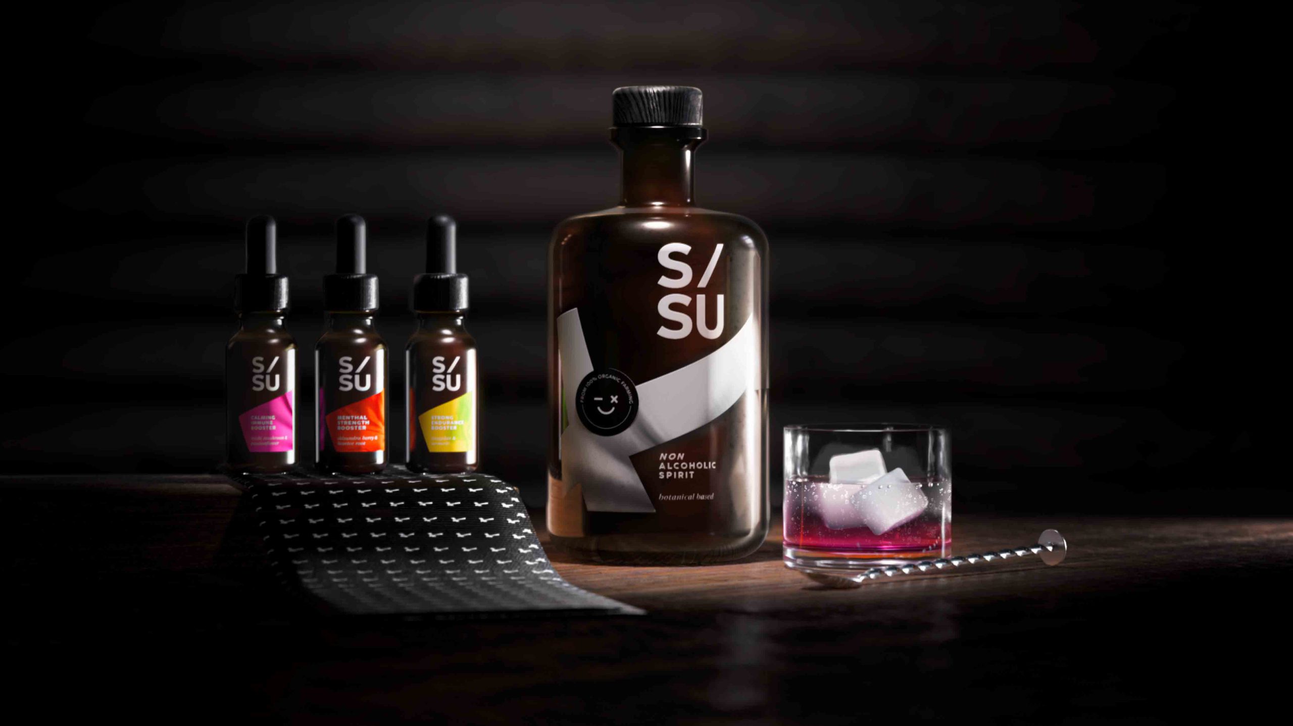
SISU is a non-alcoholic spirit whose name stands for „mental quality“ in the Finnish language and embodies strength, endurance, courage, relentlessness and fighting spirit.
Non-alcoholic spirits are an alternative to conventional spirits. These spirits are sometimes produced in the same way as alcoholic spirits but involve special processes to remove the alcohol as a last step. SISU works with adaptogens which are herbal remedies that can help you combat mental or physical discomfort. They provide a biological boost that manages stress, strengthens your immunity and improves your overall well-being.
For centuries botanicals have been associated with traditional medicine, aromatherapy and herbal teas. Today consumers still perceive herbal substances as a „healthy halo“. Given the circumstances surrounding COVID-19 and to protect their own health, consumers see a positive link between these botanical extracts and emotional well-being.
Design
When designing the label, it was of utmost importance to integrate the Finnish influence. Therefore we decided to incorporate the style of the Finnish flag into the label design.
The flag shown is tilted to the left and forms a diagonal from the bottom left to the top right. This inclination symbolises a positive spiritual development. The logo also contains a diagonal and aspirational element that underlines the concept of the brand.
Dosage & varieties
The 3 different varieties can be purchased in small pipette vials that can also serve as an additional flavour enhancer depending on your needs and taste.
The flavours are:
reishi mushroom / passion flower
shisandra berry / liquorice root
jiaogulan / Turmeric
Discover more siids projects!
On the constant look-out for new challenges we have the demand to push ourselves and to be creative. With our innovation hub siids we now bring our brave ideas to life and invite you to be part of it.
Contemporary design meets Punk
As we are always looking for the latest trends in design and lifestyle, it is our goal to offer perfect products to consumers. With our creative hub SIIDS we constantly develop and promote our creative potential and invite you to be part of it.
Nowadays sustainability is a must and should be considered in every product development. Therefore we looked at the market of decorative cosmetics, which is flooded with plastic packaging. While there is a massive usage of foils and plastics, the filling quantity is not consumer-friendly. Therefore we felt the need to develop a packaging that is both sustainable and consumer-friendly without sacrificing any stylish elements.
The idea was to develop a sustainable and refillable mascara kit, equipped with different brushes, for an exciting shopping experience. The kit includes a refillable Mascara tube, bioplastic refill containers and a selection of brushes for different looks and occasions. The design should be purist, contemporary and expressive.
Brand & Logo development
When designing the product, we took into account that the brand should have a niche character but still appeal to a wide audience. It was also of great importance to position the brand in such a way that it can be extended to a broad product portfolio. In future more mascara colors will be included in the range as well as liquid eyeliner in refillable containers.
The logo ARC has a simple but graphic approach. The C also serves as the signet of the brand. The arc symbolizes the curved eyelashes and thus embodies the hero product. The look & feel of the brand should express calligraphy, punk, contrast and a contemporary style.
Discover more siids projects!
On the constant look-out for new challenges we have the demand to push ourselves and to be creative. With our innovation hub siids we now bring our brave ideas to life and invite you to be part of it.
Performing nature – Love Nature label relaunch
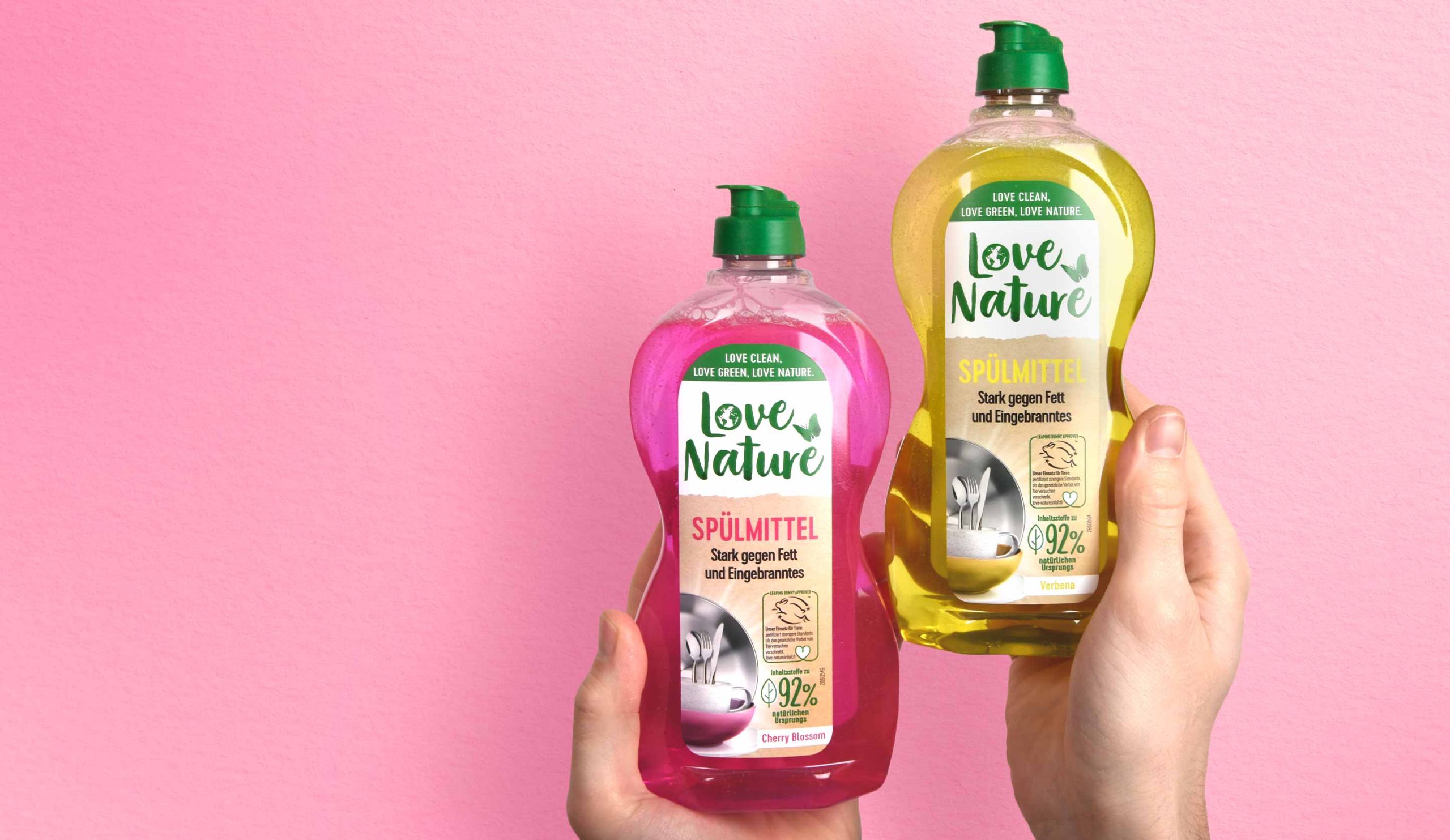
We are very proud to have been involved in this Love Nature project once more. This time the relaunch of the label design took center stage. It was of utmost importance to achieve a great impact on the shelf and to clearly emphasize the product’s eco-friendly appearance despite the brand’s powerful character.
To attract the consumer’s attention and emphasize the professional character, together with the client we decided to enlarge the logo.
The white background supports the visibility of the logo and makes the overall brand look friendlier and stronger. In addition, splitting the label in two creates a higher level of attention for the consumer who notices the brand on the shelf.
While the logo has increased in size and abandoned its previous boundary in the form of the circle, some of the old elements were kept. The butterfly remains but has moved to a different horizontal position. This creates the impression of space and gives more room to all design elements.
It was a pleasure to support the Love Nature team with our expertise and skills to make the relaunch of the Love Nature Label Design a success.
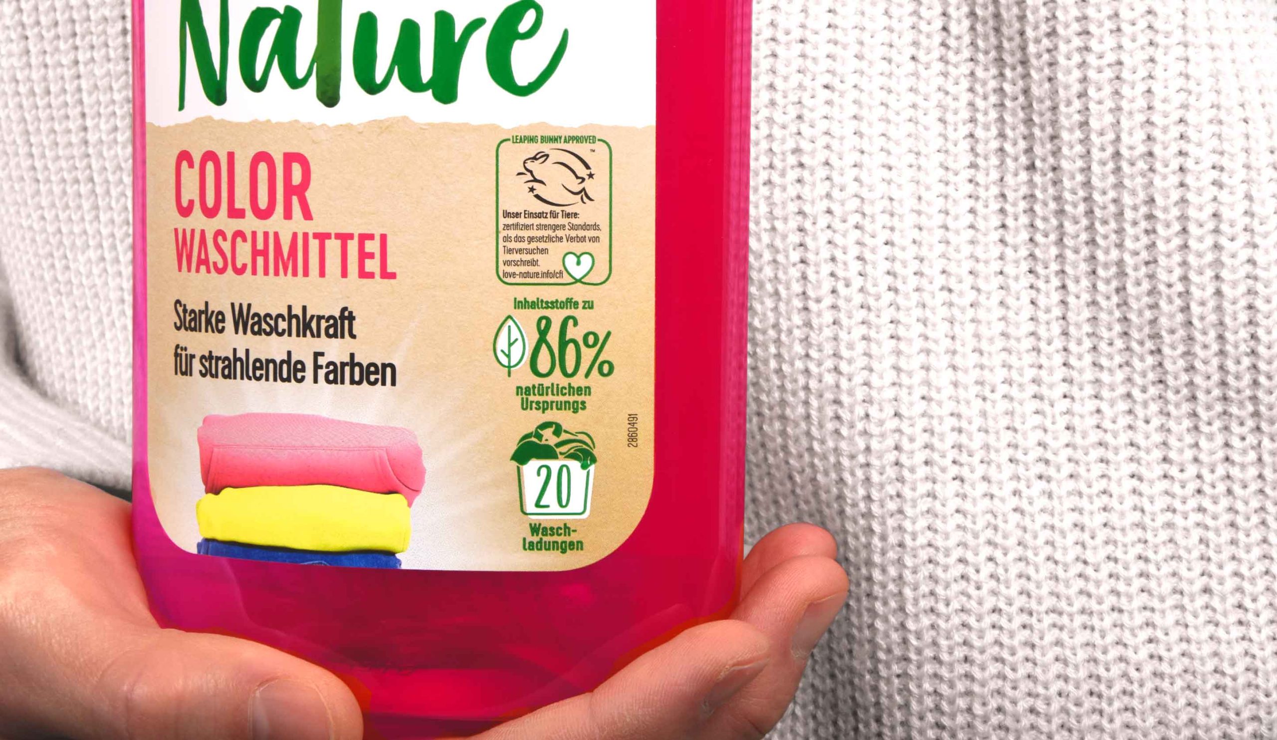
In addition, the division of the label into two parts provides a structure for the content displayed on it. A very tidy design character is created, which is stressed further by the left alignment of the text. Moreover, all icons are now right-aligned and easy to recognize. The new division within the label provides a clean design impression and a modern look & feel without losing the powerful character that a detergent product needs.
Furthermore new elements are added as for example the laundry stack. This deepens the emotionality of the design and helps the consumer to find the right product.
Discover more projects!
Douglas Salon Hair now matches the new Douglas CI
The new packaging design for the expert hair care range ‘Douglas Salon Hair’ looks contemporary and professional while communicating performance and style. The Douglas hair care series has now been adapted to the new Douglas corporate identity that was relaunched in 2018 and thus gives it a premium character!
To reinforce the premium character of the brand, we used the colours white and black in combination with golden elements. Furthermore we have created a simple icon that conveys the image of hair in an abstract but indulging and caring way. So its flowing gradient lines on a golden background aesthetically imitate a hair wave.
As for the typography we chose a sans serif font to enhance the high-end look. The simplicity contrasts the high quality golden icon and gives the design its own charm. In order to attract the consumers’ attention and underline the professional character, together with the client we decided to name the product Salon Hair. The typo is simple yet playful and its soft appearance even reflects the concept of the brand’s indulging hair care products. Once again, the effect of contrasts is played with, as the design of the name contrasts the rather plain label design.
As we are experts in designing high quality products it was a pleasure for us to support the Douglas team with our know-how and skills to successfully reinvent the Hair Care relaunch.


