Tag: Pril
The BeautyLove skin care line for e-commerce beauty boxes
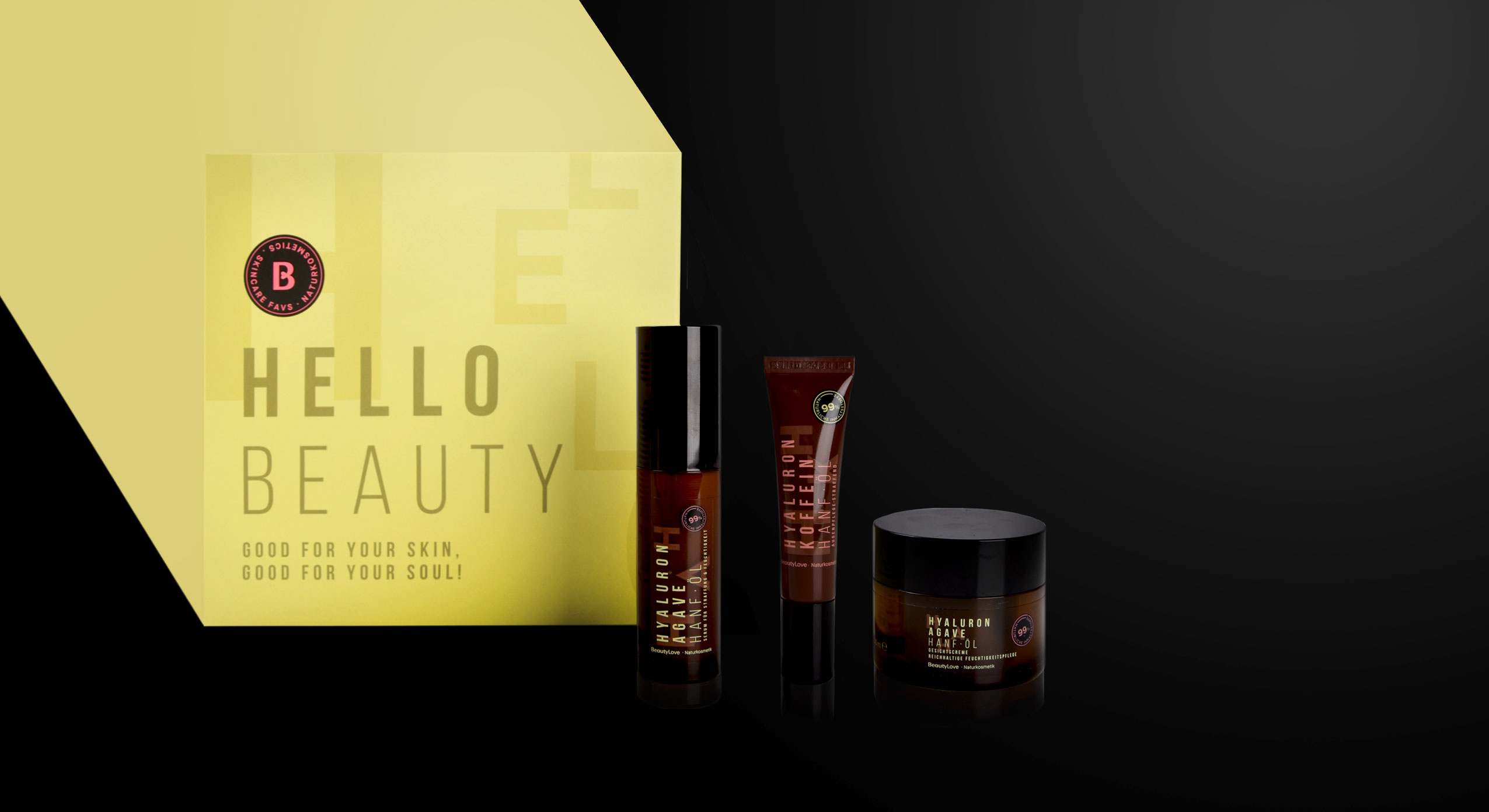
In 2022 BeautyLove, an online shop for beauty lovers and beautybox fans, launched a new natural cosmetics skin care line. BeautyLove stands for eco-friendly cosmetics and packaging. Thus 99% of all ingredients used are natural and all products are NATURE certified.
For the first time, The OrganicLabs of BeautyLove has developed natural cosmetics together with Beauty lovers in the network. Together with the community three natural cosmetic products were developed, featuring power ingredients such as hemp oil, hyaluronic acid, agave & organic caffeine.
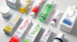
The design follows a typographic approach to achieve an expressive avant-garde look that appeals to the younger target group and GenZ. For the design of the product range we used pastel colours and warm colour codes that are usual stylistic elements of natural cosmetics. Nevertheless, we deliberately avoided elaborate visualizations of the ingredients. Instead, it was important to combine the natural colours with a large typography that describes the ingredients in an almost graphic way. To leave more room for these design elements, the BeautyLove logo appears more in the background as an „endorser“ on the black bar of the front. The strong contrast between the black colour and the soft pink and green colour tones emphasizes the young and fresh look as well as the premium character.
All in all, the tonality of the products is natural, organic and of high quality as well as performing. The seal supports the claim of being a sensible brand that highly values sustainability. For us it was very exciting to support the brand’s launch of a natural cosmetic product and we are proud to see the product hitting the e-commerce shelf!
Discover our other skin care projects!
The new design for Pril Strong & Natural convinces with a pure look
Pril is one of the great traditional brands in Germany when it comes to performance and trust. Hence it’s all the more important for the brand to create a product line for its loyal consumers that meets the challenges in terms of sustainability and naturalness without sacrificing any of its renowned reliability. With our new design we have supported Pril on its path to a new naturalness.
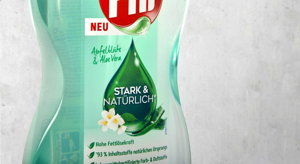
The green drop for natural power
To combine naturalness with performance and communicate clearly to consumers, we have kept the drop as an iconic element. It conveys the cleaning power that distinguishes Pril products, while simultaneously communicating purity and naturalness through its green colour and the subtle integration of the fragrance. To emphasise these features, the Pril logo was also adapted by colouring the drop.
The refill pouch saves up to 70% plastic and thus marks a right step towards greater sustainability in the household. The illustration of the pump dispenser design on the pouch offers particularly easy orientation for consumers at the shelf. The shape of the bottles forms a transparent window which, just like the real bottle, conveys the naturalness and purity of the product. Additionally the design features a large disruptive element to show the advantages of the refill pouch at one glance.
It was very exciting to join a big traditional brand like Pril on its way to greater sustainability. The development of its corresponding refill pouch was a matter close to our hearts. It makes saving plastic so easy for consumers!


