Tag: product design
Truly Care – a zero waste face mask
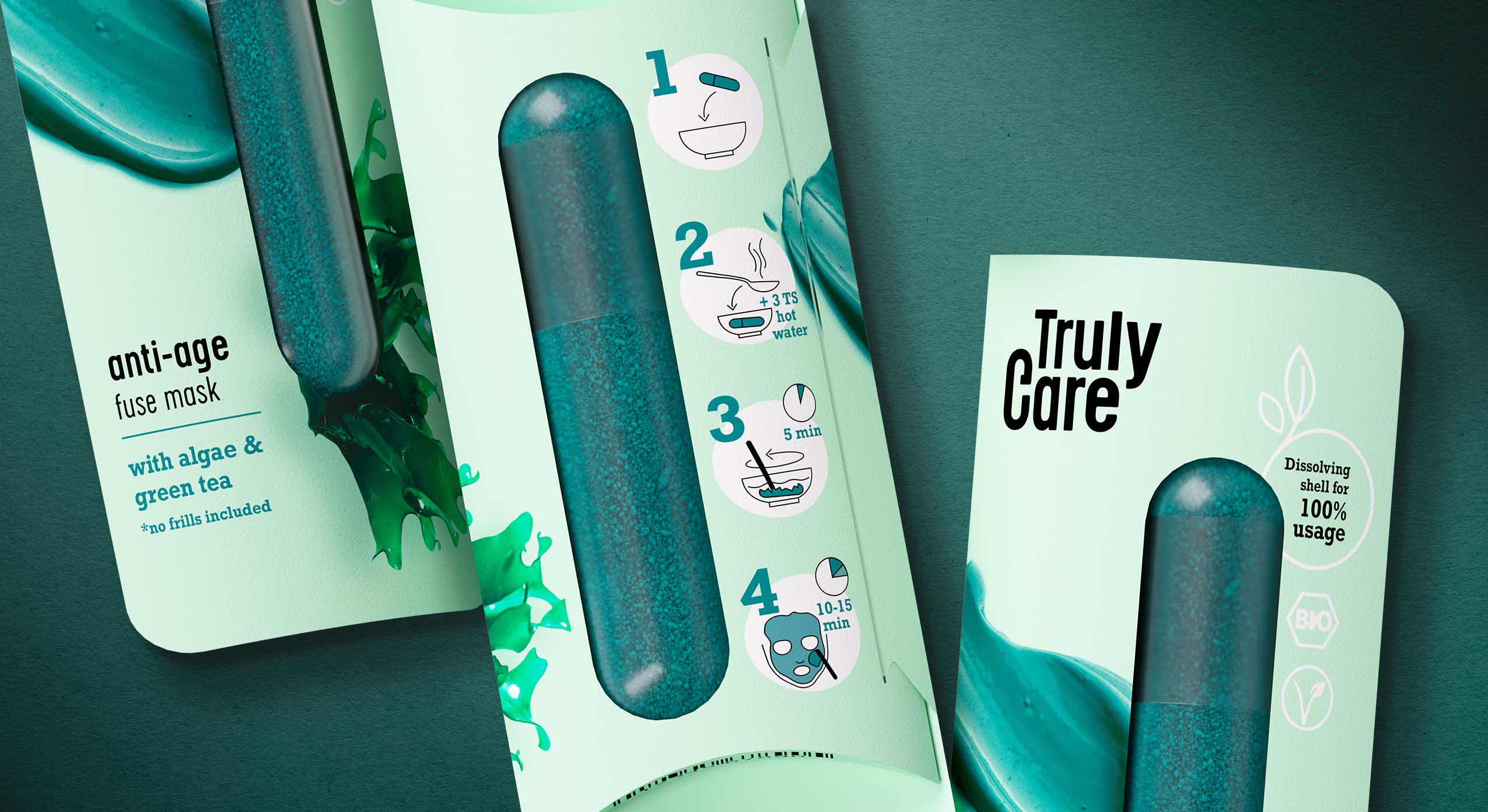
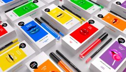
In our day-to-day work as packaging designers we notice that single treatment products, such as face masks, are often also sold in single-use plastic packaging. While single treatments are convenient for many consumers, single-use packaging means a burden on the environment. Therefore we challenged ourselves and designed Truly Care – a sustainable single treatment and zero waste face mask. Truly Care was designed to create as little waste as possible. The packaging consists of a paper wrap and a capsule that contains face mask powder. The paper can be returned to its recycling cycle because we paid attention to not using hot foils or any other finishing that would exclude the paper from its recycling cycle and make the packaging more expensive. The capsule itself is vegan and made of agar-agar – the same material used for nutritional supplement capsules.
Truly Care is developed by siids, the baries innovation hub.
The capsule contains the face mask powder which must be merged with water before application. By pouring hot water over the capsule, the shell dissolves. The powder can then be mixed with the water and the dissolved shell so that the mask can be applied. To support sustainability and to create a healthy product, the amount of ingredients is kept very low. The anti-age fuse mask consists of algae powder (spirulina) and green tea leaves. The calming fuse mask contains concentrated pomegranate powder and clay. The cleansing fuse scrub is made of coffee and charcoal.
No additional microplastics, chemical dyes or any other chemical agents are included. Truly Care is organic and vegan and the face mask can be flushed away without any concern.
The motto of Truly Care, “no frills included”, does not only refer to the ingredients but also to the product itself. The packaging material was kept as minimalistic and pure as possible. Furthermore the visual appearance of Truly Care speaks a clear and straightforward design language. The paper wrap only shows the main ingredient and the texture of the product to give buyers and consumers an idea of the product. On the back easy, minimalistic icons guide consumers through the user instructions. The product’s sustainability and organic ingredients are communicated through the “bio” and “vegan” icons. We refrained from using explicit sustainable features, like brown paper, because we believe that these days it is one’s duty and it goes without saying to design any product as sustainable as possible. This should not only be communicated to a sustainable target group because we want everyone to use and see it.
„Truly Care“ tells what the product does: It’s an honest and genuine caring product for your skin. Hence we chose a minimalistic but sturdy font to represent the products’ features. The omission of serifs underlines the „no frills included“ motto because a striking and detailed font would not represent the raw pureness and strength of this product. The „c“ in the logo was extended by a little line which, combined with the letter C, represents the shape of the Truly Care face mask capsule.
Discover more siids projects!
On the constant look-out for new challenges we have the demand to push ourselves and to be creative. With our innovation hub siids we now bring our brave ideas to life and invite you to be part of it.
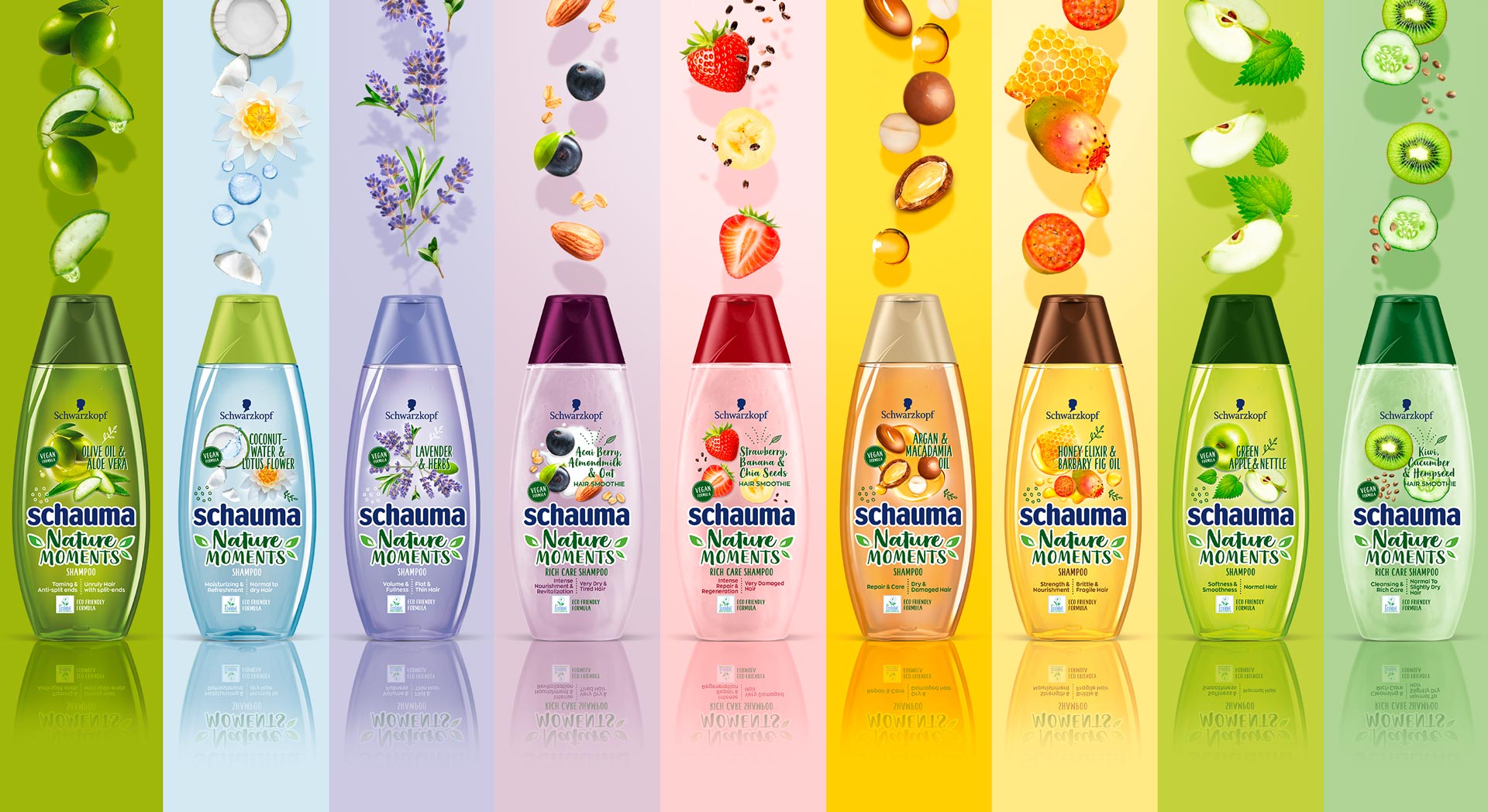
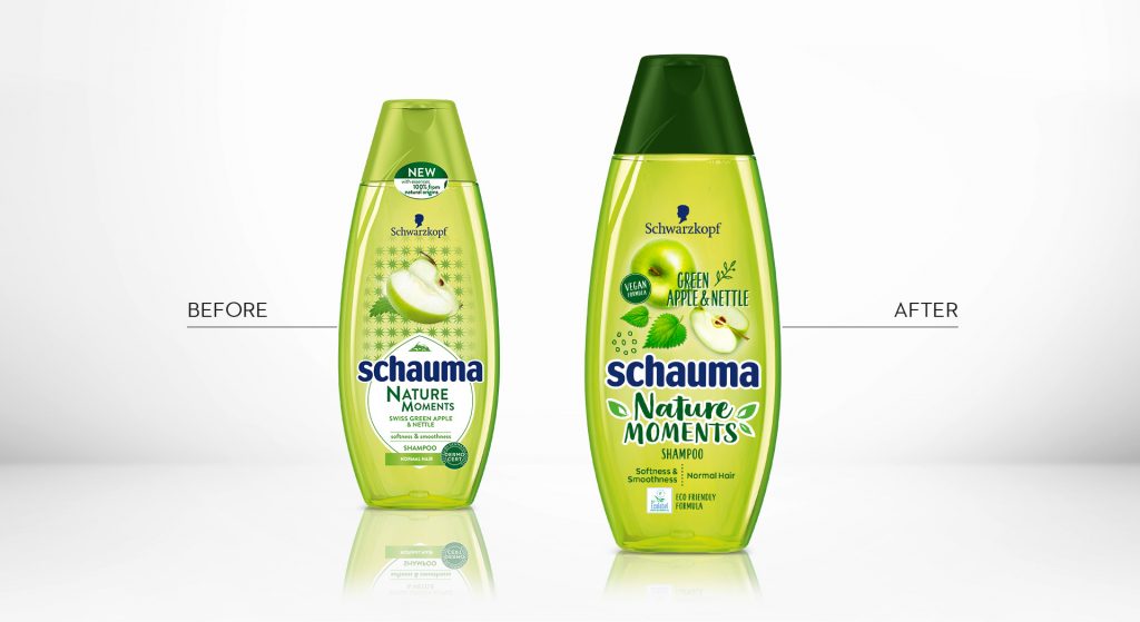
In 2019, Schwarzkopf relaunched the packaging design of it‘s natural shampoo subline „Schauma Nature Moments“. Furthermore, they not only relaunched, but got the eco-label on top! Additionally, they added new ingredient variants and the „Nature Moments Hair Smoothies“ subline was implemented into the portfolio.
Briefing
Because natural ingredients are continously on the run, they stay relevant for the thoughtful consumer. Though, those who care for naturality are now also seeking for more environmental responsibility. Following, the already trusted line „Nature Moments“ needed to be updated to stay relevant and to attract even more responsible consumer to the brand.
– Enhance the natural appeal of Nature Moments
– Modernize visuals to show appealing and gentle natural ingredients
– Communicate environmental responsibility
– Integrate the new eco-label
Our Work
We created an appealing packaging design, that has a strong stopping power and is very playful and designed openly.
The design is focusing on the natural ingredients. Therefore, those are displayed in a modern and dynamic way.
Inspired by food bowls, because they are very appealing to the conciuos consumer, the ingredients are shown in a top view.
So, we catched up with the latest food trend and used the insights in the beauty sector.
Moreover, the open design on the transparent label increases the effect of the transparency of the bottle.
So, this is giving contrast to the Schauma baseline, which is now visually clearly seperated.
Not only by the transparency, rather, because of the emotional focus on the ingredients.
Furthermore, additionally to the new design of the ingredients, we did also add illustrations, so that empower the playfulness.
Finally, we need to find a good way to integrated the eco-label icon.
Even more, the modern typo does help us to enhance the fresh concept.
Especially, the subline „Hair Smoothies“ by Nature Moments is refined by a typo and that gives us a „yummie“ feeling.
Logo Development
The new brand name got a modern and technological font with natural look & feel.


Schauma Nature Moments in the web: click here
Fa packaging design relaunch 2018, created by Baries.
Finally in 2017 Schwarzkopf announced the FA brand relaunch 2018.
The challenge: Relaunching the extensive portfolio of the number 2 brand in Henkel body care, that is sold in 78 countries.
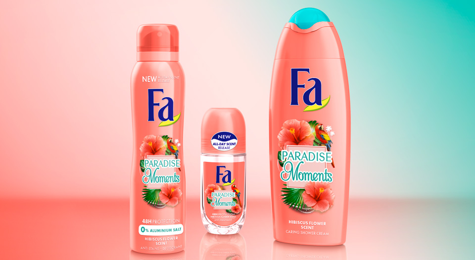
International Fa Brand Relaunch 2018 Moodboard
Briefing
– Differentiate extensive FA portfolio
-“From a trade brand to a love brand“ – strengthen brand uniqueness
– strenghten brand mission and character: “The explorer“
– Address “lighthearted experience seeker“
– Realize trendy & modern refreshment
– Give brand a more premium appeal
– Intensify scented sensoriality – “FA feels fantastic“
Our Work
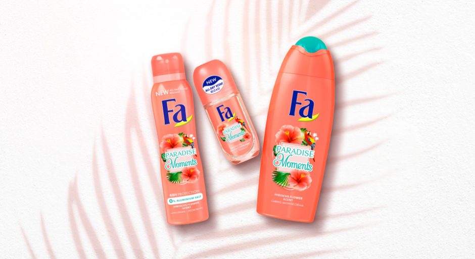
For FA we developed a new overall packaging design concept. Communicating the power of fragrance by strong and emotional surrounding stories. The stories are told within different pillars such as “Yoghurt“, “Cream&Oil“, “Oriental Moments“ and more. The different pillars are visually cluttered by geometric shapes.
„Cream&Oil“ designs are focusing on sensoriality and premiumness by soft shapes and golden refinements. FA Moments is the trendy line of experimental and powerful fragrances, expressing the new motto “live the moment!“. And there are more pillars to explore!


Before and after comparison of the Fa packaging design

Fa brand relaunch 2018 abstract
In 2018 Schwarzkopf brand Palette launched the new „Naturals Color Creme“ packaging design, created by Baries.
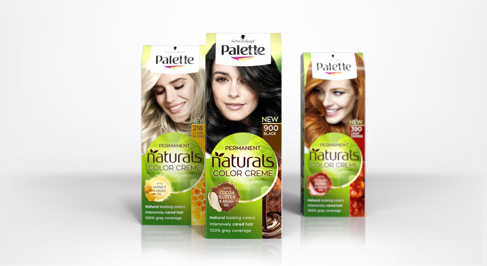
New Schwarzkopf Palette Natural Color Creme packing design
Briefing
Rise to a strong autonomous subbrand under Schwarzkopf Palette.
Focusing the natural color result and natural, caring ingredients.
Free interpretation of claim box and ingredient visualisation.
Our Work
Palette and Baries have been connected throughout many years of collaboration. In 2018 we got the exciting challenge to go the next big step with our well known brand for the Palette Natural Color Creme packaging design relaunch 2018.
The new design creates a central round shape along with the new logo which gives the packaging a new individual branding. Keeping the historic green color code, we stressed the natural impact by implementing natural lightening and textures. We put a new focus on the natural ingredients and moved from the classic drop to modern, food inspired ingredient visualisations. Hereby we developed an extended color coding that fits the hair colors and therefore creates a strong brand block and shelf impact.
Logo Development
The new brand name got a modern and technological font with natural look & feel.


Model approach
Palette naturals got a new face and personality.
We aimed for more natural and approachable models, with naturally flowing hair and diverse attitudes.
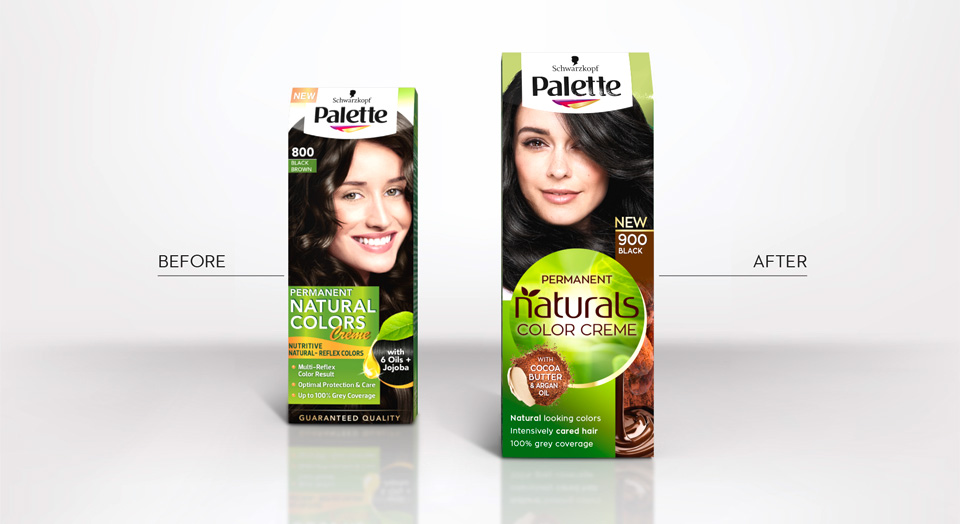
Before and after comparison of the old and new packaging design
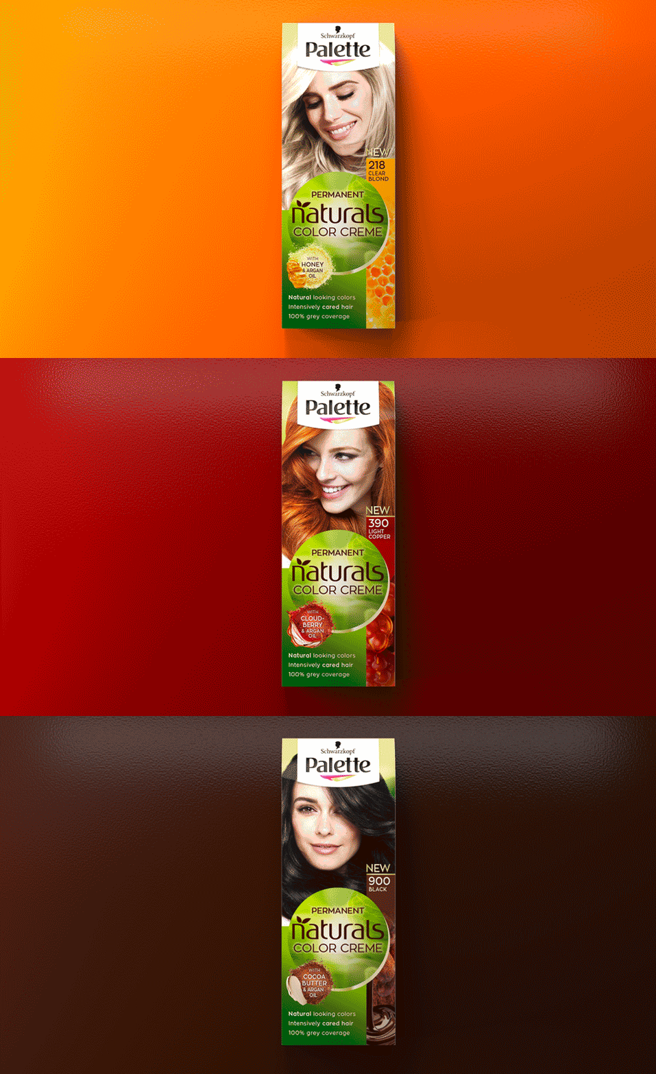
Palette Natural Color Creme color tones
Palette Naturals in the web: click here


