Tag: relaunch
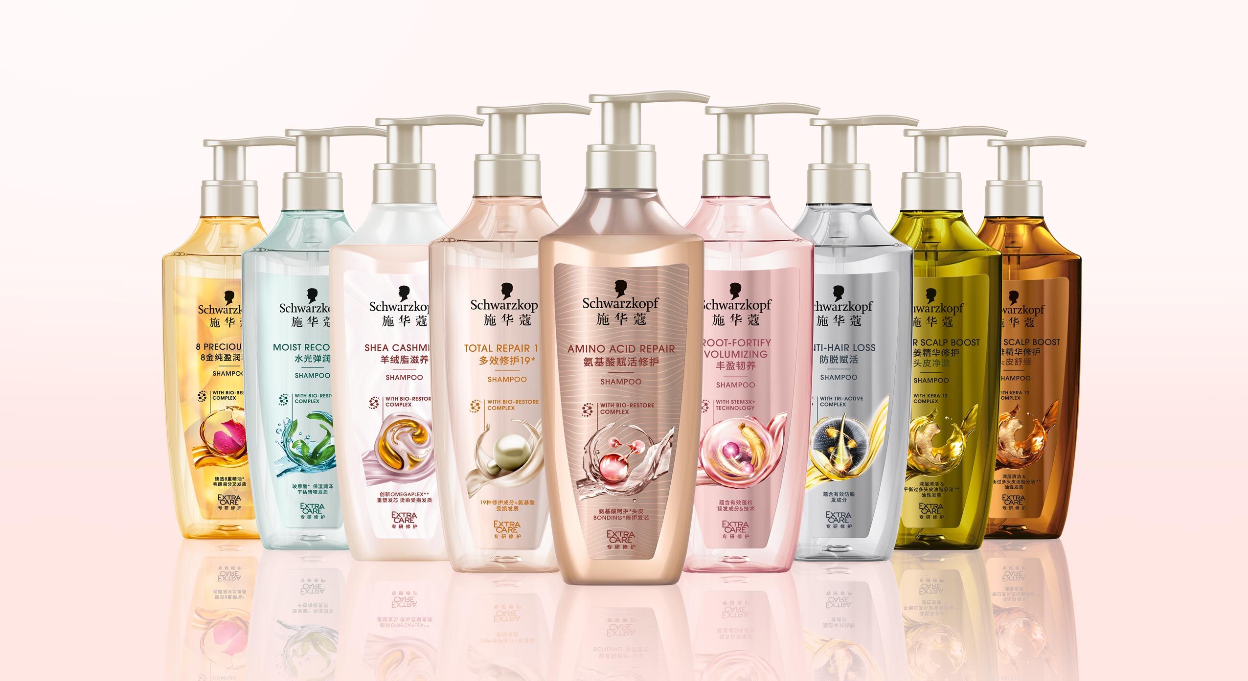
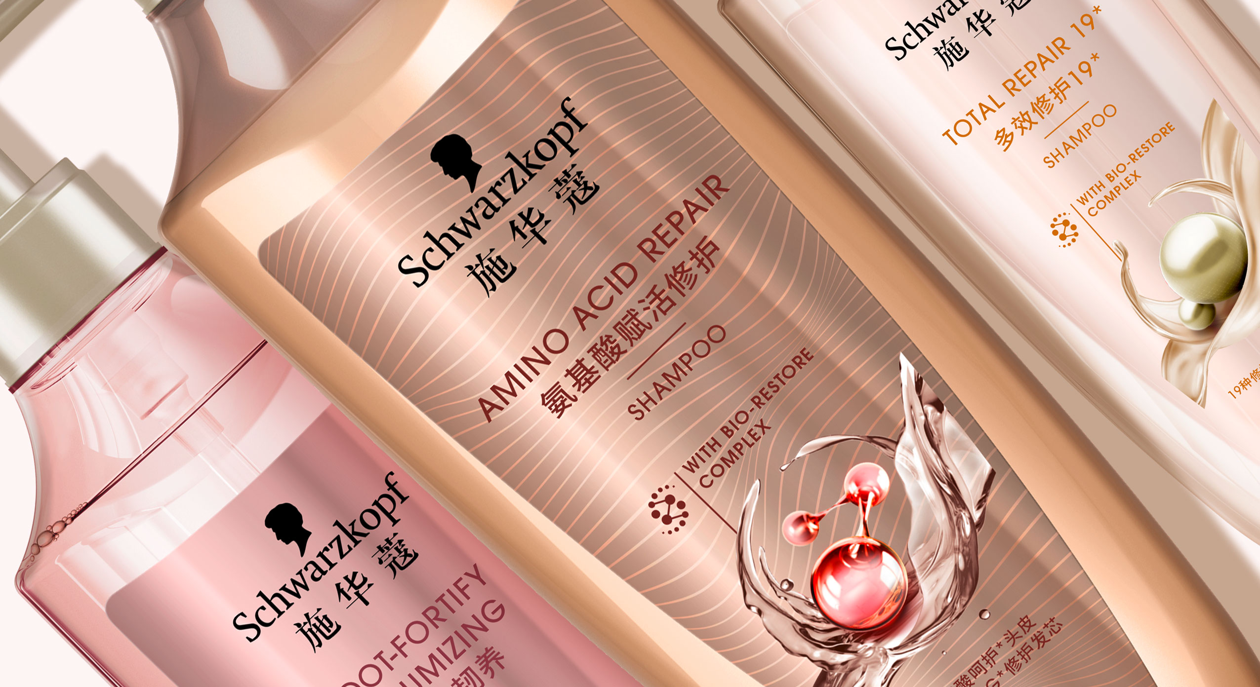
In 2021 Schwarzkopf relaunched the new Extra Care range for China, developed with baries design.
scientific performance meets natural beauty
With over 70 years of expert hair experience, Extra Care stands for targeted formulas for all hair types that repair the hair strand from inside and outside to ensure healthy and resistant hair. Customers are offered smart hair solutions thanks to the latest technologies that combine the best of science and nature for healthy, resilient hair and an outstanding performance.
Our work
When designing the Extra Care series, we had to consider that hair care experts are driven by Schwarzkopf’s salon image, which means that the product should be perceived as professional, high-quality and innovative. Therefore, when designing the Extra Care range it was important to visually reinterpret the significant circular icon. Instead of a closed circle, we opted for an open circle that conveys a sense of lightness and movement. Thus, the respective natural ingredient is surrounded by swooshing water, oil or cream. In combination with the small graphical icon of the ‘Bio restore complex’, the overall impression is innovative and of high quality. The icon itself should reflect the combination of technology and natural ingredients and symbiotically form a unity.
Furthermore, when designing the 3D shape of the bottle we tried to take the characteristic wavy shoulder of the old bottle into consideration and reinterpreted it in a more feminine and delicate way. The bottle is slimmer and gives an impression of elegance and high quality. Additionally, the bottle caps were replaced by pump dispensers which stress the selective approach. Together with the icon, the overall appearance is harmonious.
Design tonality
Competent, performing, caring, indulgent, feminine, approachable, technological, science powered by nature, innovative, modern, high quality, trust


Discover more design relaunches!
In 2020, we designed the relaunch for Schwarzkopf’s professional coloration brand Syoss.
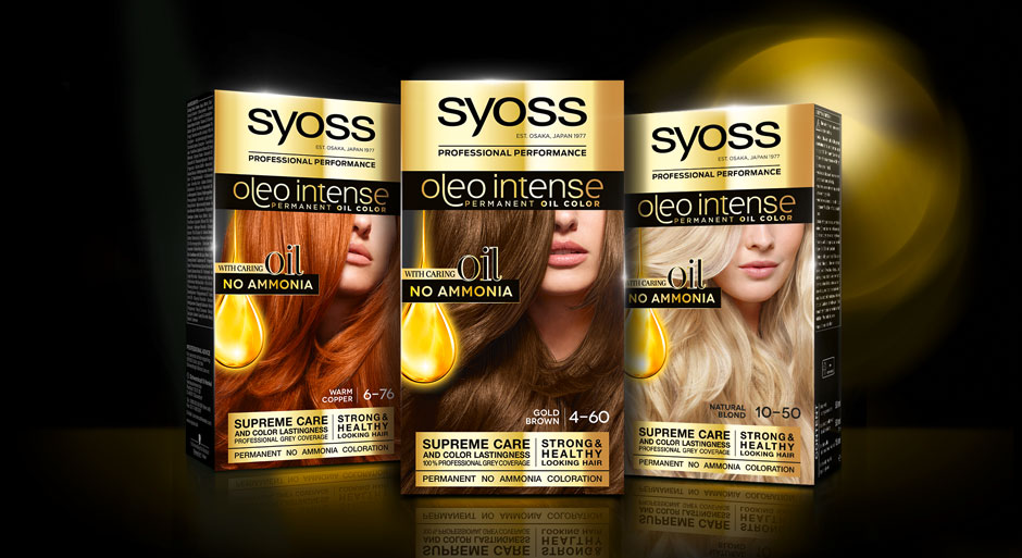
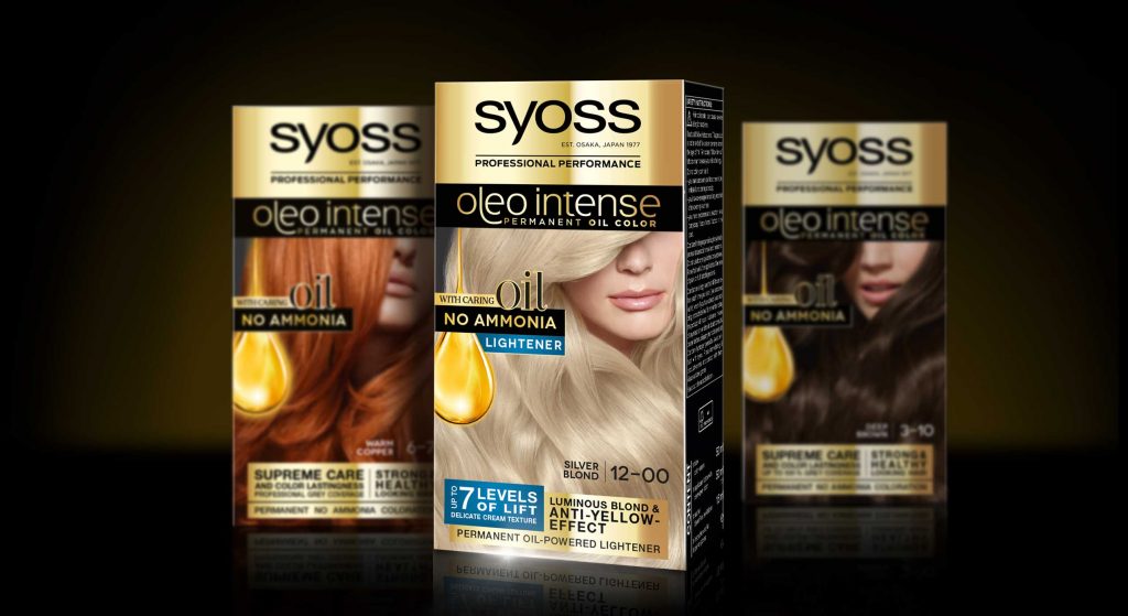
At the same time, the line extension Syoss Oleo Intense got a facelift with a baries packaging design.
Challenge
- modernize design
- evoke caring oils & focus on „caring oil and no ammonia-formula“


Our design concept
To achieve the requested goals, we changed the logo background from black to gold. This strengthens Syoss Oleo Intense in comparison with the baseline and catches attention with a highly supreme look. Nevertheless, the dark brand look is still maintained. The other way around, the subtitle „oleo intense“ is now written in fine gold typo on black. But here too, reversing the color code appeals more premium.
Moreover, our main focus was to reinvent the oil visualization. It was most purposeful to keep the clear message of the drop shape but interpret it in a modern way, that underlines the intense care.
Therefore, we removed the abstract lights in the background and instead focused on the drop itself. Furthermore, we refined the shape and inner texture to arise a more premium and caring character that describes the supreme coloration formula. The extended peak that is dropping from the top adds a delicate dynamic and integrates the drop in a refined way into the layout.
The newly implemented serif typo on the drop is adding a luxurious attraction.
Also have a look at our packaging design in this stunning tv spot

Schwarzkopf Syoss Oleo Intense hair coloration the web
See more hair coloration packaging designs
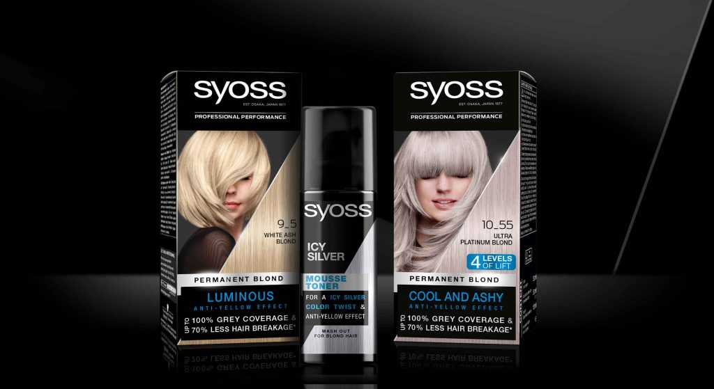
In 2020 Schwarzkopf relaunched it’s professionally performing hair color brand Syoss with a baries packaging design.
Briefing
- Create a packaging design for a professional, but still approachable brand look & feel
- Drive the main focus on the key benefits „precision & intensity“
- Draw new attention on the hair color & refine the model approach
Our design concept
Syoss is Schwarzkopf’s professional hair color brand in the retail shelves. The brand ensures most precise and intense results, which should be more notably highlighted within this relaunch 2020.
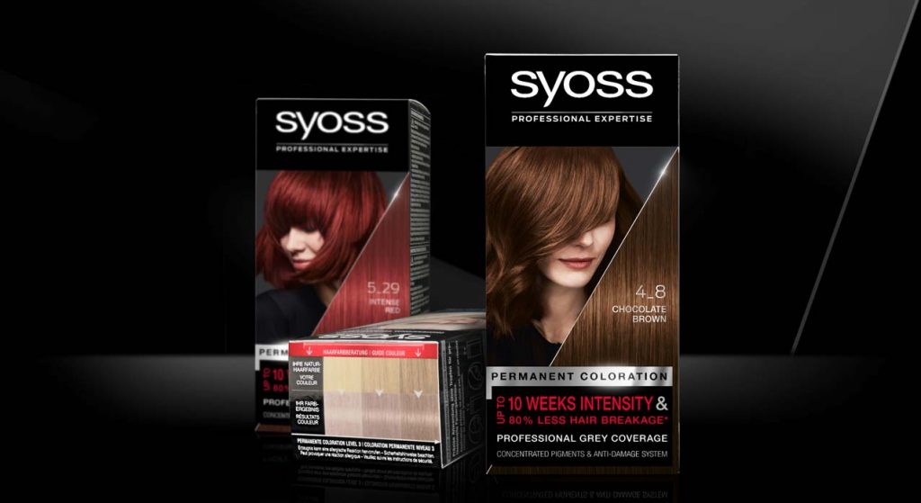
Accordingly, we worked with a just as much precise visual concept. The front layout shows a new diagonal cut, that complementary to the model integrates immaculate hair texture. This new hair-triangle with the prominent shade number puts a new focus on the outstanding hair quality, which will be reached by using Syoss hair coloration. The sharp cut visualizes precision, whereas the diagonal shape adds a new modern dynamic, that is also found in the details of the new model approach. Also, the new elements do visualize the technological performance of the patented colorist ingredient mix.
Strengthening the brand
Regardless the new implementations, the brand personality is still pure and clear, due to the bold black main color. Furthermore, the successfully proven color coding in black, silver and red – or blue for the lightening shades – ensures the brand recognition to the current user. The brands traditional black professionalism is now additionally underlined by clear color differentiation. This applies especially in case of the old fading between the models head line and the logo on the previous design. The new clear line between the both with the anthracite background behind the model are now strengthening the logo on top, which has got a clear standing on black.
Besides the color differentiation, we kept the horizontal layout division in logo, model and text block. Likewise, the very individual block text design in the bottom area kept this layout. Yet, we simplified the text elements to strengthen the consumers focus and set a new content-related focus. Especially the lightener shades benefit from the new structure, that implements the „Levels of Lift“ in the text box for a clear contextual communication.


Surround design
The precise, salon-like color result is the brands key benefit and need to be communicated to the consumer with a more prominent approach. Accordingly, the typical color guidance system was moved from the back to the top of the pack. This sets a new focus on the clear match between recommended base colors and achievable color results.
We also did design the icons on the side of the packaging. They communicate the usage in the precise coloration process in a way that fits the clear visual approach of the new facing.
Model approach
The brand Syoss was seeking for a new model inspiration that keeps the professional brand identity but appears more approachable.
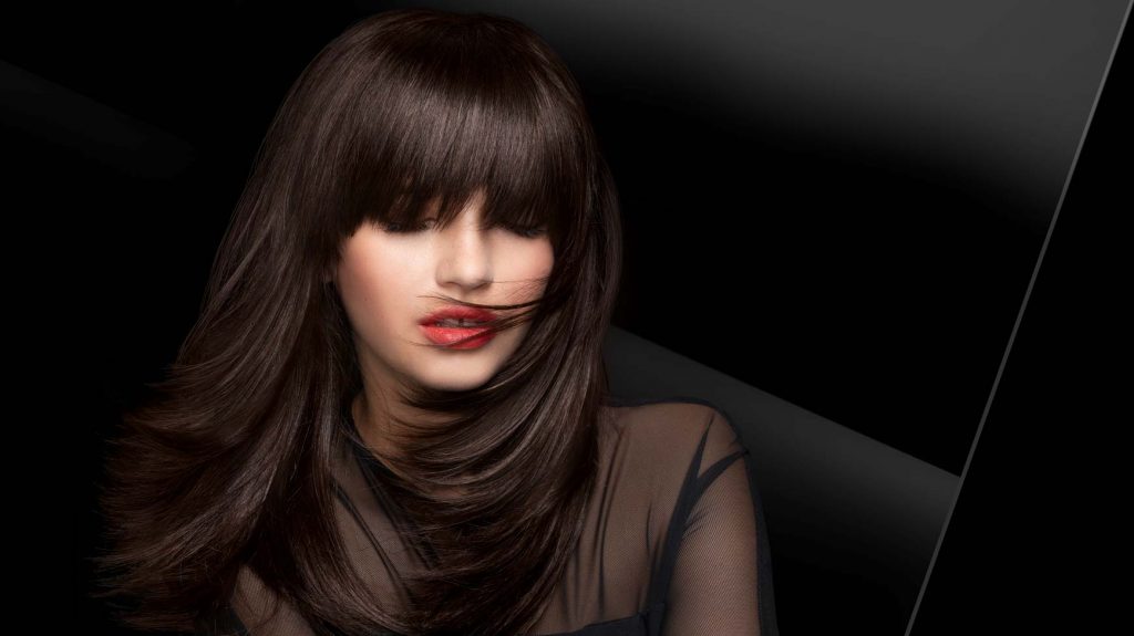
The brand is historically catching the consumers eye with unconventionally models with hidden eyes. Those have usually been covered by sharp fringe hair styles. Based on this, we kept the unique concept but modernized the style.
Now, the models have a dynamic hair cut line that covers the eyes in a more natural, not-perfect, more unexpected and approachable way. Nevertheless, the strong, mystery character and most importantly the perfectly professional hair quality are maintained.
Schwarzkopf Syoss colorationon the web


