Tag: Schwarzkopf

“A summer day outside” – for a beautiful summer at home
It’s finally summer! Due to the pandemic, travelling around the world is still easier said than done for most people. But luckily you don’t have to travel far to feel the sun and summer breeze on your face. Flower fields, bike rides and lovely patterned summer dresses are just a few of the things that turn a summer at home into fun.
If we think about summer at baries design, the Summer Repair line by Gliss Kur is one of the first things that pop up in our mind as in recent years we were consulted to design its limited packaging edition.
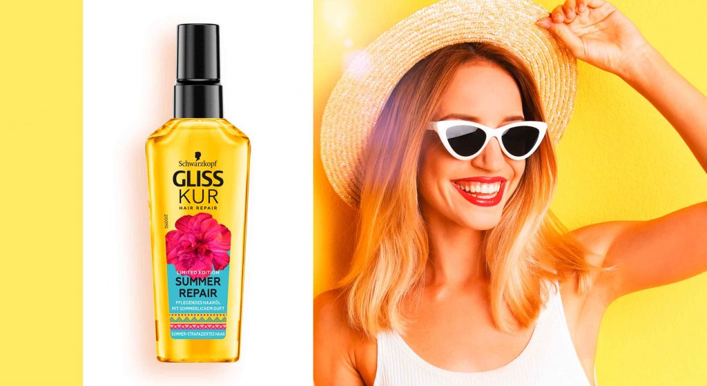
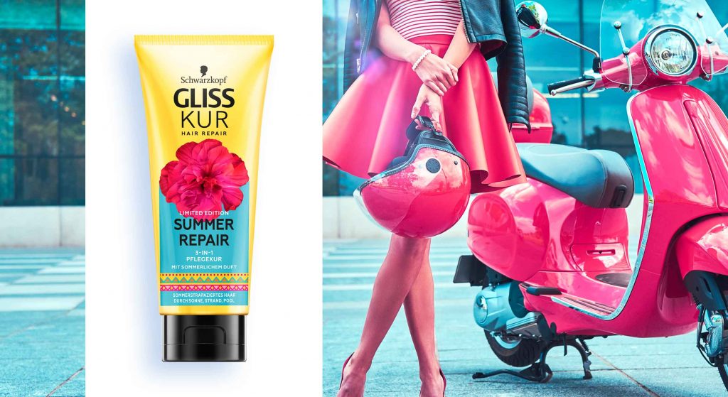
This year, we give the consumers a summer feeling without showing exotic beaches or sceneries. „A summer day outside“ is the theme of the Summer Repair design 2021.
But this is not the only reason why this year’s summer edition is special: for the first time we will design our summer edition straight onto our brand-new bottle shapes which we developed during the Gliss Kur relaunch last year!


Our work
The Gliss Kur summer repair edition is a product the consumers are looking forward to every summer. They love spending time outside in the sun. However, sun exposure, salt water and chlorine can cause damage leading to faded colour and dry hair. Consumers want to enjoy the summer without worrying about possible hair damage and thus appreciate beauty products with an emotional design they can relate to.
Therefore, the new summer repair design has a strong colour coding and design elements that evoke an enjoyable summer feeling. Especially the big pink flower in the centre of the design alludes to the floral scent of the formula. It sits on top of a light blue background that symbolizes the fresh blue of the summer sky. The blue colour complements the yellow bottle that stands for the warmth of the sun. Additionally, the design is topped off by a colourful and playful pattern. All in all, the composition reflects the warm feeling of a beautiful summer day outside.
Maybe you are interested in more hair care packaging designs made by baries design:

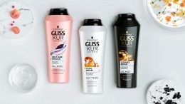


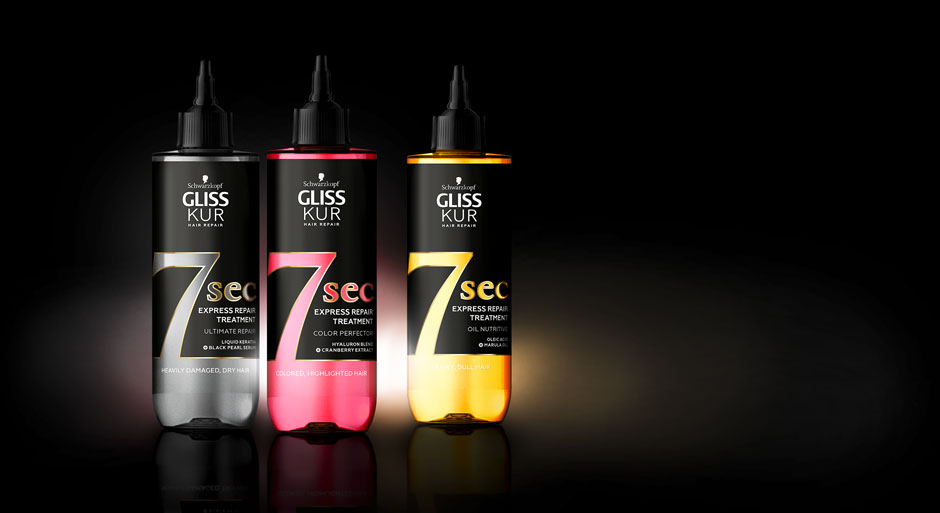
In 2021, Schwarzkopf launched a new innovative treatment solution developed together with baries design. The Gliss Kur 7 sec Express Repair treatment does not only repair hair in the glimpse of an eye but also immediately stands out on the shelf due to its strong colour effect providing a unique look. All these features are reflected in the packaging design.
New treatment design, combining label and bottle in a symbiosis of transparency, contrast & colour
With increasingly demanding lifestyles, the need for faster solutions and quick results is constantly growing. Inspired by Korean skincare traditions, the new in-shower transformative hair masks offer the benefits of a traditional mask in just 7 seconds, delivering intense repair for exceptional hair quality. These water-active masks contain a high concentration of powerful ingredients, achieving maximum results in minimum time.
Our work
When designing the product, it was very important to showcase the innovative effect of the mask which delivers the ultimate result in just 7 seconds. Therefore, we highlighted the 7 seconds with the help of concise typography. In addition, number and text are cut out so that more of the liquid mask inside the bottle is visible. At the same time the coloured liquid matches the respective signature ingredient such as black pearl serum, cranberry extract & marula oil. Together with the black label and the gold finish contours, the overall design impression is reduced, yet sophisticated and premium.
Schwarzkopf Gliss Kur 7sec Express Repair Treatment, designed by baries design
Maybe you are interested in more hair care packaging designs made by baries design:

The brand IGORA Vital has been in Latin American countries for more than 50 years and is well-established. It provides a unique treatment coloration combined of Keratin & Serin including 7 Oils. But these caring properties weren’t prominent enough on the brands packaging design. Therefore, it had to be emphasized as part of a brand relaunch.
The new packaging design of IGORA Vital brand relaunch
The aim was to make the brand the first option for women over 35 who are experiencing greys for the first time. To position the brand under the care concept, a packaging design with more advanced caring properties was required. For this reason, the following objectives should be taken into account:
- Create an appealing look & feel leading to a superior market position.
- Clear visualization of the benefit: perfect care while coloring.
- Adapt the design structure to the Gliss Color architecture created by baries design.
- Keep IGORA’s main elements to not lose current users of the well-known brand.

Our work
Together with the team from IGORA vital, we strengthened the brand position in the Latin American market. So, we were able to reinforce the brand’s unique selling proposition with a new packaging design.
We started to move the packaging design forward by adapting a more modern and structured design architecture as well as the colors of the packaging. To evoke a premium brand image and to not lose existing users at the same time, the elegant blue, red and gold have been kept. But now the colors are balanced in a new way such that a premium appearance is ensured. As an example, the background color red has been moved to the bottom part of the focal text box.
In order to appeal to a target group of 35+, who experience greys for the first time, a new model approach was required. In order to that, the new packaging design shows women in the age of the target consumer with a natural and approachable presence. Additionally, more modern fonts have been applied. Especially on the shade number – an important aspect influencing purchase decision – this transformation leads to a more elegant brand image.
prominent oil visualization on the packaging design to underline the intense care
Absolutely crucial was to communicate IGORA’S caring properties and to reinforce the caring concept: permanent coloration that does not only protect the hair from damage but treats the hair during the coloring process with an anti-breakage action. The new built-in ‘Color Care System’ uses the most advanced anti-hair-damage technology and 7 Oils complex for outstanding caring properties. Hence, our main focus was to include a very prominent oil visualization on the packaging design to underline the intense care. The oil visualization is a drop in a soft and smooth shape with inner texture and light reflections to make it stand out and give it a premium and caring character. To make it easier for consumers to understand the complex caring formula, we have decided to put focus on the 7 Oils complex and included this benefit on the drop in text form.

Igora_Vital_Blog_Mood_Relaunch_and_Silver
Through the elegant color tones and the new design architecture, the brand stays recognizable for existing users. At the same time, it transfers a more premium look & feel. With natural and approachable women, the right target group is addressed. Overall, the packaging design creates a more caring, modern and sophisticated brand image. An additional line extension for more mature women has been created by highlighting silver color tones. Thereby, the key target user can be addressed directly and a broader market may be explored.
See more relaunch designs made by baries design

„Content design means brand building beyond packaging design“
In 2020 the Henkel Schwarzkopf team asked us to create video content designs for two of their social media campaigns and we were happy to assist the brands with design work that goes beyond packaging design.
The brief
- Catch attention on the Schwarzkopf social media channels
- Motivate viewer to participate on social projects
- Create short but interesting videos & additional content material
Schauma “Family Action“ campaign by Schwarzkopf
The idea behind this campaign was to generate possible family projects during the first corona lockdown in 2020. With kids being homeschooled and having no possibilities to meet with friends, this Schauma campaign provided a welcome, creative and fun alternation.
Families should be motivated to craft something creative out of old shampoo bottles. The best ideas could win a Schauma package for the whole family. We are at least as happy as the winners about this initiative and that we were able to support this family-friendly and sustainable project. #upcycling
Our work
The aim of the campaign is a super family-friendly, funny and happy look and feel. It is intended to speak to both parents and their children. Therefore, we shot an authentic video ourselves in which one of our designers is doing handicrafts with her son at home. In combination with short and incisive calls to action and happy background music, we have created an appealing and emotional video.
In addition, we used one of the crafting ideas from the Schauma team as further inspiration and created a simple, easy-to-understand, yet entertaining crafting manual for an Instagram carousel post.
Schwarzkopf & Henkel‘s charity campaign with DFB
The second video content was created to promote Schwarzkopf & Henkel‘s DFB collectors edition campaign via the social media channels. In 2020, even the European soccer championship was cancelled, due to the pandemic. Nevertheless, the Schauma, Taft and Fa teams decided to launch their planned collectors packaging design edition of the national team anyways. To support amateur clubs, who where also hit by the crisis, Henkel brought a fundraising campaign to life. With every sold product from the collectors‘ edition, 10 cents were donated.
Our work
Accordingly, the design of the social media content follows the design rules of the packaging design. We have created a suitable call-to-action video that shows the products and explains the fundraising campaign, but also has an emotional twist with pictures of soccer playing kids.
Learn more about Schwarzkopf & Henkel‘s soccer charity project
See more packaging designs made by baries design


Seasonal limited editions by Schwarzkopf Gliss Kur allow us creative freedom. Therefore, we had a lot of fun creating the limited edition design for Gliss Kur Winter Repair 2020.
Elegant and modern design for winter-stressed hair
The challenge
Contrary to the baseline range, the design should be more disruptive while reflecting the products winterly benefits. Furthermore, we should consider a few other aspects:
- Keep the logo as it is
- Use the new relaunch bottle design
- Create an emotional story around the winter theme
Our work
Like in the years before, we were so excited to create the design for this seasonal range. By breaking up the usual brand structure, the Winter Repair edition differentiates more and more from the baseline. Luckily, this development gives us a lot of leeway to build the design.

Gliss Kur Winter Repair 2020 Limited Edition Design
We used the new Gliss Kur bottle designed by baries design as the basis for the design. Thanks to the flowing shape, there is a bigger label and therefore more space for layout. Furthermore, to create a winterly atmosphere, we chose white as basic color. This clean basis also stands for the caring character. The abstract blue watercolor visual suggests an icy surface and transports the winterly coldness. In addition, golden lettering and snowflakes complete the design and create a luxurious look.
Moreover, the strong caring formula is explained by the powerful dark blue tones as well as through the product name lettering. While the word “Repair” states the technological part through a sans serif font, the handwritten word “Winter” communicates the caring aspect.
All these style elements create a look & feel that brings the emotional winterly atmosphere to the bathroom and still conveys the years of expertise that Gliss Kur stands for.

Gliss Kur Winter Repair 2020 Limited Edition Range Mood
Schwarzkopf Gliss Kur Winter Repairon the web