Tag: sustainable

Contemporary design meets Punk
As we are always looking for the latest trends in design and lifestyle, it is our goal to offer perfect products to consumers. With our creative hub SIIDS we constantly develop and promote our creative potential and invite you to be part of it.
Nowadays sustainability is a must and should be considered in every product development. Therefore we looked at the market of decorative cosmetics, which is flooded with plastic packaging. While there is a massive usage of foils and plastics, the filling quantity is not consumer-friendly. Therefore we felt the need to develop a packaging that is both sustainable and consumer-friendly without sacrificing any stylish elements.
The idea was to develop a sustainable and refillable mascara kit, equipped with different brushes, for an exciting shopping experience. The kit includes a refillable Mascara tube, bioplastic refill containers and a selection of brushes for different looks and occasions. The design should be purist, contemporary and expressive.

ARC professional make-up concept, mascara © 2023, baries design GmbH
Brand & Logo development
When designing the product, we took into account that the brand should have a niche character but still appeal to a wide audience. It was also of great importance to position the brand in such a way that it can be extended to a broad product portfolio. In future more mascara colors will be included in the range as well as liquid eyeliner in refillable containers.
The logo ARC has a simple but graphic approach. The C also serves as the signet of the brand. The arc symbolizes the curved eyelashes and thus embodies the hero product. The look & feel of the brand should express calligraphy, punk, contrast and a contemporary style.
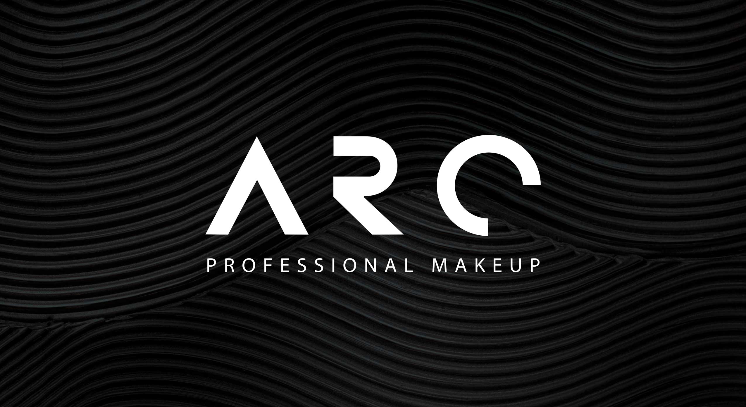
ARC professional make-up concept, logo close-up © 2023, baries design GmbH
Discover more siids projects!
On the constant look-out for new challenges we have the demand to push ourselves and to be creative. With our innovation hub siids we now bring our brave ideas to life and invite you to be part of it.


In 2019, the new Vademecum bio kids design featuring ‚Happy Companions‘ was added to the Vademecum bio toothpaste portfolio.
The brief
- Communication of the free-from formula combining scientific expertise with natural extracts
- Matching color coding to the Vademecum bio baseline
- Creation of cute child-friendly characters featured in a minimalistic drawing style

Our work
For the new Vademecum bio kids line we developed the packaging design & illustrated two individual characters to embody the ingredients and taste of the toothpaste. The mint and the strawberry are very cute and illustrated with bright and happy colors. The friendly design and characters will help to make brushing teeth a fun thing to do for children.
In order to highlight that the toothpaste is completely organic, a natural pastel color tone and recycled paper structure were used for the basis of the pack. Furthermore, the „Bio“ -seal was placed in a prominent and freestanding position, to make it clearly visible to the customer.
We used a simple and easily understandable color coding, which harmonizes with the color of the illustration, to differentiate the two sorts and to highlight the user age recommendations.

Vademecum Bio Kids on the web