

Challenge
In 2022, Schauma, a brand steeped in tradition with over 80 years of history, faced the challenge of refocusing its brand identity – towards an emotionally charged family brand with the new claim “bathe your family in love”. At the same time, it was essential to retain its existing customer base and attract new target groups.
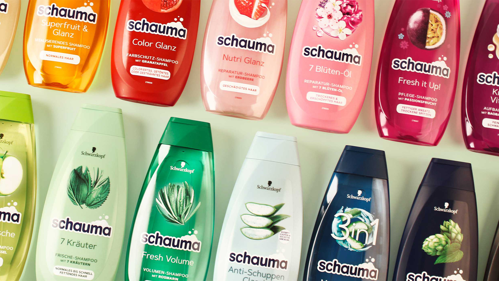
The goal was to develop a unified, modern packaging design for a very broad product portfolio with over 60 SKUs. This involved harmonizing the diversity of the sub-brands, simplifying the overall look, and improving sustainability. Furthermore, clear shelf recognition was essential to strengthen Schauma’s position as a leading shampoo brand.
Approach
The relaunch was built on a holistic packaging design that visually expresses Schauma’s brand values — Family, Love & Care. Key design principles included reducing visual complexity, standardizing the color system, and eliminating model photography in favor of a calmer, more authentic look.
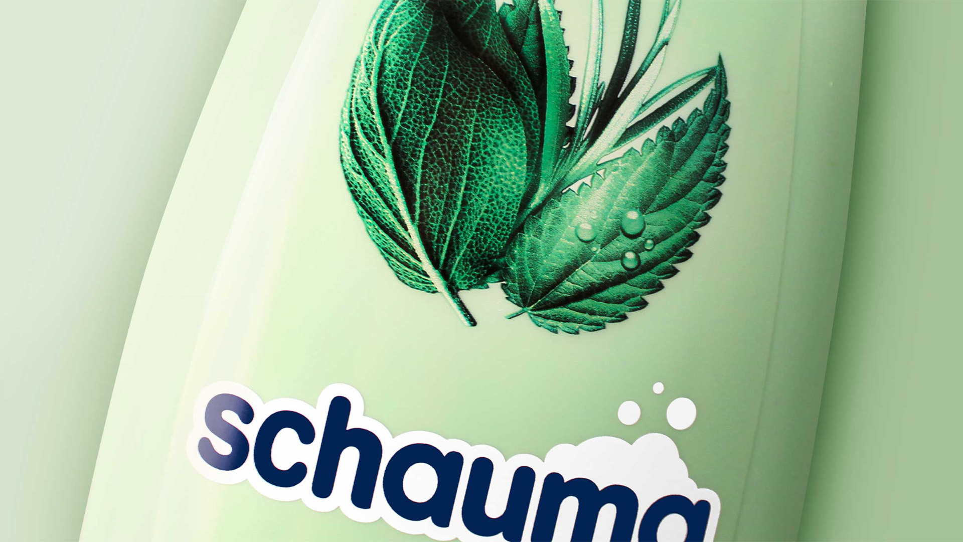
Through strategic brand consulting, portfolio analysis, and a systematic design approach, a cohesive visual world was created that seamlessly integrates all sub-ranges. The new design features natural ingredient visuals, recycled materials, and an updated logo incorporating foam elements — a subtle reference to Schauma’s heritage and emotional resonance at the point of sale.
Process
A modular packaging system was developed for over 60 products, introducing visual calm while maintaining variety. Harmonized color schemes, coordinated bottle and cap tones, and the absence of model images produce a unified, contemporary look.
The refreshed Schauma logo — with its foam-inspired detail and simplified typography — strengthens brand identity and recognition. High-quality ingredient illustrations were arranged in circular compositions, referencing Schauma’s visual heritage while creating differentiation on shelf.
Result
According to Henkel, Schauma remains Germany’s best-selling haircare brand and has held market leadership for decades. The relaunch successfully reinforced its position as a family brand while expanding the range to address diverse hair needs.
The minimalist, sustainable design was honored with the Red Dot Design Award for Brand & Communication Design — a testament to the high creative and strategic quality of the relaunch.


A new logo in line with the brand value of foam and packaging with clear communication make it easier to find the right Schauma product.