Challenge
baries design was tasked with creating a packaging facelift for the UK and other European markets.
The objective: make consumers feel confident that every wash is safe with Colour Catcher.
The facelift also needed to reinforce Colour Catcher’s premium image, ensure immediate understanding, and present a contemporary, self-explanatory look.

Approach
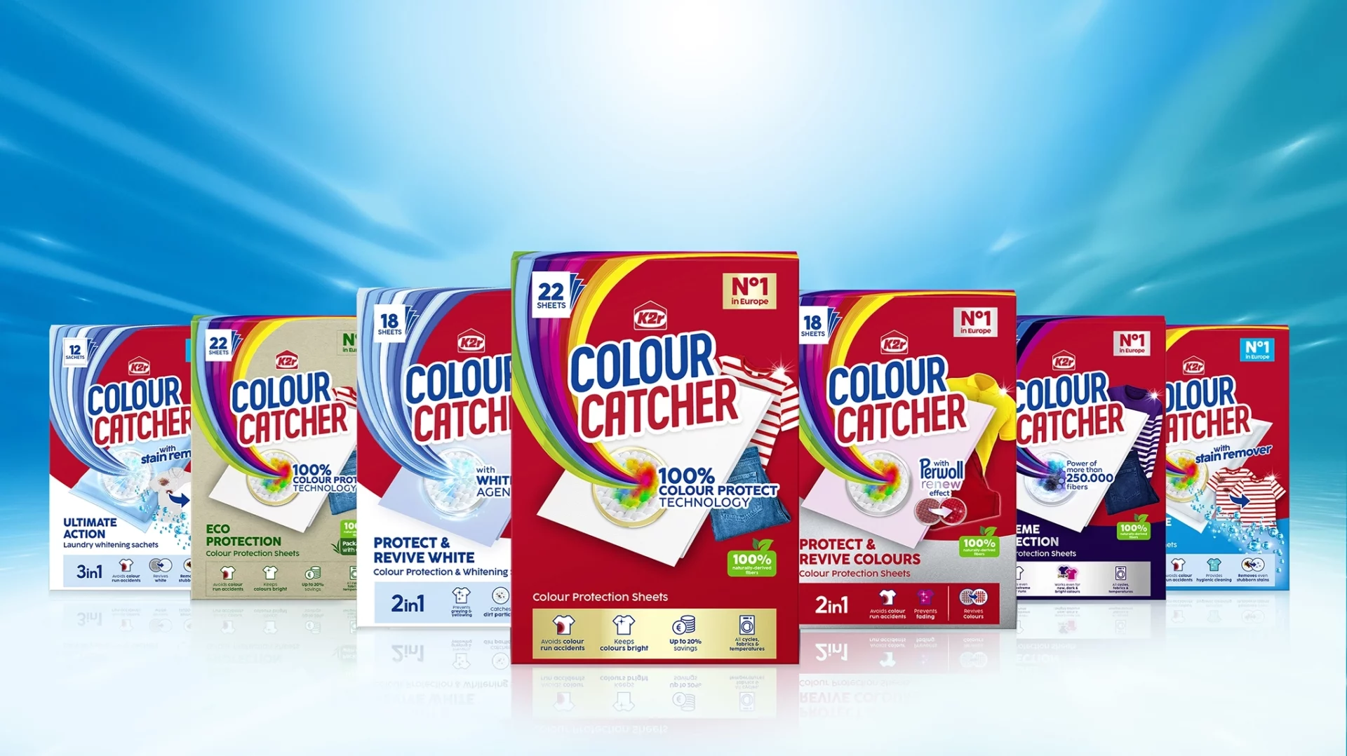
Clarity guided every design decision: A structured, tidy layout for maximum legibility. The iconic Colour Catcher red used flat and solid, without gradients. The rainbow key visual reworked with a luminous surface and top-down perspective for depth. Benefits communicated through simple, intuitive icons. The Colour Catcher sheet placed front and center as a shield protecting the laundry. Through this multi-layered approach, visual clarity underscored the brand’s high-performance promise.
Process
Working closely with the client, the baries team developed multiple design routes within Colour Catcher’s strict branding framework.
The main challenge was to innovate creatively while respecting the brand’s existing visual grid.
Adaptations were also created for different markets, ensuring consistent recognition across regions despite variations in product naming.

Result
The Colour Catcher relaunch delivered a premium, clear, and cohesive visual presence.
By focusing on clarity in structure, color, and communication, baries design strengthened Colour Catcher’s status as the No.1 laundry protection brand in its market segment.