Challenge
Scalp care is evolving from a niche segment into a standalone care category. GLISS wanted to seize this momentum and launch a new scalp care line whose design language conveys the scientific rigor of the products. The core idea: “Scalp is the foundation of your hair.” A healthy scalp creates the basis for strong, healthy hair. baries design was tasked with developing packaging that makes this philosophy visible while deliberately appealing to both women and men equally. The challenge was to find a visual language that feels neither too clinical-cool nor too feminine. Instead, a unisex design was needed — one that radiates efficacy while functioning as a lifestyle product on the shelf.
Approach
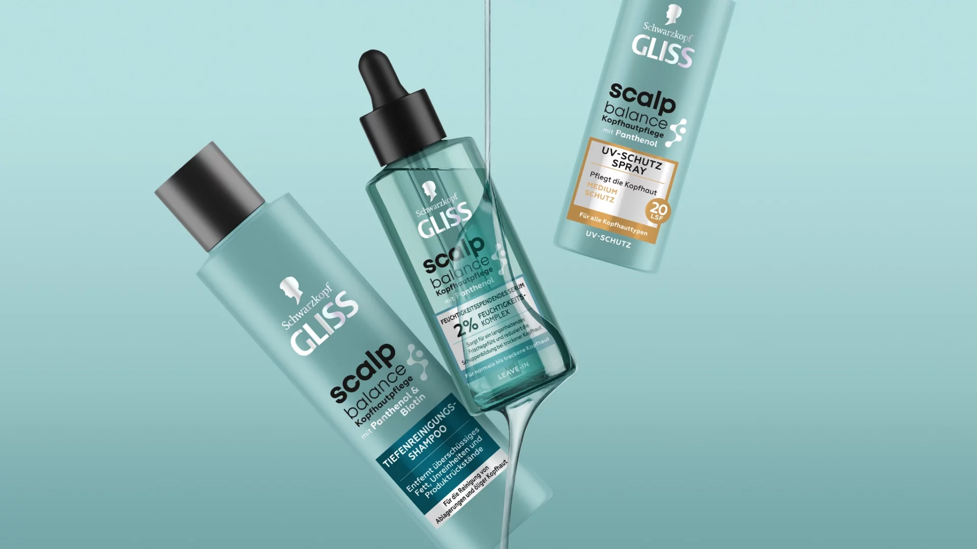
The baries design strategy focused on combining dermatological credibility with modern aesthetics. The serum color palette pairs teal with black. Teal conveys freshness and purity, while the black pipette lends the line a professional character and a clear unisex coding.
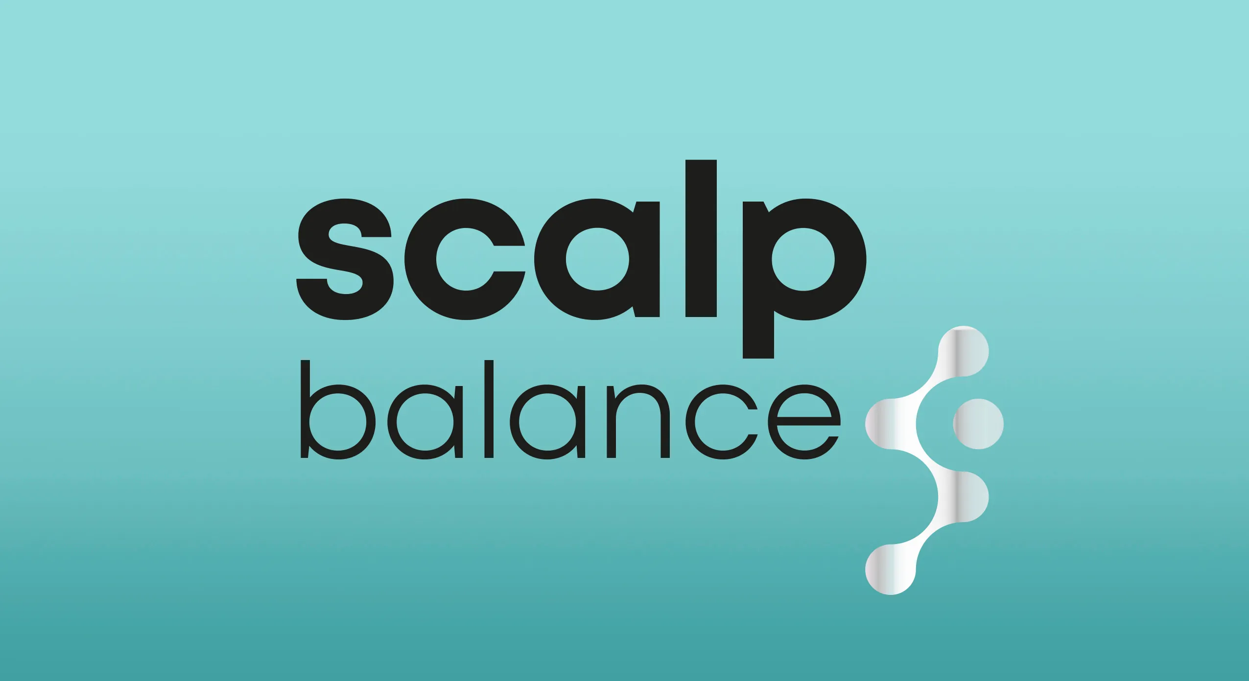
The central element of the word-image mark is a silver-finished molecule icon that visualizes the active-ingredient expertise of the serums directly on the packaging. Combined with a reduced, clean typography, this creates a visual RTB that builds trust before the product is even opened.
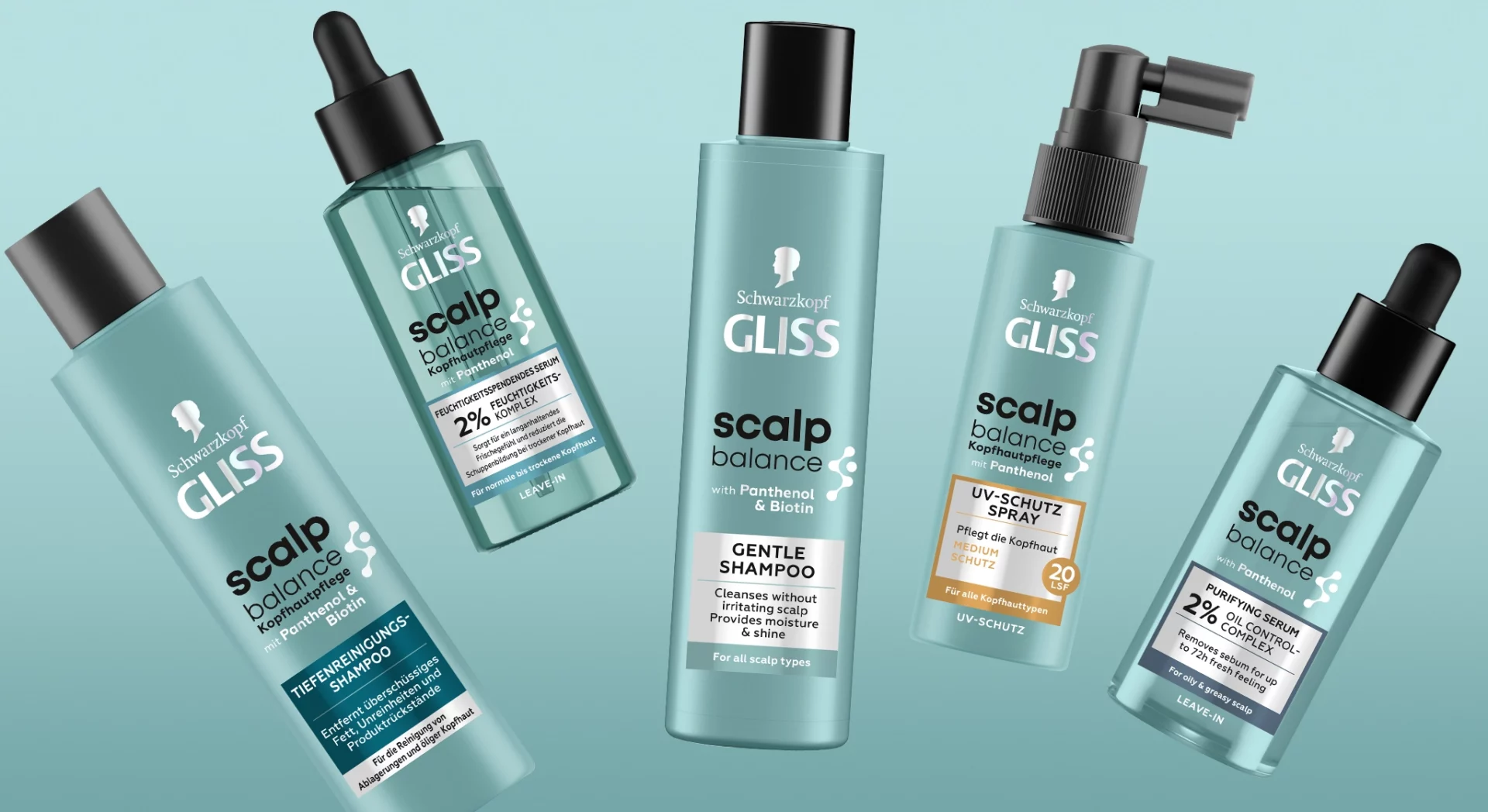
The result: a precise, clean appearance with a premium feel that clearly differentiates itself in the competitive landscape.
Process
At the heart of the design process was the question of how to unite scientific credibility and accessible lifestyle aesthetics in a single design. The baries team first analyzed the scalp care market and identified a design gap between purely clinical and strongly feminine approaches.
On this basis, the team developed the word-image mark as the central anchor point of the entire line. The molecule icon was refined through multiple iterations until it precisely captured the active-ingredient character of the serums.
Color palette, finishing, and typography were carefully coordinated to ensure a gender-neutral appeal while creating clear differentiation on the shelf.
Result
The packaging design of the GLISS Scalp Balance line translates the scientific core idea — “Healthy hair starts here.” — into a clear, distinctive design language.
The combination of a silver-finished molecule icon, a teal-and-black color palette, and clean typography positions GLISS Scalp Balance as a scalp care expert without excluding any target group. The result is a cohesive overall look that authentically conveys the brand’s active-ingredient expertise and convinces both on-shelf and digitally.
baries design developed a clean, scientifically grounded packaging line for GLISS Scalp Balance that appeals equally to women and men. The design combines dermatological expertise with a modern, gender-neutral aesthetic that immediately stands out on the shelf and communicates efficacy.