Challenge
The 2023 packaging relaunch aimed to modernize Maison Verte’s appearance and broaden its appeal beyond the eco niche.
The goal was to highlight the brand’s key attributes — freshness, cleanliness, and sustainability — while aligning with contemporary design aesthetics.
Approach
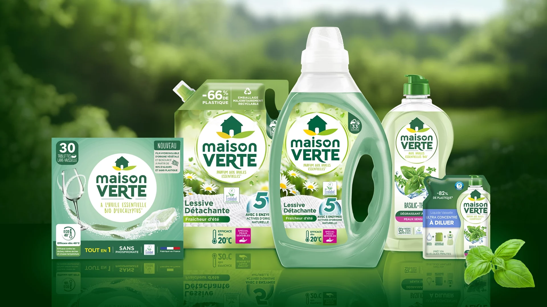
baries design restructured the brand architecture, placing the iconic “green house” (Maison Verte) at the visual center.
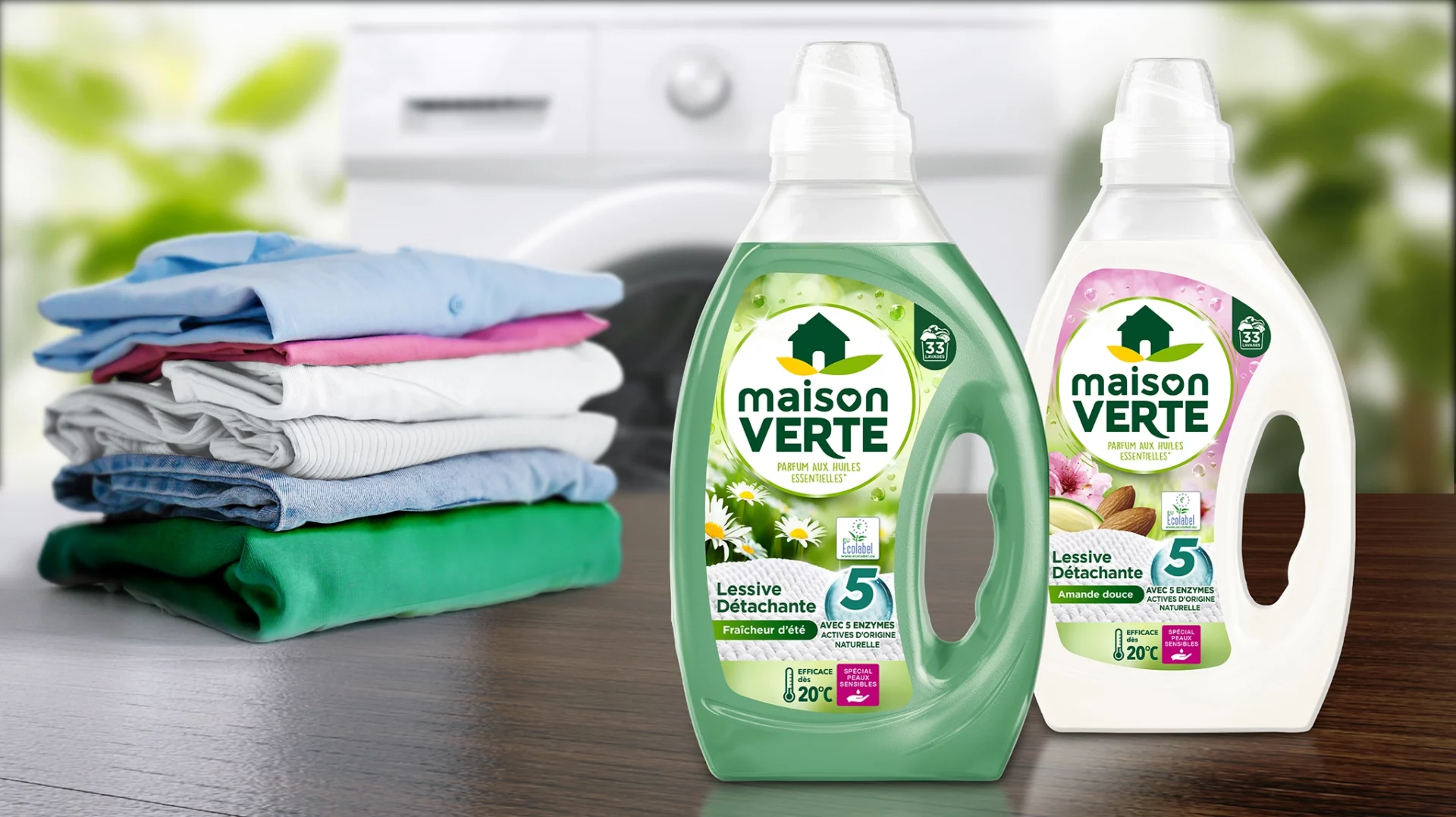
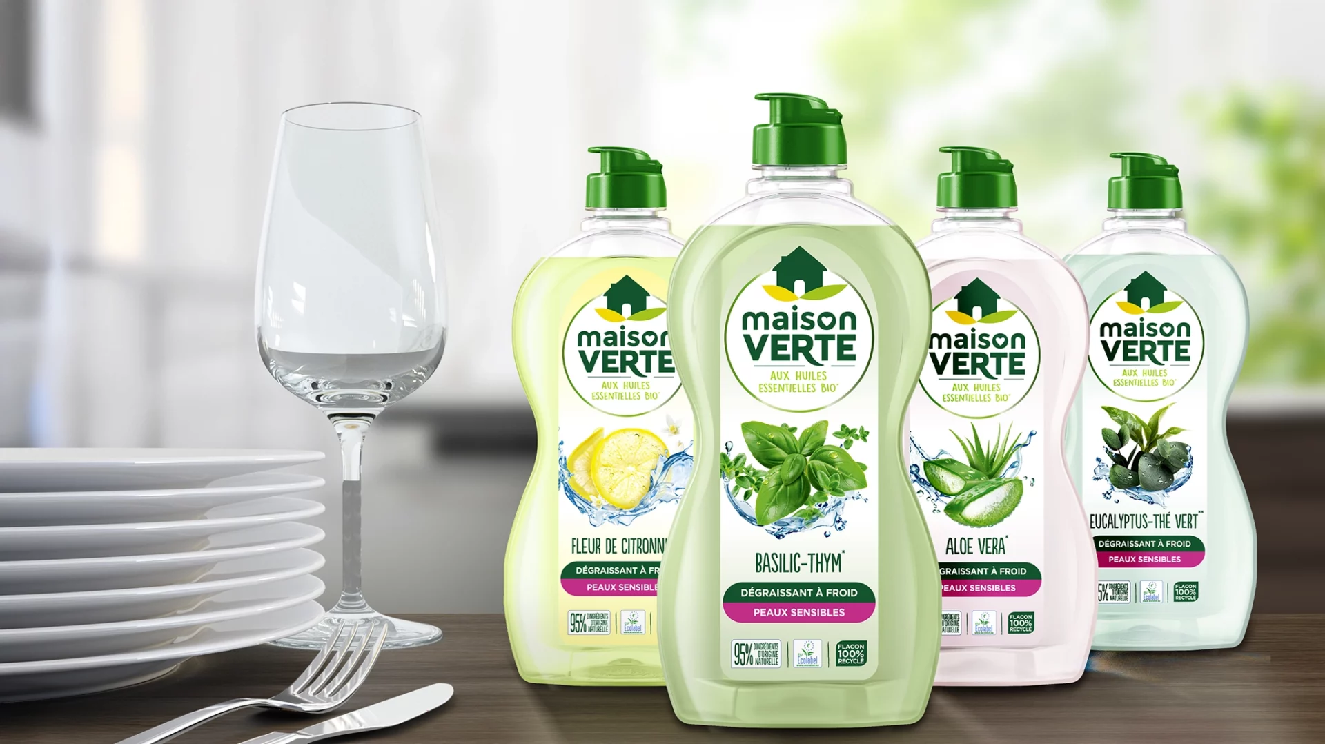
Green served as the dominant design color, representing freshness and environmental care.
Soft pastels and illustrative elements emphasize individual variants (e.g., almond, chamomile) and evoke fabric textures — reinforcing Maison Verte’s approachable and modern household appeal.
Process
baries design began with an in-depth market analysis of the French detergent sector.
In close collaboration with the client, several design routes were developed and refined until the final version emerged — clean, approachable, and unified.
Result
The relaunch repositioned Maison Verte as a modern, trustworthy choice in the French cleaning market.
The design makes brand values — sustainability, freshness, cleanliness — immediately visible.
Its structured layout and cohesive green color family unify the product range, turning diverse SKUs into a recognizable brand family on shelf.