Challenge
Pril is a trusted, established brand known for strong performance and quality.
The goal was to develop a product line that visibly communicates sustainability and naturalness without compromising Pril’s core identity.
The challenge lay in presenting natural qualities while maintaining the impression of cleaning power.
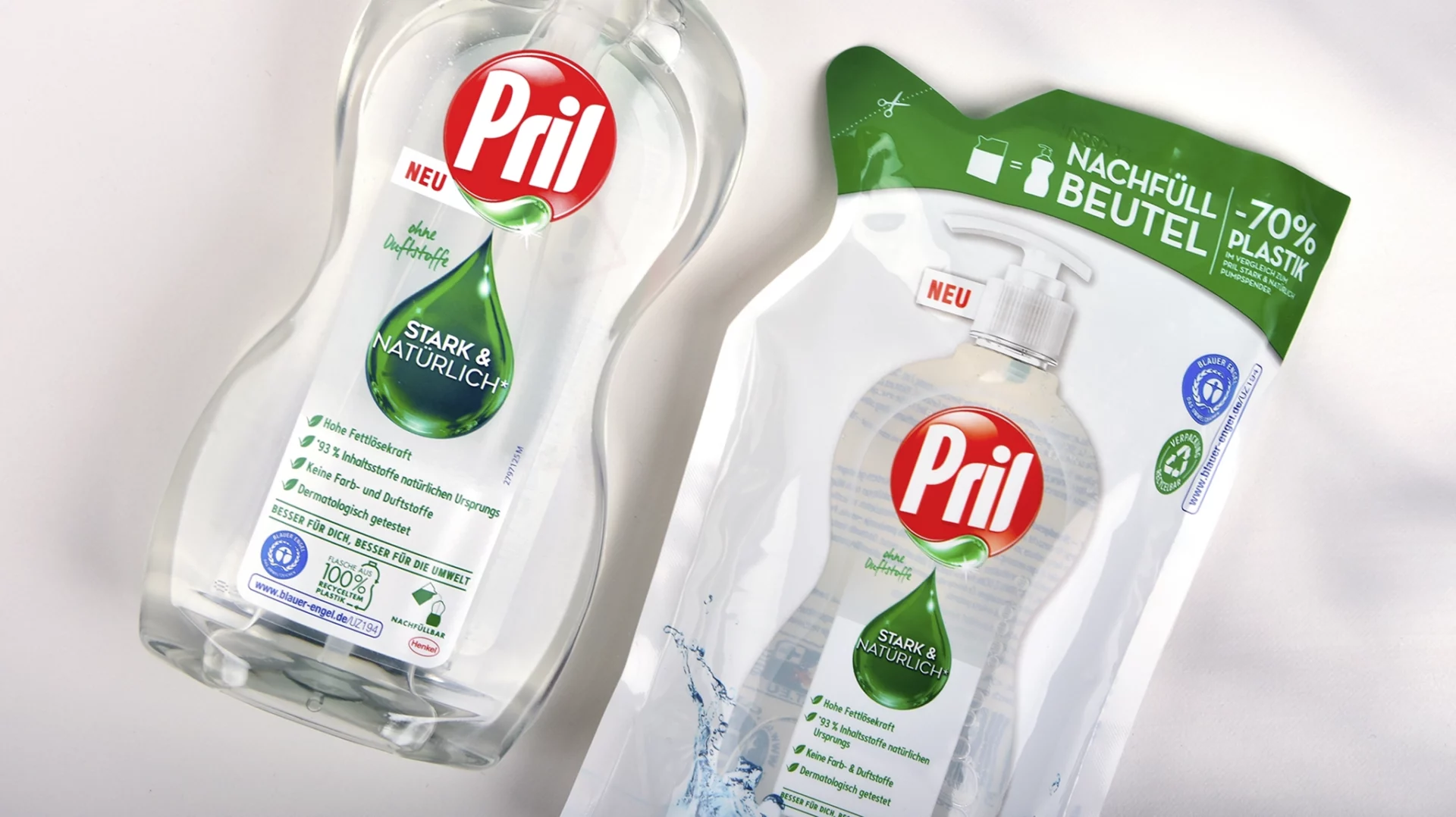
The design also had to introduce a new refill pouch that uses {{70% less plastic}}, clearly communicating this eco benefit to consumers.
Approach
baries design created a visual concept uniting naturalness and performance.
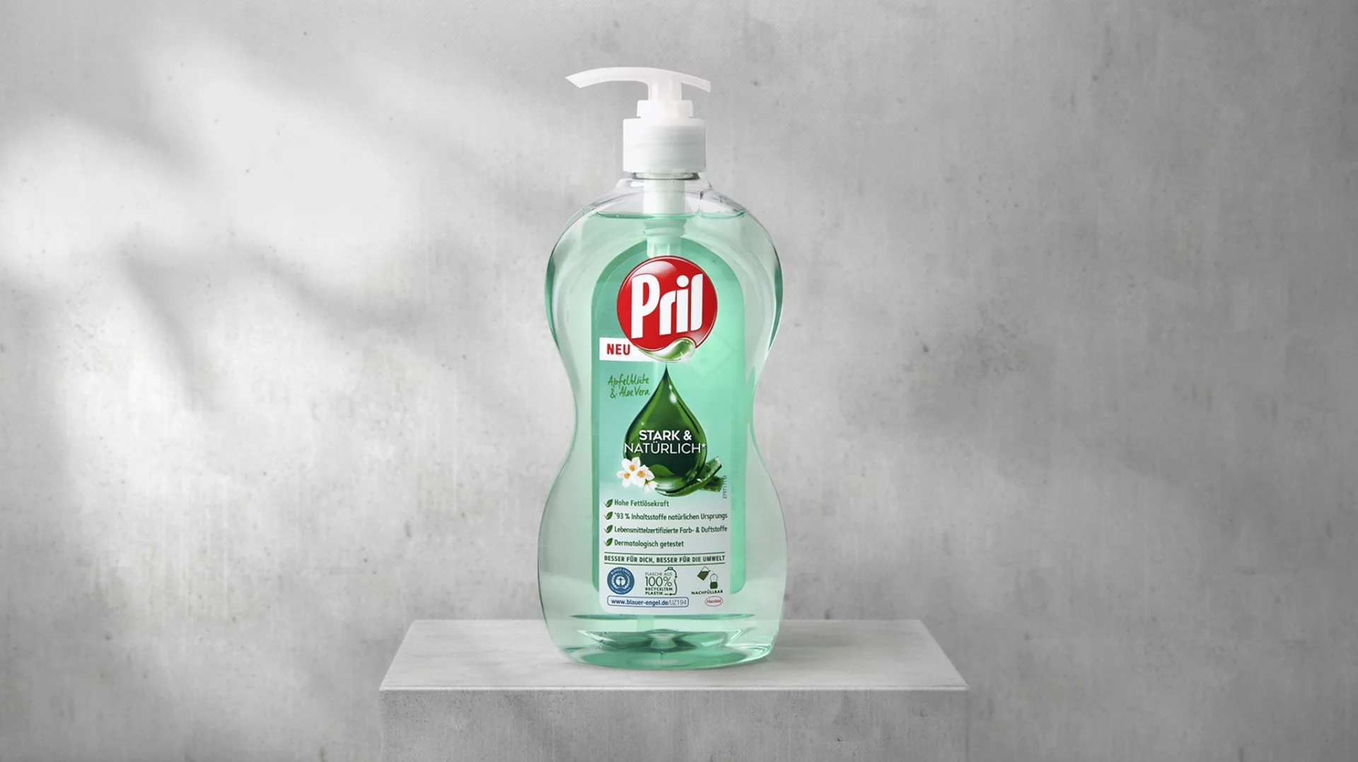
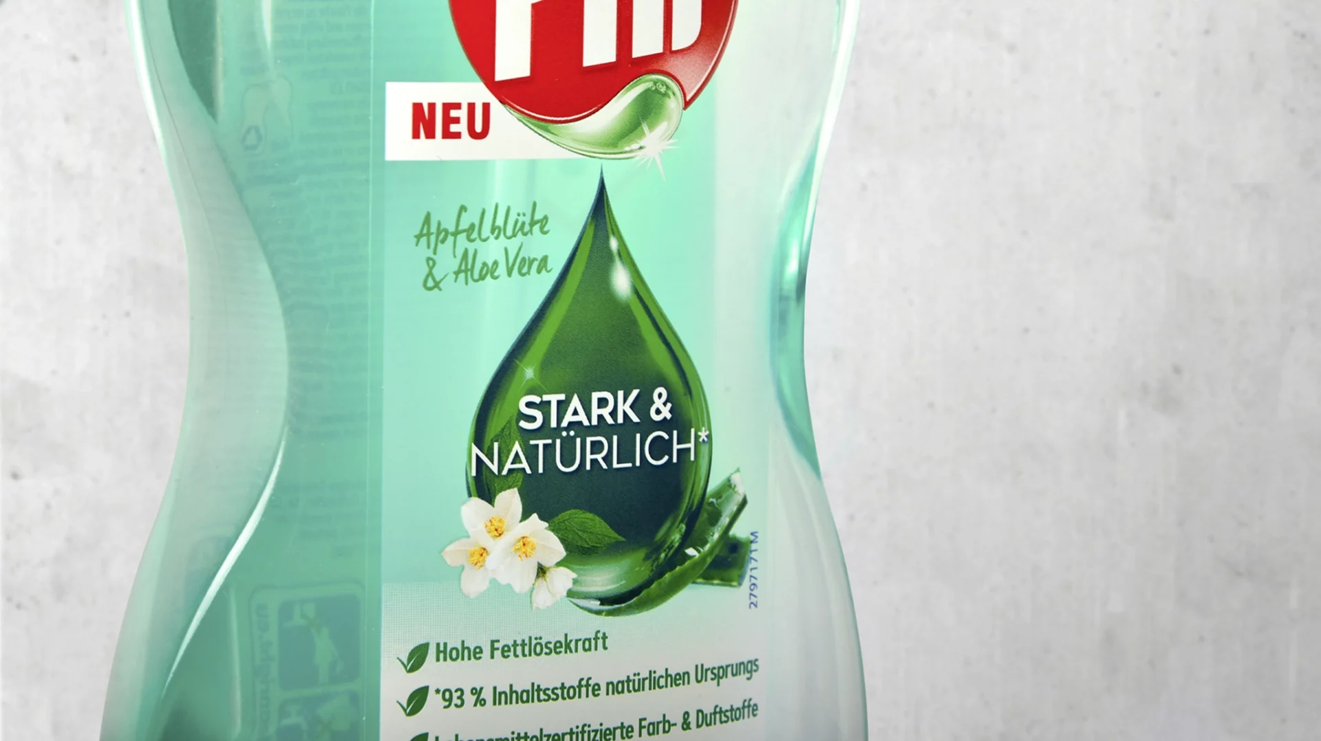
The iconic Pril droplet was retained but recolored green and adorned with subtle apple blossom visuals — symbolizing purity and strength.
The Pril logo was adapted accordingly. Transparent bottle windows and an image of the pump dispenser on the refill pouch improve orientation and build trust.
The new packaging concept makes sustainability tangible and supports Pril’s environmental strategy without compromising its core brand identity.
Process
In an iterative collaboration with Henkel, baries design explored several design routes.
The focus: a packaging concept that reflects Pril’s established identity while visibly communicating sustainability.
The team conducted a comprehensive competitive analysis to identify opportunities for differentiation and studied consumer purchasing and usage habits for dishwashing liquids — applying a customer-centric design logic.
Result
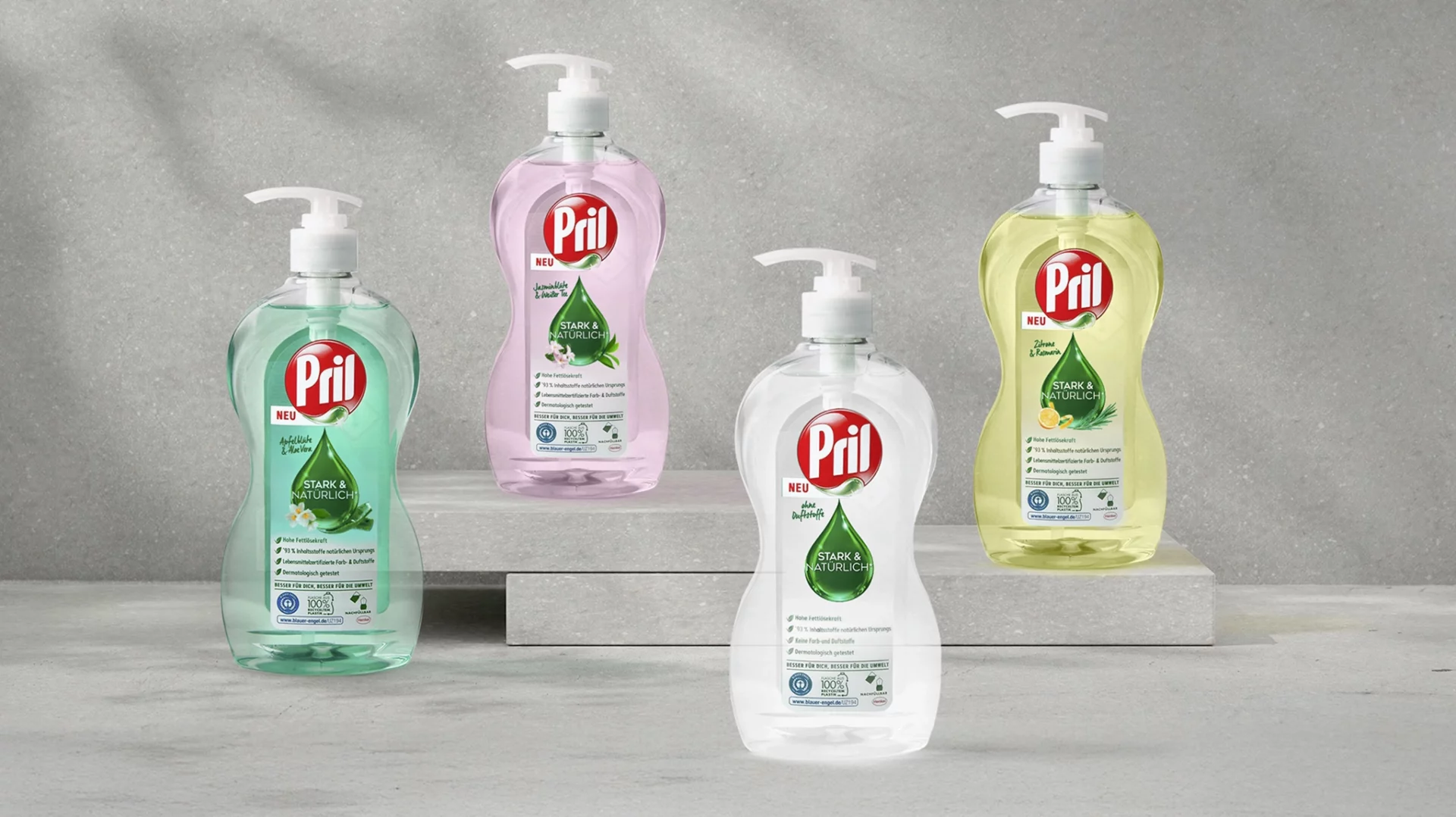
The new design for Pril Strong & Natural combines familiar brand strength with a credible sustainability message.
The green droplet stands for natural cleaning power, while the transparent, structured design enhances recognition and purchase confidence.
Overall, the packaging design has contributed significantly to making Pril’s environmental and natural positioning visible and relevant — supporting both perception and sales at the shelf.