Challenge
baries design brings decades of expertise in tailoring beauty packaging for the nuanced APAC market. Recognising that Asian consumers don’t just follow trends – they define them – we analysed local aesthetic preferences to create designs that resonate deeply. For this project, we anticipated the region’s booming ‘Clean Beauty’ movement, seamlessly executing it through a highly curated ‘Model Approach’.
Approach
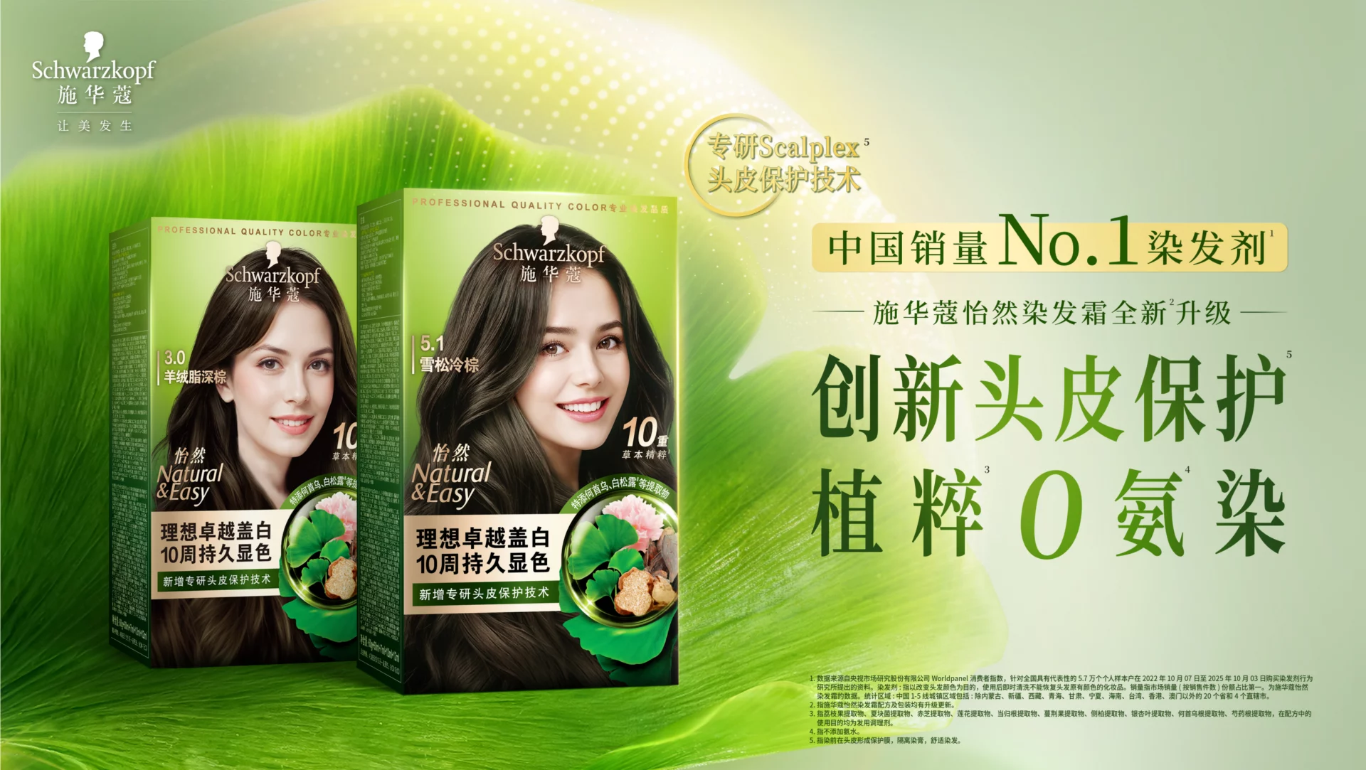
Hair colouring is a category driven entirely by trust. Because consumers only see the results after application, the packaging must do the heavy lifting at the point of sale. It is the tangible embodiment of the brand’s promise. Natural & Easy uniquely bridges nature, traditional Chinese medicine botanicals, and modern science. The relaunch required a delicate balance: rejuvenating the brand and strengthening its premium appeal, without alienating its loyal consumer base or diluting its heritage.
Process
Our approach focused on the brand’s visual core assets to reflect a premium identity.
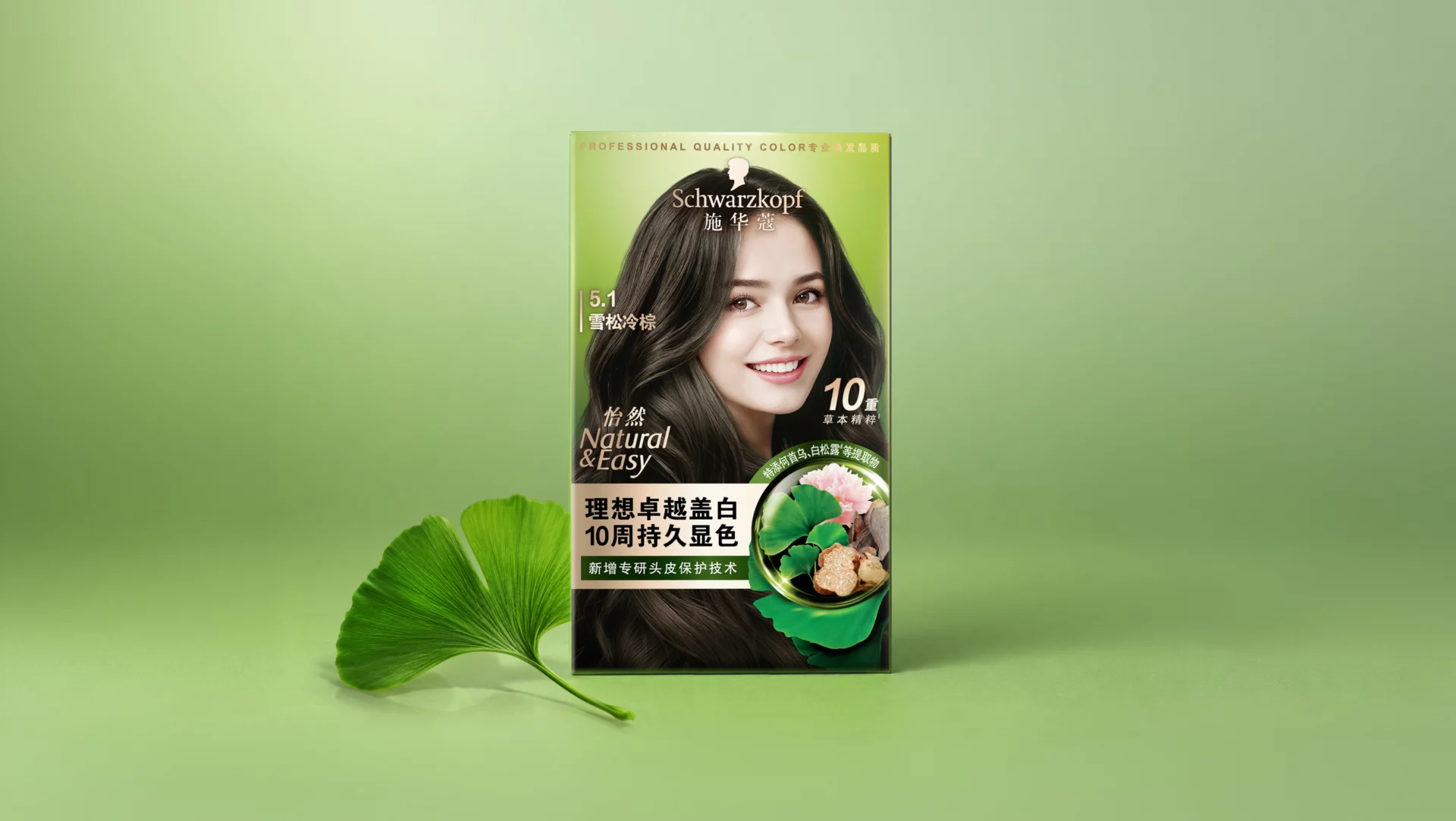
The signature brand green is retained as a vital anchor for instant shelf recognition. It was revitalised to inject fresh, modern energy.
Meanwhile, to visually validate the intersection of natural efficacy and scientific rigour, the botanical ingredients are suspended within a tech-inspired hydrosphere graphic.
The modelling approach was grounded in the ‘Clean Beauty’ theme, with visual language that conveys serene confidence, calm, care, and natural radiance.
A structural gold bar anchors the layout, establishing a clear visual hierarchy. Paired with clean, sophisticated typography, it highlights key performance claims without overloading the minimalist, upscale aesthetic.
Result
The result is a masterclass in harmonious design. By seamlessly blending the vibrant green, technical hydrosphere, editorial imagery and premium gold accents, Natural & Easy sheds its traditional, clinical-looking look. The brand emerges as a tactile, contemporary and youthful icon, all while remaining loyal to its original DNA.