Challenge
The new Clean Beauty brand one.two.free! required a distinctive visual identity and packaging design that would appeal to young, trend-conscious Millennial women.
The challenge was to visually communicate the brand’s core values — transparency, naturalness, and efficacy — through design that felt fresh, bold, and intuitive.
The visual system needed to highlight the simple 3-step skincare routine, stand out on shelves, and perform strongly across digital channels. The logo also had to express purity, modernity, and ease of use.

Approach
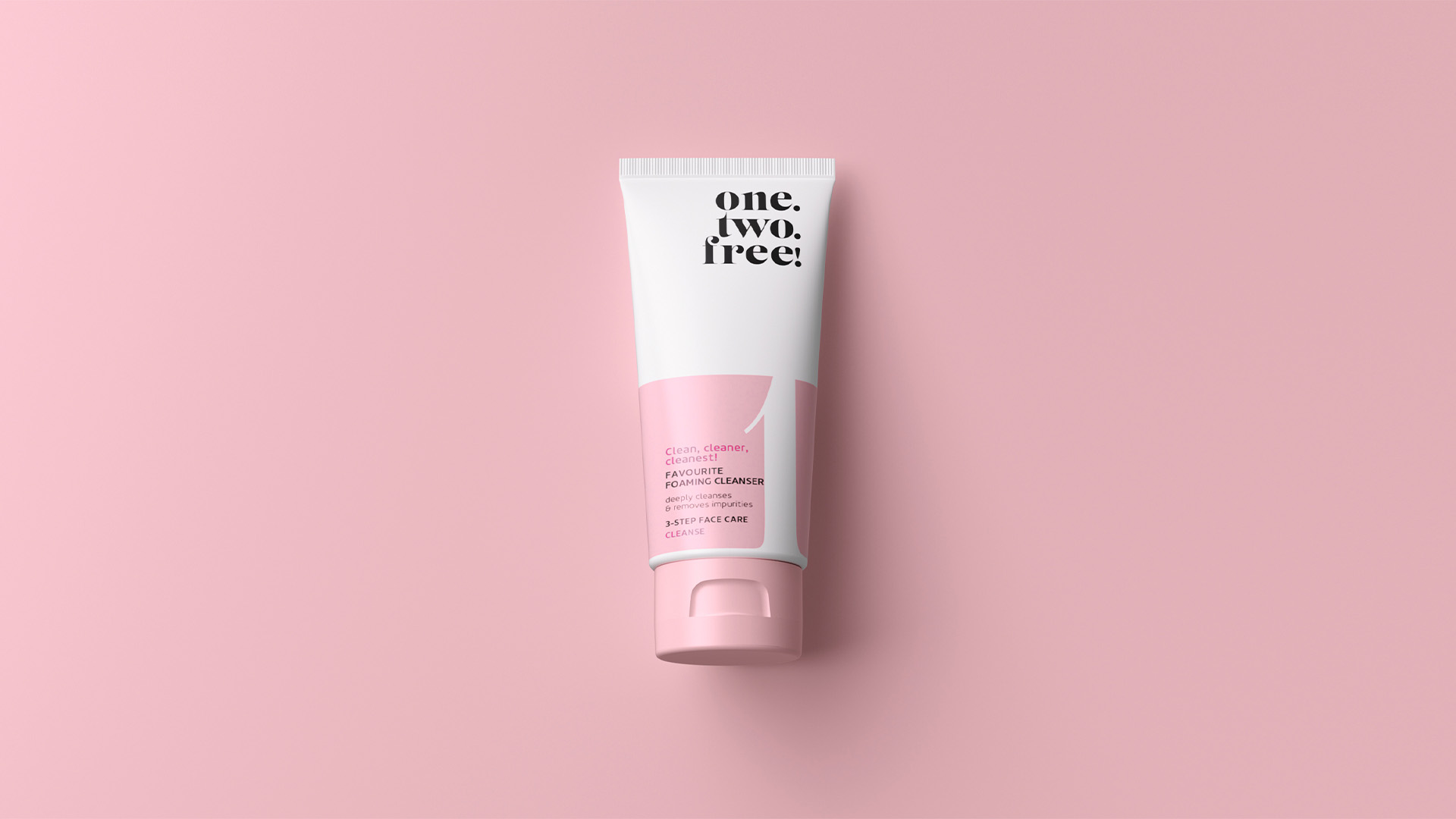
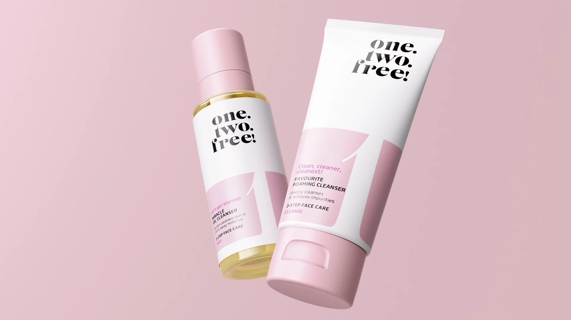
baries design created a striking, minimalist packaging design that visually represents the 3-step skincare routine through large numbers, pastel tones, and a structured color layout.
The clean design directly appeals to Millennial sensibilities, while the logo — with its fashionable, contemporary typography — reflects one.two.free!’s core values: simplicity, purity, and effectiveness.
The result is a cohesive visual identity that connects emotionally with consumers and aligns with the cultural aesthetics of the target group.
Process
The design process began with defining a strong, easily recognizable brand identity that visually translates the principles of Clean Beauty.
Inspired by the name one.two.free!, the packaging concept highlights the 3-step skincare system through numbered elements and color cues.
The team examined skincare rituals and user behavior — discovering that no existing Clean Beauty brand had yet represented a step-based ritual this clearly.
Large numerals, light pastel hues, and a typography style with fashion appeal created a distinctive, modern aesthetic. The logo was custom-designed for packaging use, balancing simplicity and freshness.
The goal was a strong, social media-friendly design that stands out in the market and emotionally appeals to the young target group.

Result
The final design delivers a visually bold and emotionally resonant identity that communicates Clean Beauty with modern clarity.
one.two.free! stands out with minimalist design and strong shelf presence, translating effectively to digital touchpoints.
The brand has since established itself as a leading name in Germany’s Clean Beauty sector.
According to surveys, {{12% of Clean Beauty consumers in 2024}} reported using one.two.free!, demonstrating significant visibility and acceptance within the target audience.