Challenge
Dash was already performing strongly, achieving impressive sales volumes, revenue, and customer reach. However, this success brought a distinct challenge: the brand needed to retain its newly acquired customers, whilst simultaneously refining its brand identity to drive further market growth.
During the initial project briefing, the client emphasized the need for a higher perception of quality. Specifically, the themes of purity, cleanliness, and freshness – all business-critical for the laundry category – needed to be much more visible on the shelf. The ultimate goal was to modernise the design, preserve the familiar brand essence, and deliver an at-a-glance product hierarchy across the entire range.
The baries design team was tasked with to creating a new visual structure to solve these issues. This involved modernising the Dash logo while respecting its heritage and ensuring the brand’s ‘Alpine Freshness’ concept element was instantly conveyed. It also required developing a universal visual framework that worked across heavy-duty, colour-safe, liquid, powder, and capsule formats, while aligning the packaging with Dash’s Rein ins Leben (Into Life) campaign, which celebrates refreshment, cleanliness and embracing life to the fullest
Approach
We began with a comprehensive diagnostic analysis, identifying several key areas for improvement. While the existing design already featured strong brand equity and recognition in the Dash logo, the rest of the packaging relied too heavily on text rather than visual storytelling – and Dash’s ‘Alpine Freshness’ scent concept was completely missing from the visual layout Furthermore, the“3-in-1” claim remained just a piece of text, rather than a visual reinforcement of the product’s actual performance
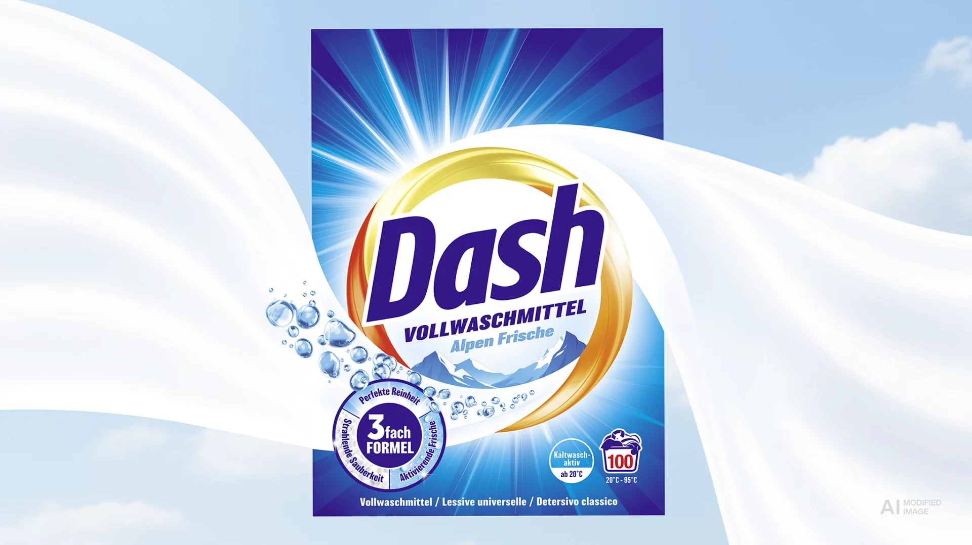
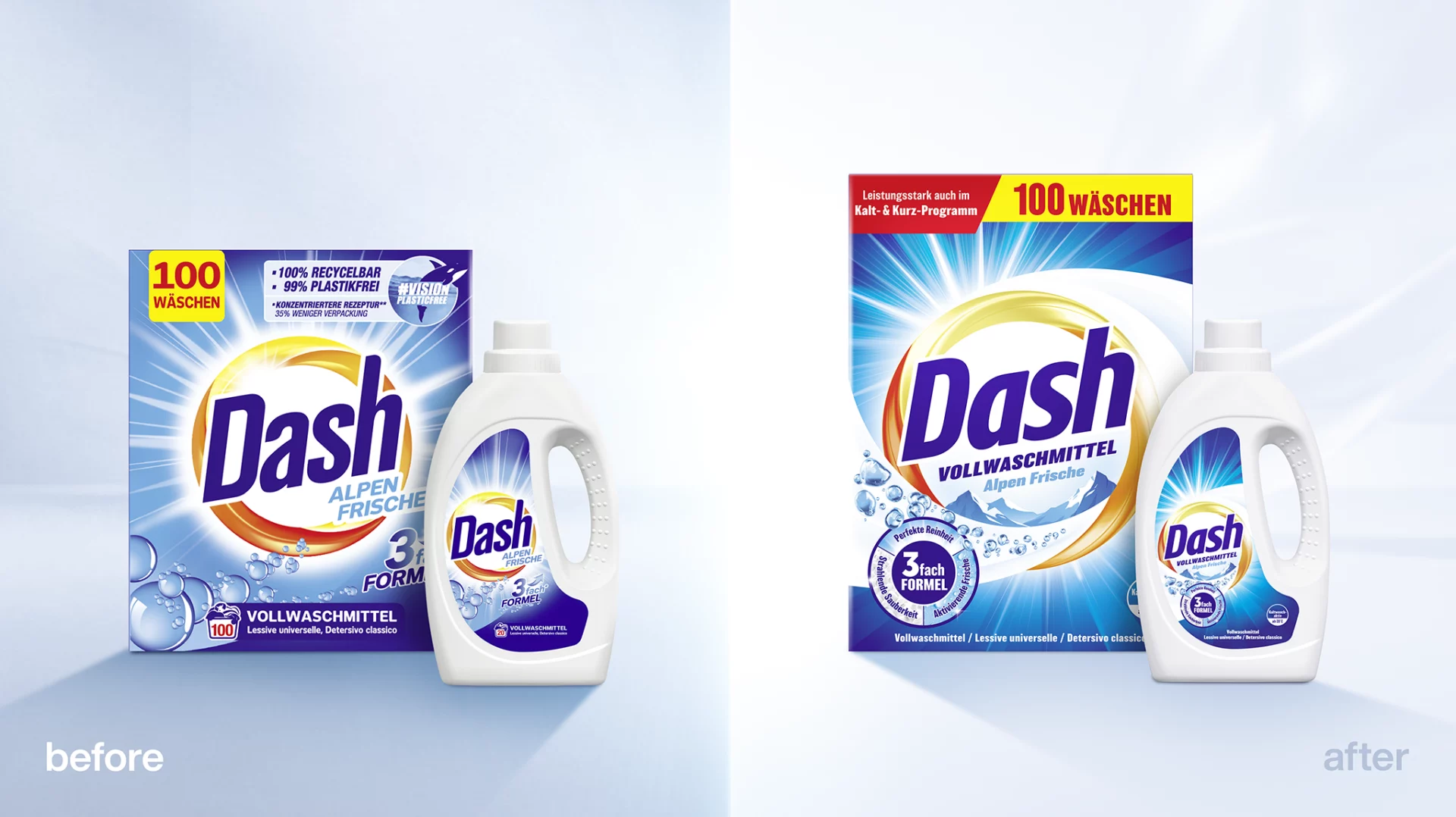
The third step was to visualise the fragrance world. Below the product name, the design focused on ‘Alpine Freshness’ by way of a mountain range – rendered in crisp, fresh shades of blue – to visualise the brand’s core freshness positioning, and giving the range a distinct, ownable asset. For the colour detergents, the familiar pink and purple colour coding was supplemented with strategic blue elements. This maintained a clear distinction from the All-Purpose range while seamlessly weaving in the freshness theme.
In terms of graphic Icons and finishing touches, the 3-in-1 formula was translated into a sleek, three-part circular banner. For heavy-duty variants, the graphic zoned in on Perfect Purity, Radiant Cleanliness and Activating Freshness. For the colour variants, performance was communicated as Vibrant Colours.
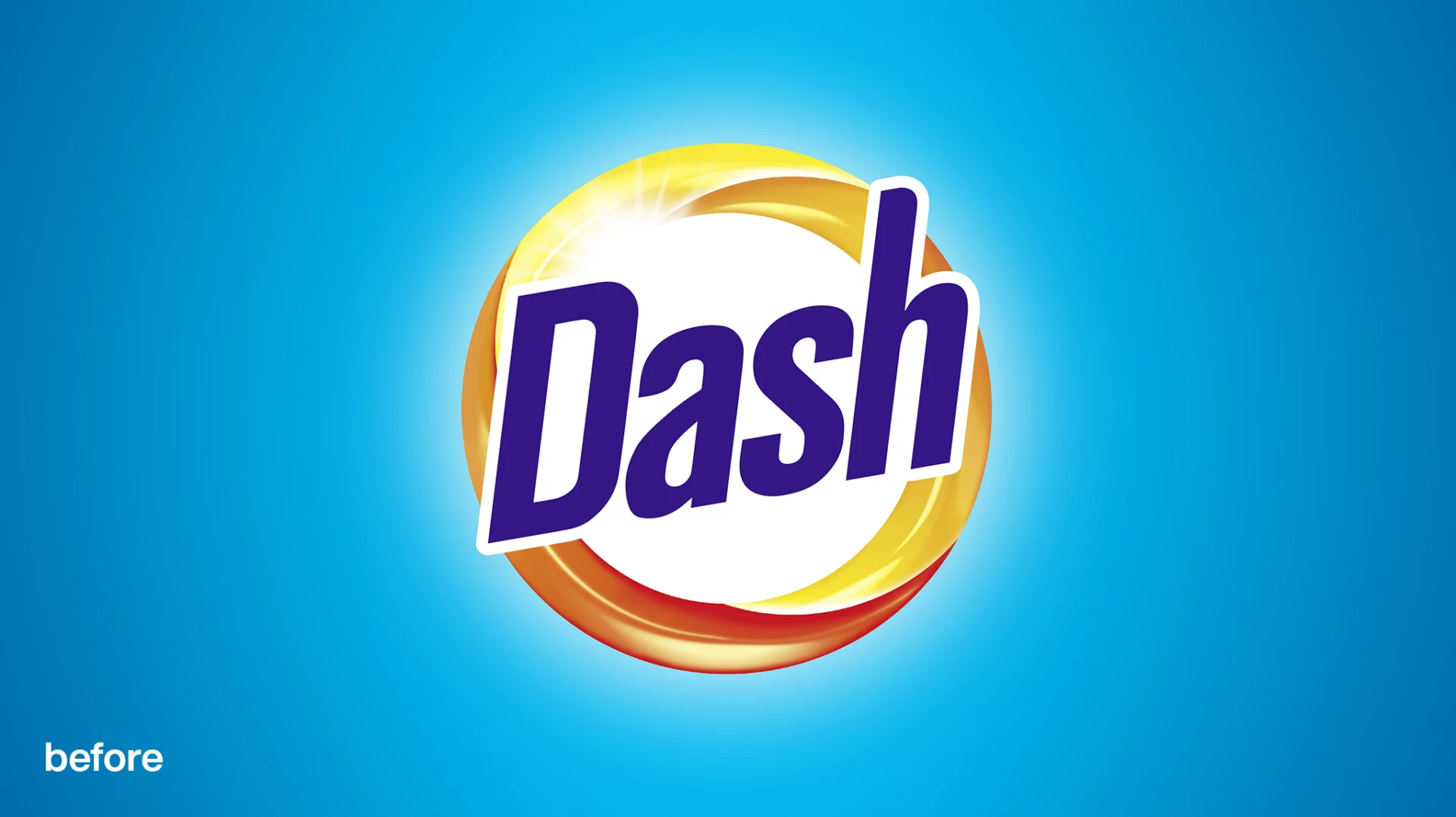
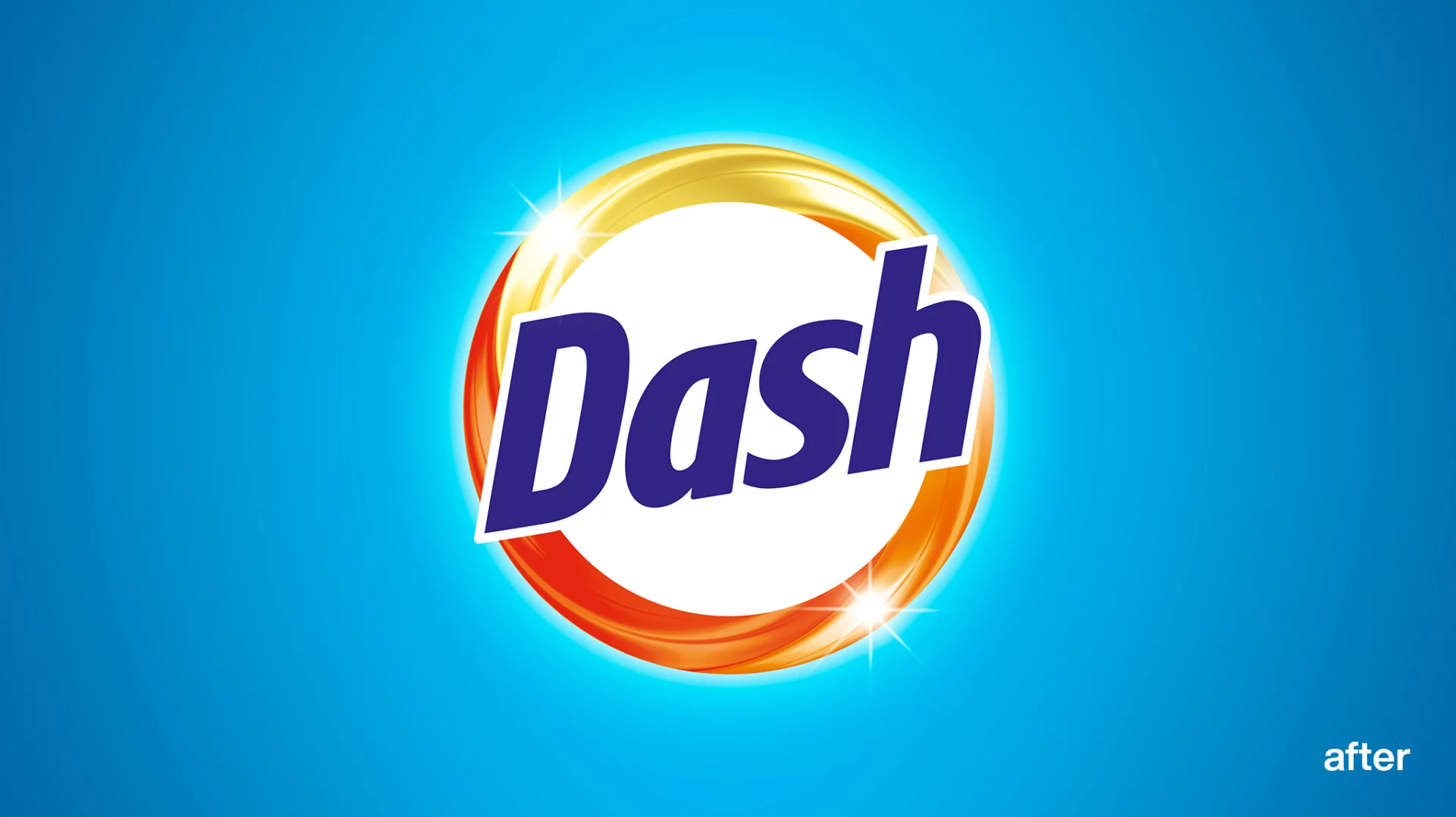
The bairies team began by updating the Dash logo, by way of a more contemporary look while retaining its function as the brand identifier. The lettering was made sleeker, with more open spacing. The iconic yellow-orange swoosh was redrawn dynamically, and the surrounding glow and rays were rendered with finer, premium detail.
Process
The central design challenge was balancing continuity with change – creating a visual identity that radiated greater energy, freshness, and cleaning power without alienating loyal buyers.
The baries team began by updating the Dash logo, by way of a more contemporary look while retaining its function as the brand identifier. The lettering was made sleeker, with more open spacing. The iconic yellow-orange swoosh was redrawn dynamically, and the surrounding glow and rays were rendered with finer, premium detail.
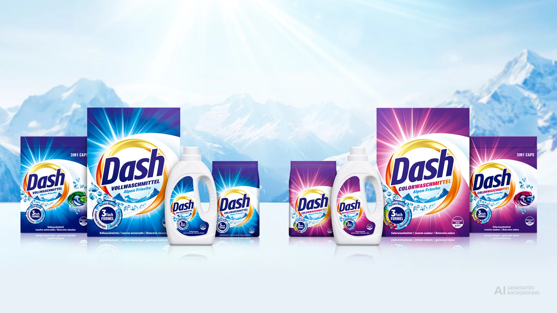
In a cross-format rollout, the new design logic was systematically applied to the entire product pipeline. This included folding cartons for powder, labels for liquid detergent containers of all sizes, and capsule packaging. The primary challenge was maintaining cohesion across vastly different formats. By keeping the brand hierarchy, product name typography, Alpine mountain graphic and the 3-in-1 icon consistent, the entire line now felt like a single, united family.
Result
This gave the three performance pillars a unified visual identity that was instantly recognisable across the entire Dash range. Finally, individual background elements were rebalanced. Bright rays gave the background colours greater luminosity, while realistically rendered bubbles reinforced the active cleaning process on a subconscious level.
The baries design system has now been successfully rolled out across more than 20 packaging SKUs. The result is a unified, contemporary Dash range that commands shelf presence and accelerates long-term sales growth.