Challenge
The task was to visualize the promise of “pleasure without added sugar” in a way that felt modern and yet typically Dr. Oetker.
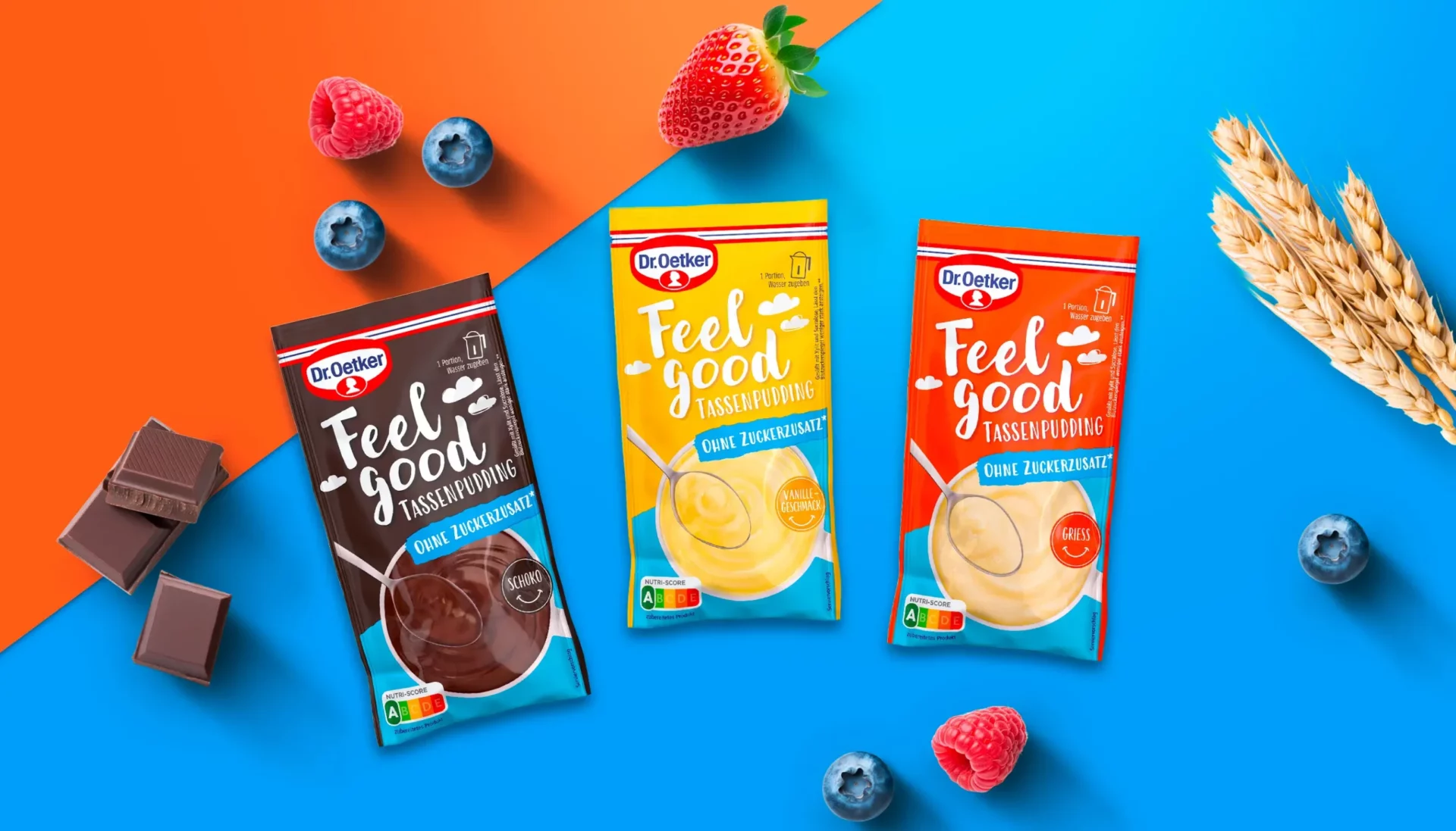
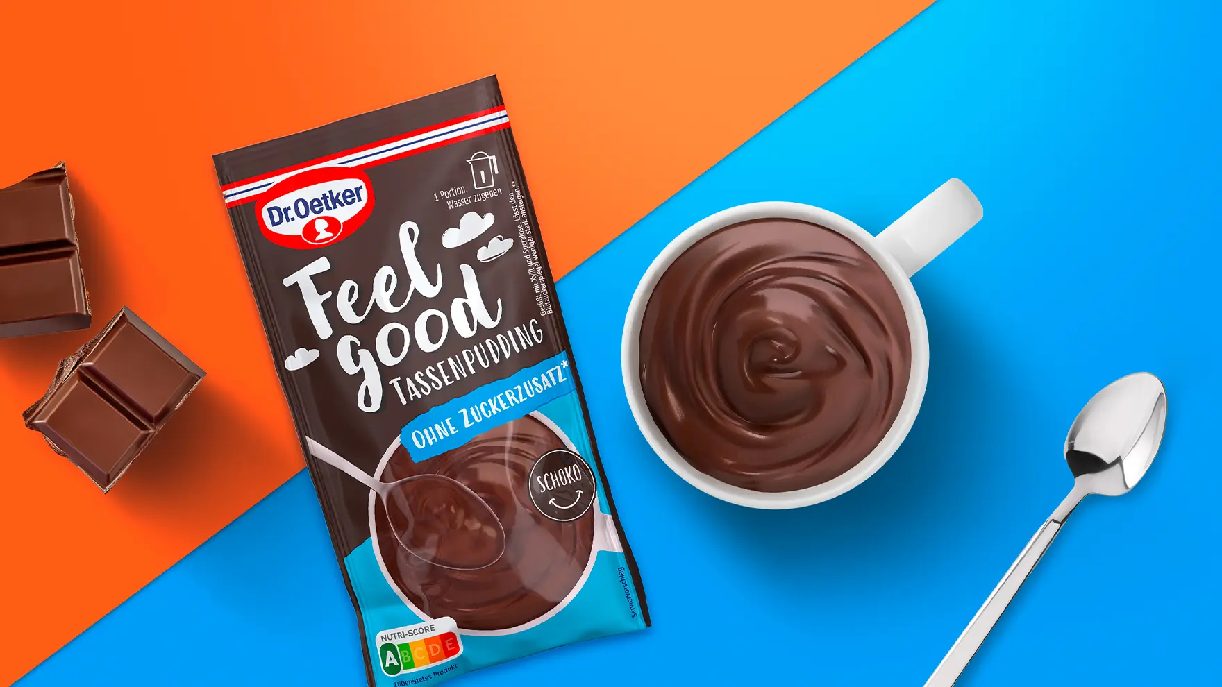
The Feel Good pudding cups — available in vanilla, chocolate, and semolina — needed to reference familiar Dr. Oetker products while signaling something new.
Consumers should instantly recognize the brand connection and simultaneously perceive innovation and positivity.

Approach
baries design explored various options for typography, color, and layout to find the perfect balance between tradition and freshness.
The final concept visually communicates indulgence and lightness — clouds, soft color gradients, and rounded type convey an airy feeling of well-being.
The Feel Good design merges Dr. Oetker’s established visual codes with a contemporary lifestyle aesthetic, ensuring strong recognition and appeal among younger audiences.
Process
The process was iterative from the outset.
The baries design team developed multiple concept routes reflecting different ways to express the central promise — from color intensity to typography and layout.
Testing variants helped identify the best combination for shelf visibility and target group affinity, ensuring that the new range integrated seamlessly into the existing Dr. Oetker design universe.

Result
The result is a packaging design that delivers a modern, inviting identity for Dr. Oetker’s Feel Good range.
Classic brand elements ensure consistency, while new graphic features draw attention to the “no added sugar” message.
The colorful design radiates positivity and lightness — making Feel Good both instantly recognizable and emotionally appealing.

The colorful design provides plenty of good vibes and feel-good moments.