Challenge
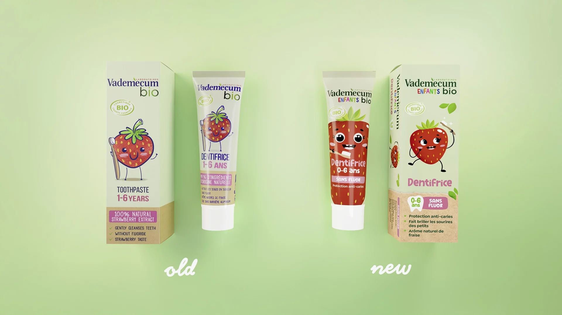
In 2019, the Vademecum Bio product line expanded with a new kids’ toothpaste.
The goal: communicate the “free-from” formula in a child-appropriate way while maintaining the natural brand identity.
The design had to appeal to children, convince parents, and clearly convey organic quality — using playful illustrations, strong color contrast, and clear labeling for flavor and age range.
baries design’s successful launch was further refined in 2025 to enhance visibility and clarity.
Approach
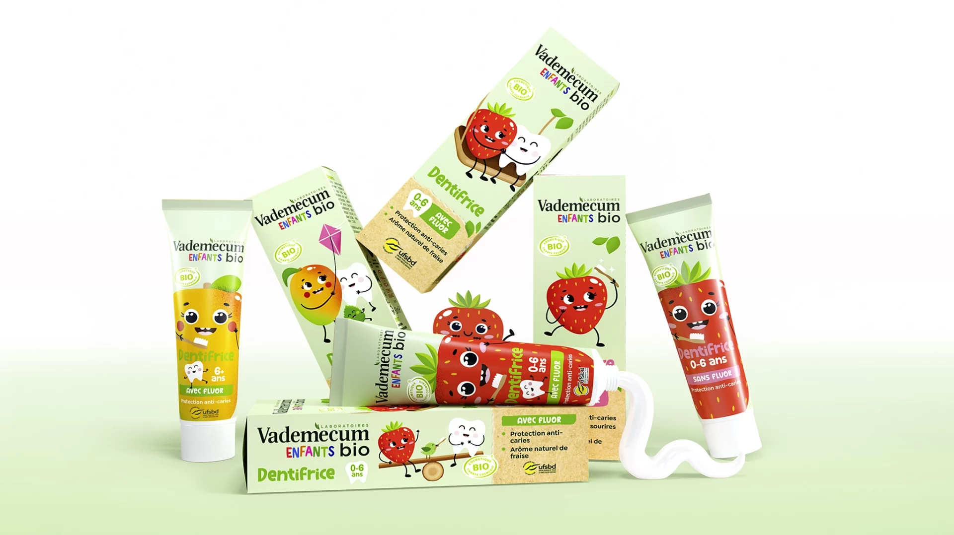
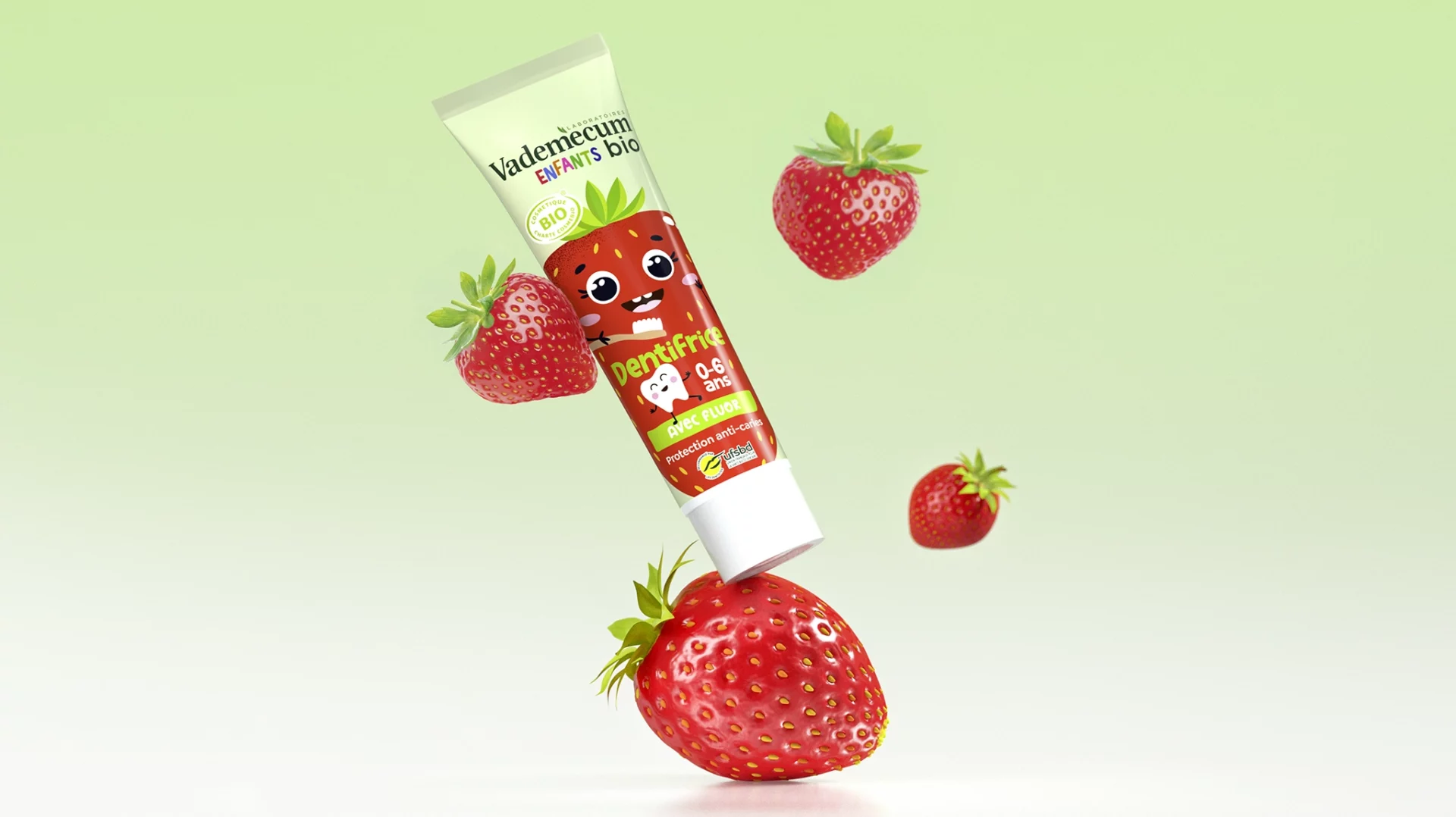
To reach both kids and parents, baries design developed a fun, engaging design with lively illustrated characters representing the two flavors — Mint and Strawberry.
A clear color code helps parents distinguish variants and select the right age group. Soft pastel tones and a recycled paper texture emphasize the brand’s organic positioning, while a prominently placed organic seal builds trust.
In the 2025 update, the design retained its cheerful tone but introduced a more dynamic composition. The labeling for “with/without fluoride” was made more prominent for added transparency.
Process
The design process centered on creating appealing, character-driven visuals that integrate smoothly into the existing Vademecum Bio identity.
Two charming characters — Mint and Strawberry — were illustrated to visually communicate flavor and ingredients.
Color palette, texture, and typography were carefully balanced to convey naturalness, organic quality, and age relevance in a way that feels playful, friendly, and tailored to young families.
Result
The Vademecum bio kids design succeeds through charming illustrations, clear coding, and a sustainable, natural look.
It makes toothbrushing fun for children and instills confidence in parents about quality and origin — creating a cohesive brand image that stands out on shelves and authentically conveys the brand’s values.