Challenge
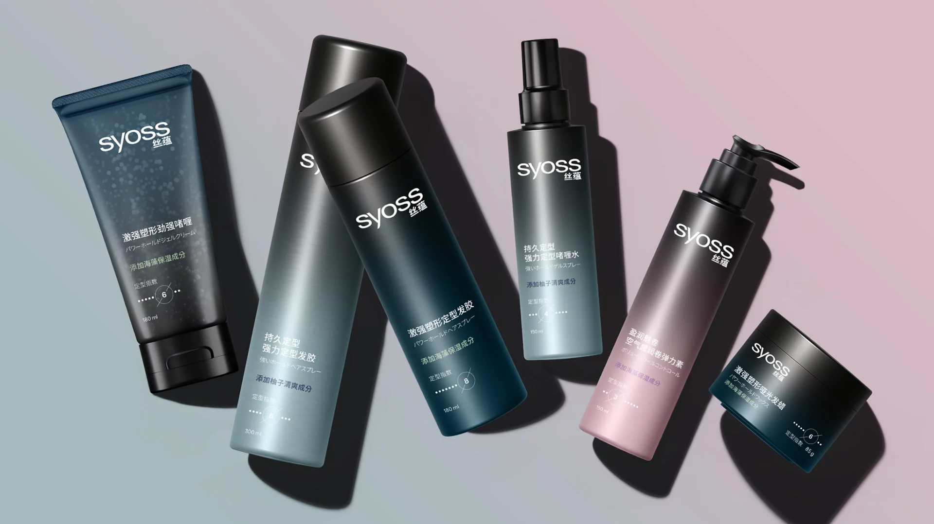
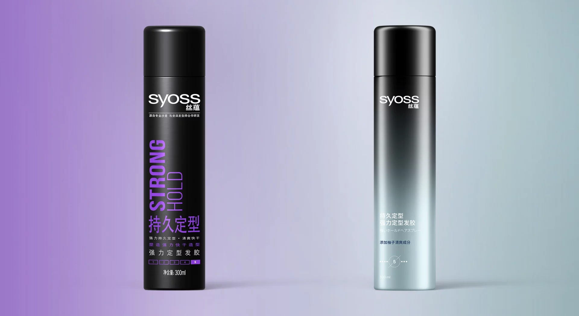
In 2021, Henkel is relaunching the Syoss styling range for the APAC region. The formulas are new: With MicroSculpt particles, the range delivers long-lasting hold with a light, invisible finish. Japanese active ingredients such as seaweed, yuzu, and camellia oil nourish the hair during styling. This new brand promise – powerful yet gentle – had to be clearly conveyed through the packaging. The task involved two aspects: a fundamental premiumization of the overall look and feel, and a visual interpretation of the J-Beauty trend. Both had to be achieved within the existing Syoss brand universe.
Appraoch/ Strategy
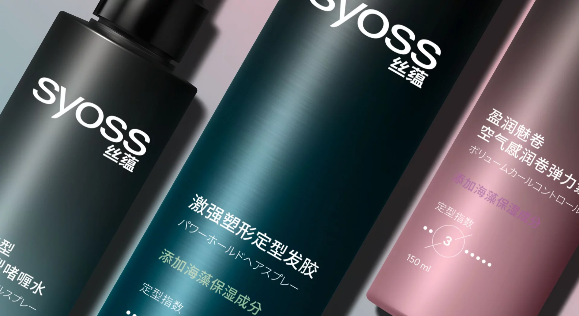
Color architecture forms the strategic core. Black, Syoss’s brand color, serves as the base color palette from which a precisely defined color gradient develops depending on the product line. The color gradient serves as both a decorative element and a functional code. Each color represents a specific Japanese active ingredient: seaweed, yuzu, and camellia oil. The gradient translates the world of ingredients directly onto the packaging while simultaneously providing clear guidance within the product line.
The design language consistently reflects the values of the new brand concept: minimalist, clean, unisex, premium. Smart chic meets salon expertise. Added to this is an innovative hold-level icon—an artistically designed row of dots with a numerical value. A detail that combines function and aesthetics: It clearly communicates the hold level while making the product appear both distinctive and premium. The typographic architecture was conceived as bilingual from the outset. Chinese and Japanese character sets were integrated into the design from the start to specifically highlight the brand’s Japanese origins.
Result/ Success
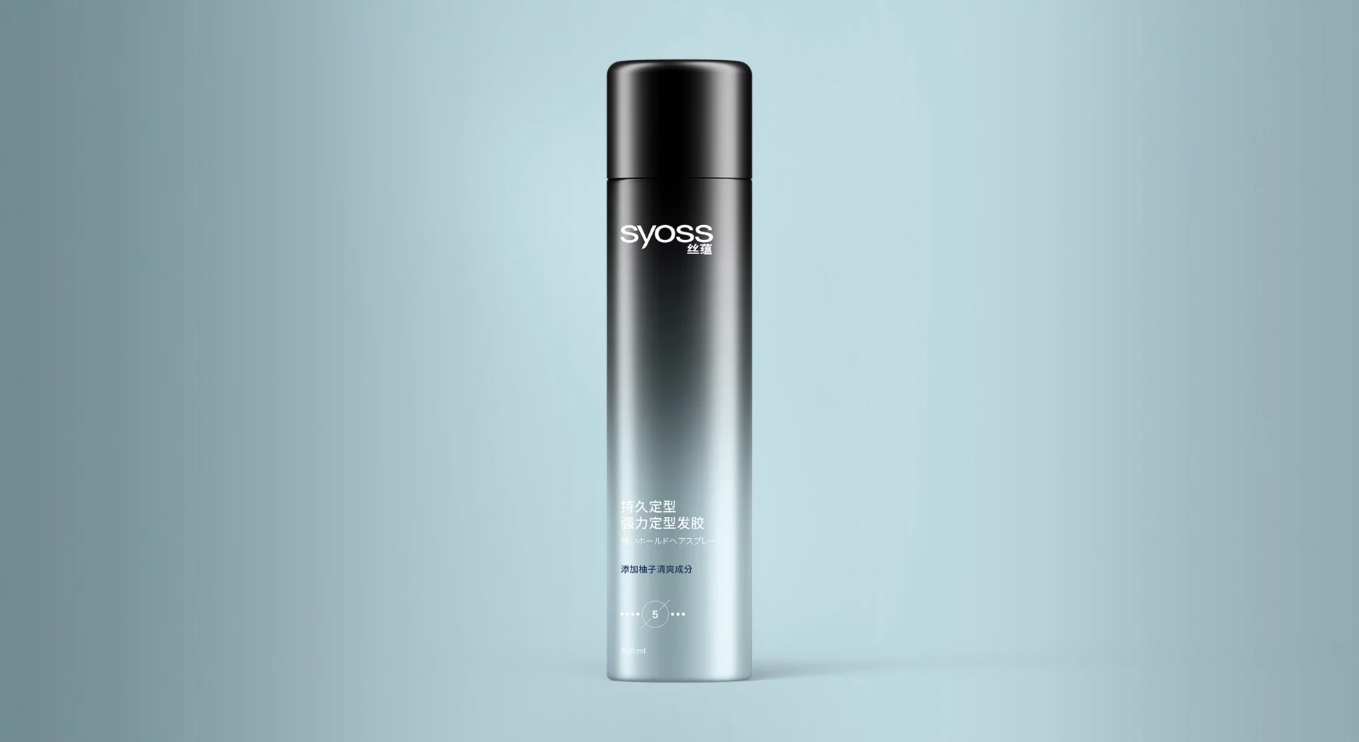
A styling range that brings the brand’s promise to life. The color gradient gives each line a distinctive look while ensuring a strong visual impact on the shelf as a unified whole. The design language conveys the J-Beauty concept clearly and without the need for explanation. The range functions as a cohesive system: consistent in its approach, clear in its focus, and striking on the shelf.
Tough on hold. Gentle on hair. You can tell at first glance.